Speech Inflation: The Recent Past and the Future

Good afternoon. I would like to thank BankSA for the invitation to speak in Adelaide today. It is a pleasure to be here.
The topic that I would like to talk about this afternoon is inflation, which ties in very nicely with the main theme of BankSA's quarterly bulletin which is being released today. First, I will talk in some detail about the distinct cycle in underlying inflation that we have seen in Australia over the past six years or so. After that, I will discuss the lessons that we might take from this cycle, as well as the broader lessons we have learnt from the past two decades of inflation targeting in Australia.
The Recent Cycle in Inflation
I would like to start with the cycle in underlying inflation that began in the mid 2000s (Graph 1).
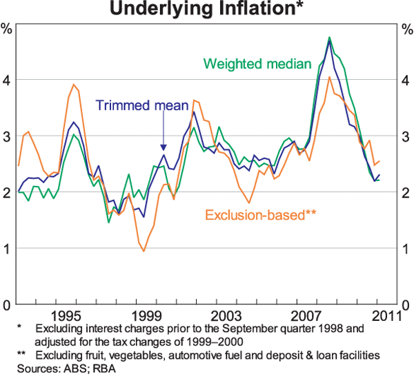
Across a range of measures, this cycle has been the most pronounced since the introduction of inflation targeting in the early 1990s. Between 2005 and September 2008, underlying inflation rose by more than 2 percentage points from around 2½ per cent to just above 4½ per cent. Then, since late 2008, underlying inflation has steadily declined to be around 2¼ per cent over the year to March 2011.
As the RBA discussed in the latest Statement on Monetary Policy, this decline in underlying inflation looks to have now run its course and a gradual rise is expected over the next couple of years. Given this, it is timely to look back and to review what caused the recent cycle and what lessons it holds for our understanding of the inflation process.
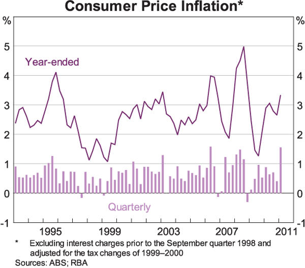
Before doing this it is worth noting that a cycle in headline CPI inflation is less obvious (Graph 2). This largely reflects the quarter-to-quarter volatility in the prices of fuel and fruit & vegetables. This volatility has been especially pronounced over recent years, partly because of the effects of Cyclones Larry and Yasi on banana prices.[1] This volatility is also one reason that we often use the various underlying measures when assessing the ongoing inflation pressures in the economy.
At a general level, the fact that underlying inflation picked up between 2005 and 2008, and then subsequently declined, is hardly surprising. In the period immediately prior to the North Atlantic financial crisis, global commodity prices were rising strongly, the unemployment rate in Australia had fallen to its lowest level in more than three decades and there was considerable pressure on capacity in the economy. The result was a pick-up in inflation. Then when the slowdown occurred, pressures on capacity eased and global commodity prices fell. Again, not surprisingly, the result was a moderation in inflation.
What did, however, surprise us somewhat was the amplitude and the timing of this cycle in inflation. Within the RBA, the staff run a number of standard ‘workhorse’ models based on historical relationships to help explain and forecast inflation.[2] While these models are all consistent with a pick-up, and then moderation, in inflation, they have difficulty explaining the amplitude of the recent cycle. This is obvious from Graph 3 which shows the average fitted values of four of these models, along with the trimmed mean measure of underlying inflation. In mid 2008, for example, underlying inflation was around ¾ of a percentage point higher than can be explained by the average of these models, and none of the models can explain why underlying inflation reached over 4½ per cent. In contrast, during the period 2005 to 2007, inflation was mostly lower than can be explained by these models.
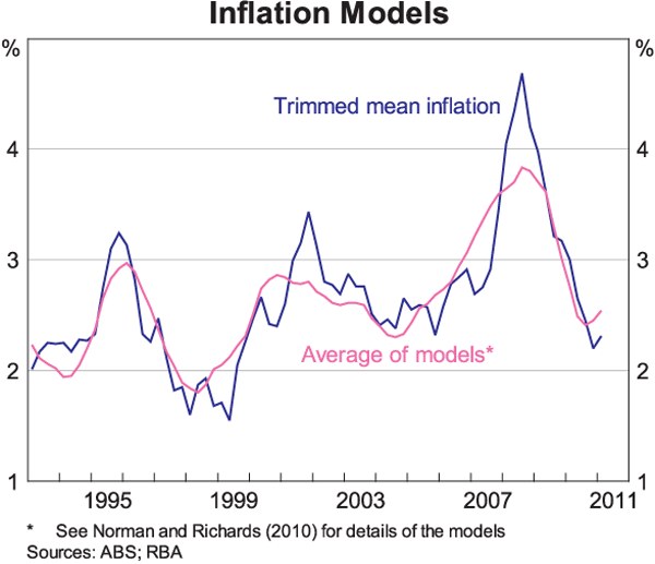
The general picture that one gets from this analysis is that underlying inflation in Australia was slower to pick up than suggested by the historical relationships, but when it did eventually pick up, it did so more quickly, and by a larger amount, than suggested by these relationships.
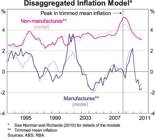
When we look closely at the details of the CPI, it is clear that this pattern is largely accounted for by the prices of services. This can be seen in Graph 4 which shows the inflation rate for manufactured goods in the CPI separately from that for non-manufactured items. Over the past decade, movements in the prices of manufactured goods are reasonably well explained by import prices, the exchange rate and labour costs. In comparison, over this period, the historical relationships do less well in explaining the inflation rate for non-manufactured items; the models over-predicted inflation in the middle years of the decade and then later under-predicted inflation.
This overall pattern of surprisingly stable inflation for a few years and then a sharp pick-up is evident in the RBA's own inflation forecasts over this period. In late 2006 and early 2007, the outcomes for underlying inflation were surprisingly well contained. At the time, we and others wondered whether something had changed significantly in the inflation process. But not long after that, the inflation outcomes were turning out to be considerably higher than we had expected. In fact, the difference between the RBA's 18-month-ahead forecast for underlying inflation and the actual outcome over the year to September 2008 was the largest over the inflation-targeting period.
In trying to understand this experience, there are three specific issues that I would like to touch on: the evolution of unit labour costs; the impact of housing-related costs on the CPI; and the role of international factors.
Unit labour costs
In the long run, movements in unit labour costs – i.e. average labour costs per unit of output – have an important bearing on the rate of inflation. Over the inflation-targeting period, unit labour costs have increased at an average annual rate of 2.6 per cent and the CPI inflation rate has averaged 2.7 per cent.[3] The fact that these two numbers are so close to one another is no accident. If the profit share is to remain relatively steady over time, average growth in unit labour costs needs to be consistent with inflation target.
Of course, in the short run, the link between unit labour costs and inflation is not nearly as tight. In the recent cycle, growth in unit labour costs picked up in 2004 and remained high until late 2008 (Graph 5). This was the result of both faster growth in average labour costs and slower growth in productivity.
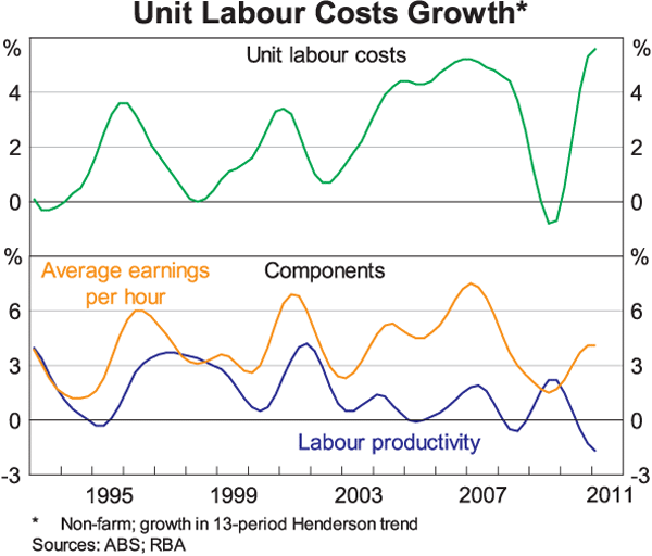
The pick-up in labour costs in the middle years of the 2000s is evident in a wide range of measures. Not only was there a lift in annual wage increases as the labour market tightened, but there were reports of many firms upgrading positions in an effort to retain and attract staff, with the upgraded positions attracting higher rates of pay. Some firms also increased the bonuses and other benefits paid to their staff.
This increase in labour costs coincided with a period of slower growth in labour productivity. Since 2005, estimated labour productivity growth has averaged less than ½ per cent per year, compared with average growth of 2 per cent over the 1990s. The reasons for this slowdown are not fully understood, although it may partly be a result of the high commodity prices that have allowed lower quality and/or more costly mines to be developed. In any case, productivity growth will need to pick up again if our living standards are to improve at the rate we have become accustomed to over the past two decades. This is a major challenge facing both the private and public sectors.
Looking back to the recent cycle in inflation, it is clear that developments in unit labour costs had a significant role, both in contributing to the increase in inflation and then to its decline. But they provide only a partial explanation, and alone cannot explain why inflation picked up so sharply in 2007 after having been stable over the preceding few years. One possible explanation for this pattern is that there is some threshold in capacity utilisation which when crossed causes inflation to increase very quickly. An alternative explanation is that the short-run dynamics of underlying inflation were influenced by other factors during this period. It is difficult to formally test these two explanations, but other factors do appear to have played a significant role. Of these, developments in housing costs were perhaps the most important.
Housing cost inflation
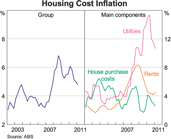
Currently, housing-related costs – including rents, utilities and the cost of building new dwellings – account for around 20 per cent of the CPI, the largest share of any single group. Broadly speaking, the housing component of the CPI shows the same general pattern as that in underlying inflation, although the recent moderation is less pronounced (Graph 6).
A couple of factors are important in explaining this general pattern.
The first is that the large run-up in Australian house prices that was driven by the adjustment to low inflation ended in late 2003. When the housing boom came to an end, building cost inflation came down and growth in rents was subdued for a few years. These outcomes helped hold down overall inflation rates during this period. But by 2007, the cycle had again turned, with building costs rising more quickly and growth in rents accelerating. This faster growth in rents reflected the changing balance of demand and supply in the rental market, with strong population growth coinciding with relatively slow expansion of supply.
The second factor has been utilities prices. During the middle years of the 2000s utilities prices were increasing at an average rate of 4 per cent, which was slightly lower than that in the previous few years. Then from 2007, utilities price inflation accelerated sharply. The proximate cause was the regulatory decisions allowing double-digit price increases, partly to help fund infrastructure investment, particularly for the distribution of electricity. But a deeper cause was the low levels of investment in previous years, which meant that the capacity of the system to distribute electricity had not kept pace with the growth in demand, particularly during hot weather.[4]
While these developments in rents and utilities do help explain the particular dynamics of inflation over the recent cycle, they also demonstrate that when the economy is operating up against supply constraints, all sorts of prices – and not just the price of labour – start rising more quickly.
International factors
The third issue that I would like to touch on is the role of international factors.
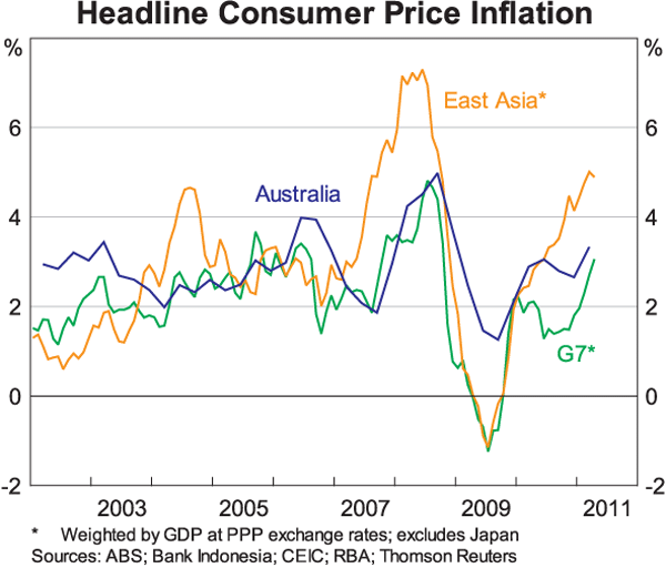
Looking at headline inflation rates across countries over recent years, there is a deal of similarity in the movements (Graph 7). Many countries in both Asia and the North Atlantic experienced increases in headline inflation rates in 2007 and 2008 and many experienced declines in late 2008 and in 2009. This co-movement partly reflects the large changes in global commodity prices over recent years. When global oil prices went up, they boosted the CPI in almost all countries, and when they went down during the financial crisis, they led to CPI inflation falling almost everywhere. Movements in food prices had a similar global effect.
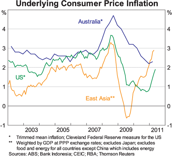
In terms of underlying inflation, we also see some co-movement across countries over recent years, although somewhat less than in headline inflation (Graph 8). When underlying inflation in Australia was rising, so too were equivalent measures of underlying inflation in the United States, as were exclusion-based measures of core inflation in most Asian countries.[5] Similarly, measures of underlying inflation fell almost everywhere in the aftermath of the financial crisis, although there has been more dispersion recently. These common movements reflect the correlation in the business cycle across countries, as well as the flow-on effects of the large changes in global commodity prices to the prices of a wide range of final goods and services.
Movements in the exchange rate have also influenced inflation outcomes over recent years. In particular, the trend appreciation of the Australian dollar from 2002 has helped hold down the prices of many imported manufactured goods. For example, the price index for household electrical appliances is 8 per cent lower than it was nine years ago. Over this same period, clothing prices have fallen 10 per cent, the price of shoes by 13 per cent and the price of manchester by 24 per cent. These are all large price declines.
Around the trend appreciation of the exchange rate there have, however, been significant swings. In particular, the large depreciation of the currency as a result of the financial crisis saw the prices of many manufactured goods increase in 2009. These increases slowed the moderation in underlying inflation during this period. More recently, the subsequent appreciation of the currency has led to quite large falls in the prices of many manufactured goods. Overall though, these swings in the exchange rate have played only a relatively minor role in explaining the recent cycle in underlying inflation which has been primarily driven by domestic factors.
Some Lessons
So to summarise, an important lesson from this recent experience is that inflation responds to the changing pressures on capacity in the economy. When demand is high relative to the economy's capacity to produce goods and services, the cost of labour and raw materials tend to rise and firms' mark-ups tend to increase. Conversely, when demand is low relative to the economy's capacity to produce goods and services, these pressures ease and inflation tends to fall.
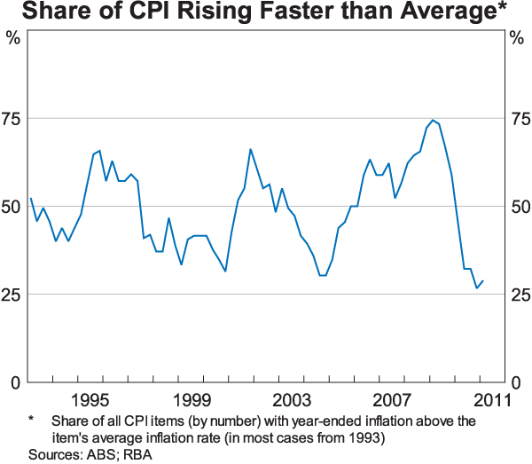
It is also clear that the dynamics of the recent cycle in inflation were influenced by capacity pressures in the housing market and by developments in utilities prices. They were also influenced by capacity pressures in the global markets for commodities. But these factors alone fall well short of fully explaining the cycle, with the upward pressure on prices in 2008 being very widespread. At that time, around three-quarters of the 90 individual items in the CPI were increasing at faster than their average rate of the previous two decades (Graph 9). Similarly, the deceleration of inflation since September 2008 has been widespread, with the prices of relatively few items currently increasing at faster than their average rate.
Looking at the experience over the past six years as a whole, it is clear that the protracted period of above-average growth in unit labour costs did eventually lead to higher inflation and this was compounded by a variety of other capacity pressures in the economy. Subsequently, the slowing in unit labour costs during the downturn and the easing of these other capacity pressures saw inflation moderate significantly.
But looking beyond this recent cycle, the past 20 years carry a broader and more important lesson. And that is the economy works better with low and stable inflation, and that the monetary policy framework matters.
In the 1970s and 1980s we saw the consequences of high inflation rates. Inflation eroded the value of people's hard-earned savings. It made long-term planning difficult. It added to uncertainty. It distorted investment decisions. And as the late 1980s showed it made leveraged asset purchases an easier path to wealth than hard work. The end result was slower growth and greater economic volatility.
High inflation also meant high interest rates. In the 1980s, the inflation rate averaged 8 per cent, and the mortgage rate averaged 13 per cent and peaked at 17 per cent. In contrast, since 1993 inflation has averaged just a little above 2½ per cent and the mortgage rate has averaged 7½ per cent. And the volatility of both inflation and interest rates has also been lower under the inflation targeting regime. The clear lesson here is that changes in the average inflation rate ultimately lead to changes in average interest rates, including those on mortgages.
Today, most people take low inflation as a given, as a permanent part of our economic landscape. Inflation expectations are well anchored and the possibility of a rapid increase in the general price level is not something that most people worry about. This is how it should be. There are enough uncertainties in today's world, without adding uncertainty about the average rate of inflation to the list.
For all these reasons, there is broad community acceptance that the main contribution that the Reserve Bank can make to strong sustainable growth in the Australian economy is to maintain low and stable inflation. In concrete terms, our objective is to keep the average rate of inflation over time somewhere between 2 and 3 per cent. We have achieved this over the past two decades, and this has been one of the key building blocks for Australia's strong economic performance.
Importantly, we have had from the start a flexible inflation targeting regime focusing on medium-term outcomes, which is what ultimately matters to both households and businesses. Under this framework, inflation has been both below, and above, the 2–3 per cent range. The framework allows us to respond to one-off events and to large changes in world relative prices in a way that promotes economic stability and the framework has been important in anchoring inflation expectations.
Looking ahead, as the Bank has discussed recently, the current environment is a particularly challenging one. In the central scenario, we are looking at a significant boom in investment in the resources sector at a time when the overall economy has relatively little spare capacity. While conditions are very strong in parts of the economy, other parts are finding things very difficult because of either the high exchange rate or the ongoing restraint in household spending and borrowing. And to add to the complications, global commodity prices are undergoing a structural shift as hundreds of millions of people in Asia enter the global economy.
It is not easy to navigate our way through this difficult environment. The new realities of the global economy have improved Australia's medium-term prospects. At the same time though, they are causing considerable structural change in the economy which is leading to difficulties in a number of areas. As Australia takes advantage of its new opportunities and manages the process of structural change the task for the RBA is to keep inflation low and stable. By doing this, we can help promote sustainable growth in jobs and as well as economic and financial stability. Over the past 20 years, low inflation has been a key ingredient to Australia's economic success and maintaining that record will help us meet the challenges that lie ahead.
Thank you.
Endnotes
I would like to thank Patrick D'Arcy, Hugo Gerard, Christie Lewis and Shalini Shan for assistance in preparing this talk. [*]
There has also been considerable volatility in the price of financial services due to the effect of the financial crisis. [1]
For a discussion of these models see Norman D and A Richards (2010), ‘Modelling Inflation in Australia’, Reserve Bank of Australia Research Discussion Paper No 2010-03. [2]
This calculation excludes the estimated effects of the introduction of the GST on the price level, as well as interest charges which were included in the CPI prior to September 1998. [3]
For further details, see Plumb M and K Davis (2010), ‘Developments in Utilities Prices’, RBA Bulletin, December, pp 9–18. [4]
Trimmed mean measures of underlying inflation are not available for most countries in Asia. [5]