Speech Notes for talk to ABN AMRO Australia Day Seminar

I.J. Macfarlane
Governor
Notes for talk to ABN AMRO Australia Day Seminar
Tokyo –
Last time I spoke to a group like this in Tokyo was in September 1997 when my hosts were Barclays de Zoete Wedd (BZW). The same people are hosting this Seminar, but thanks to the mergers and rationalisations that have become so common in the finance sector, I am now speaking under the auspices of ABN-AMRO.
My aim today will be to give you an update on the Australian economy, but I do not wish to concentrate too much on the very short term. As many of you are investors with a medium and longer-term horizon, I would like to spend a fair bit of my time on matters relevant to this horizon. Not only will I talk about how Australia has weathered the Asian crisis, but I would also like to touch on some of the medium-term structural adjustments that have been going on for more than a decade.
| Average annual rate (past nine years) | |
|---|---|
| Ireland | 6.8 |
| Norway | 3.5 |
| Australia | 3.2 |
| Netherlands | 2.8 |
| United States | 2.5 |
| Denmark | 2.5 |
| Germany | 2.2 |
| Spain | 2.2 |
| New Zealand | 2.1 |
| Canada | 1.9 |
| United Kingdom | 1.9 |
| Belgium | 1.9 |
| Japan | 1.8 |
| France | 1.7 |
| Finland | 1.3 |
| Italy | 1.3 |
| Sweden | 1.1 |
| Switzerland | 0.8 |
I will start with one of these longer-run comparisons – namely, economic growth. We have now nearly completed the decade of the 90s, with nine of the ten years already behind us. Over this period of nine years, which for each of the countries in my comparison includes some recessionary period, Australia has grown faster than other comparable OECD countries. Only Ireland and Norway, which taken together are only about half the size of Australia, have done better, and there are rather special reasons in each case. This is the first decade to my knowledge where Australia has put in such a strong growth performance relative to other OECD countries.
| Year to latest | |
|---|---|
| China | 9.6 |
| Australia | 4.7 |
| United States | 4.3 |
| Taiwan | 3.7 |
| Canada | 2.8 |
| Philippines | −0.2 |
| New Zealand | −0.7 |
| Singapore | −0.8 |
| Japan | −3.5 |
| Korea | −6.8 |
| Hong Kong | −7.0 |
| Malaysia | −8.6 |
| Indonesia | −19.6 |
Of course, these figures are averages over nine years – what about the current situation? My next table looks at the growth over the latest year (1998) for those countries in the Asia and Pacific Rim. It is not a pretty picture, with the majority of countries having experienced outright contraction in their levels of income. Apart from China, which is a relatively closed economy, Australia has recorded the highest growth. The figure of 4.7 per cent over the year to the December quarter 1998 was a good deal stronger than any of us had forecast, given the contractionary forces that were being felt from our trading partners. We had been expecting a noticeable slowdown, and we still are. But it will be a slowing off a much higher basis than we formerly thought.
| Average annual rate (past nine years) | |
|---|---|
| Japan | 1.3 |
| Belgium | 1.9 |
| France | 2.0 |
| Canada | 2.2 |
| Sweden | 2.2 |
| Denmark | 2.2 |
| Ireland | 2.4 |
| New Zealand | 2.5 |
| Norway | 2.6 |
| Netherlands | 2.6 |
| Finland | 2.7 |
| Switzerland | 2.7 |
| Germany | 2.7 |
| Australia | 2.8 |
| United States | 3.3 |
| United Kingdom | 4.0 |
| Italy | 4.5 |
| Spain | 4.9 |
A companion piece to the comparison of economic growth over the decade of the 90s is a look at the rate of inflation of the same countries over the 90s (or at least the first nine years). Over that period, Australia had an average rate of inflation of 2.8 per cent per annum, which is slightly higher than the average of OECD countries, but within the range of 2 to 3 per cent as specified in our inflation target. If we deleted the first two years (1990 and 1991) from our comparison, our inflation rate would be about average for OECD countries. Of course, the other thing that stands out from this graph is just how low inflation has been over that period, with 14 of the 18 countries having averaged less than 3 per cent.
There are many explanations that have been put forward for the return to a very low inflation environment. Macro-economic policy, particularly monetary policy, has played the major role, but micro-economic influences, such as heightened competition, have also been important.
In Australia's case, these micro-economic influences have been quite important, not just in explaining lower inflation, but also in explaining the economy's growth and resilience in the face of external contraction. Among the changes made have been:
- to substantially lower tariffs;
- to deregulate financial markets;
- to introduce a more stringent regime for competition policy;
- to privatise a lot of public utilities; and
- to introduce a good deal more flexibility into wage bargaining.
These are all designed to make the economy more efficient and more competitive, but, of course, in the short run they also have costs. For example, there is always an increase in uncertainty in an economy where change is occurring, and there are often job losses involved, such as when a large over-staffed public utility is privatised. Of course, there are also enormous benefits which are often overlooked, such as cheaper electricity, cars, telephone calls and airline flights, new export industries, etc.
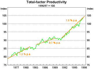
The best quantitative sign that these changes are yielding good results is that the economy is now more productive than it ever was. This graph shows productivity growth in each of the three recent expansions. It is clear that the increase in productivity of 1.9 per cent per annum in the current expansion is a good deal better than the figures we had in the expansions of the 1970s or 1980s. The figure I am showing here is multi-factor productivity. This measure of productivity cannot be increased simply by shedding labour and replacing it with capital. It can only be increased by using both labour and capital more productively.
While Australia has had good results on growth, inflation and productivity, our results on unemployment could only be described as average. Our unemployment rate has come down from the peak of 11.2 per cent in 1992 to its present level of 7.5 per cent. Such a result looks good by the standard of Continental Europe, but does not look good by other standards. Naturally, it does not look good by Japanese standards, where the unemployment rate has always been low relative to other countries. But it is also not good compared to the United States or the United Kingdom. We have done well in Australia in providing economic growth, but we have not turned it into jobs as well as we might have.
| Per cent of GDP, 1998 | |
|---|---|
| Norway | 4.4 |
| Ireland | 2.5 |
| Canada | 2.0 |
| United States | 1.6 |
| Sweden | 1.2 |
| Denmark | 1.0 |
| New Zealand | 0.9 |
| Finland | 0.8 |
| Australia | 0.5 |
| United Kingdom | −0.4 |
| Netherlands | −1.2 |
| Belgium | −1.5 |
| Spain | −1.9 |
| Germany | −2.4 |
| Italy | −2.6 |
| France | −2.9 |
| Japan | −6.1 |
I would now like to turn to public finance, which is another dimension in which the Australian performance looks good. On comparable OECD figures, our budget was in surplus to the tune of about ½ per cent of GDP in 1998, and a bigger surplus is expected next year. A better measure of the longer-run effect of fiscal policy can be obtained by looking at the ratio of general government debt to GDP. This effectively measures the accumulated deficits by the debt that is needed to finance them. On this measure, Australia's public finances have resulted in the smallest call on capital markets of all OECD countries.
| Selected OECD Economies | |
|---|---|
| Italy | 119.4 |
| Belgium | 117.3 |
| Japan | 99.9 |
| Canada | 90.0 |
| Sweden | 73.1 |
| Spain | 72.0 |
| Netherlands | 67.9 |
| France | 66.4 |
| Germany | 62.6 |
| Denmark | 59.3 |
| Ireland | 56.6 |
| United States | 57.4 |
| United Kingdom | 57.2 |
| Finland | 52.5 |
| New Zealand | 37.6 |
| Norway | 37.1 |
| Australia | 37.0 |
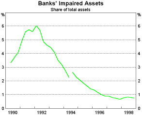
As well as our government finances being in reasonably healthy shape, our banking system is also very sound. I have tried to summarise this with one graph which shows banks' impaired assets (or bad loans) as a proportion of their total assets. This reached a peak of 6 per cent in 1992, but has come down pretty well continuously since that time. At present, the ratio is less than 1 per cent, which is about as low as it can conceivably ever get. In short, we did have some problems right at the beginning of this decade, as did a lot of other countries, but the bad loans were run off relatively quickly, new capital was raised, and the banks' balance sheets have returned to a very healthy state.
I would now like to turn to a subject which tended to dominate economic discussion in the 1980s. That subject is the current account deficit and the level of external debt. In the mid 1980s, there were fears that Australia's current account position might be unsustainable. As a result, there was a large fall in the real exchange rate, and a number of other adjustments had to be made, including a substantial tightening of fiscal policy. Where has that left us when we look back a decade later?
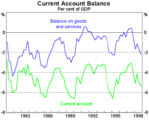
Looking back, it is clear that the situation was not unsustainable. When we look at the bottom line of this graph which shows the current account deficit as a percentage of GDP, we can see that it has oscillated between about 3 per cent and a bit over 6 per cent over the last two decades. There is a very strong cyclical element in the current account deficit, and on four occasions it has widened to a bit over 6 per cent of GDP. We have been expecting it to do the same on this occasion because of the contraction in our export markets and our own relatively buoyant domestic demand. Somewhat to our surprise, it has not happened, but we would not be surprised if it does happen soon. The only sure way of preventing such an eventuality would be to slow the Australian growth rate down to something like that of our Asian neighbours, and, quite rightly, no-one wants to do that. That would be very bad economic policy.
Although things have turned out better than expected, it does not mean we have escaped completely from the contraction of demand in our trading partners. Obviously, we have suffered from a fall in commodity prices and we have also seen the volume of our exports fall to a level slightly below that which was prevailing in the middle of 1997. But the fall in exports has been nowhere as large as you would expect if you simply added up the falls in imports in our trading partners. The reason for this is that a large proportion of our exports, particularly the rural and resource exports, can be quickly shifted from those markets that are contracting to those markets which are expanding.
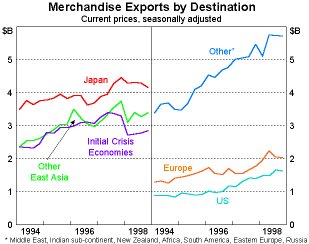
If we look at what has happened since mid 1997, we can see that:
- exports to the parts of Asia that were initially hit by the crisis (ASEAN plus Korea) have fallen by 16 per cent;
- exports to the rest of Asia have been relatively flat;
- on the other hand, exports to Europe are up by 18 per cent, to the United States by 24 per cent and to other markets by 13 per cent.
One of the reasons that it has been possible to do this is that such a high proportion of our exports are commodities. We often bemoan this fact, but in a regional crisis like the one we have just seen, it can be an advantage.
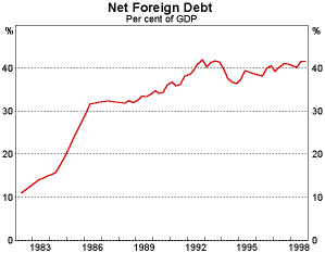
Let me return to the issue of sustainability of our external position. The other side of the worries about the Australian balance of payments in the mid 1980s was a concern about the level of foreign debt. It had risen from almost nothing to about 35 per cent of GDP in five years. This caused a lot of concern because people tended to assume that this sharp upward trend would continue, which would raise doubts about the sustainability of our external position. In the event, the sharp rise in this ratio flattened out. The present ratio is about the same as it was in 1992 and not a lot higher than the mid 1980s. The arithmetic is such that with a constant current account deficit as a proportion of GDP, the foreign debt ratio does not rise forever, it tends to flatten out at a new level, and this is what has been happening.
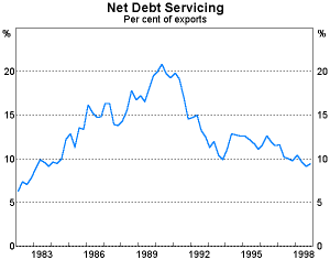
Another way of looking at sustainability is to look at it from the side of debt servicing. Here, the story is somewhat similar. Debt servicing payments as a percentage of exports rose from 5 per cent to 20 per cent during the 1980s, again causing quite a bit of concern. But with the strong growth of Australian exports over recent years and the lower interest rates around the world, this ratio has fallen back to 10 per cent in the 1990s.
What have these developments in the Australian economy and its external situation meant for financial prices such as the exchange rate, interest rates, share prices, etc.? Let me try and answer this from a medium-term perspective first and then turn to developments since the Asian crisis occurred.
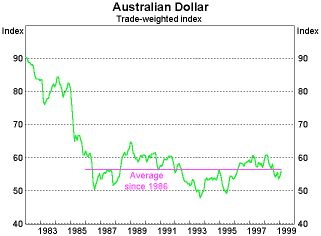
Starting with the exchange rate, the medium-term perspective is well summarised by a graph of the Australian dollar in trade weighted terms. As you can see, when we look back over the last nearly 20 years, there has been one major change, namely a downward shift in the real exchange rate in the 1985/86 period. Since then, while it has moved about quite a lot from quarter to quarter and from year to year, it has been around a basically flat trend.
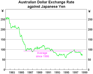
If we look at the Australian dollar against other individual major currencies, we get a similar picture. For example, the Australian dollar against the yen shows the same pattern, but the flat trend I have drawn in since 1986 should perhaps have a very slight downward slope.
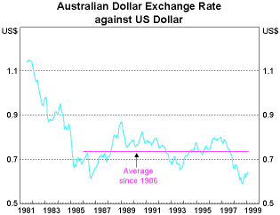
If we look at the Australian dollar against the US dollar, again we see the same pattern, and on this occasion I think the flat line is probably appropriate.
If we now turn to recent developments, i.e. over the last two years, obviously the Australian dollar has depreciated. The depreciation against the US dollar looks quite pronounced because the US dollar itself has been quite strong; the depreciation in trade weighted terms looks more modest because the Australian dollar has gone up against some Asian countries that have quite a big weight in the index. Looking over the whole period of nearly two years, we think the currency has behaved in a reasonably exemplary fashion, although there were a couple of periods where it threatened to overshoot.
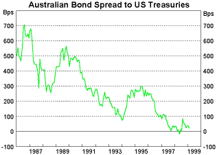
One thing that gave us a fair bit of confidence throughout this period was that the international markets seemed to be comfortable buying Australian assets. Our share market has continued to rise, although nowhere as fast as the US. The bond market has also been well behaved. The margin between Australian and US bonds, which had been very high in the 1980s and early 1990s (often as high as 500 basis points), trended down so that by mid 1997 the margin was less than 100 basis points. Despite a very temporary blip in August last year, the margin has stayed quite low and is currently about 30 basis points. We regard this as not only a reflection of an acceptance that our inflation rate is low, but also general endorsement of the soundness of economic policy in Australia.