Speech The Housing Market and the Economy

Thank you for the invitation to address this year's AFR Business Summit. It is good to be back here again.
As you would be aware, the Reserve Bank Board met yesterday and left the cash rate unchanged at 1.5 per cent. I would like to use this opportunity to highlight some of the issues we discussed at the meeting. Before I do that, though, I would like to focus on the housing market and its implications for the economy. Readers of the monetary policy minutes would have noticed that at its February meeting the Board discussed a special paper taking a deep dive into this topic. My remarks today draw from that paper. I will first focus on the current state of the housing market. Then, I will discuss the main drivers of recent movements in housing prices, before turning to the implications for the broader economy and the financial system.
The Current State of the Housing Market
Australians watch housing markets intensely, perhaps more so than citizens of any other country. Over the five years to late 2017, they saw nationwide housing prices increase by almost 50 per cent (Graph 1). Since then, prices have fallen by 9 per cent, bringing them back to their level in mid 2016.
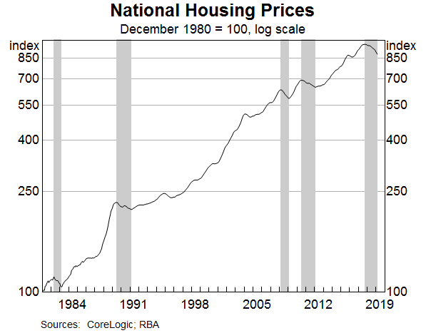
Declines of this magnitude are unusual, but they are not unprecedented. In 2008 and 2010, prices fell by a similar amount, as they did on two occasions in the 1980s. In the 1980s, the rate of CPI inflation was higher than it is now, so in inflation-adjusted terms, the declines then were larger than the current one.
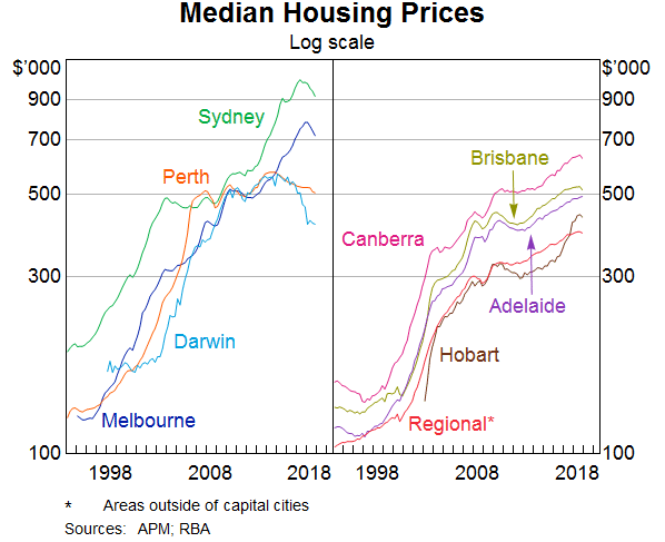
These nationwide figures mask considerable variation across the country (Graph 2). The run-up in prices over recent years was most pronounced in Sydney and Melbourne, so it is not surprising that the declines over the past year have also been largest in these two cities. In Perth and Darwin, the housing markets have been weak for some time, affected by the swings in population and income associated with the mining boom. By contrast, the housing market in Hobart has been strong recently. In Adelaide, Brisbane, Canberra and many parts of regional Australia, conditions have been more stable. Given these contrasting experiences, it is pretty clear that there is no such thing as the Australian housing market. What we have is a series of separate, but interconnected, markets.
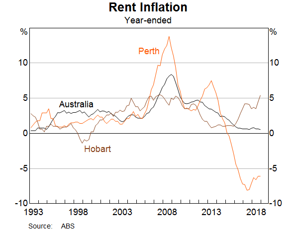
Another important window into housing markets is provided by rental markets. Over recent times, the nationwide measure of rent inflation has been running at a bit less than 1 per cent, the lowest in three decades (Graph 3). As with housing prices, there is a lot of variation across the country. Rents have been falling for four years in Perth and are now around 20 per cent below their previous peak. By contrast, in Hobart rents have been rising at the fastest rate for some years.
As is well understood, shifts in sentiment play an important role in housing markets. When prices are rising, people are attracted to the market in the hope of capital gains. At some point, though, valuations become so stretched that demand tails off and there is a shift in momentum. When prices are falling, it's the reverse. The prospect of capital losses leads buyers to stay away or to delay purchasing. At some point, though, the lower prices draw more buyers into the market. First home owners find it easier to buy a home, investors are attracted back into the market, and trade-up buyers take the opportunity to upgrade to the home they have always wanted. These shifts in sentiment and momentum are seen in most housing cycles, but their precise timing is difficult to predict.
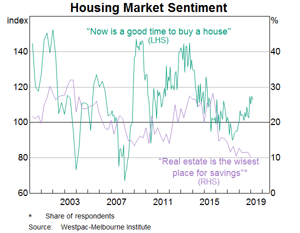
Some of these shifts in sentiment are evident in consumer surveys (Graph 4). Over recent times, the number of people reporting that an investment in real estate is the wisest place for their savings has fallen significantly. So, it is not surprising that there are fewer investors in the market. At the same time, the number of people saying it is a good time to buy a home has increased. Lower prices draw more people in and, eventually, this helps stabilise the market. So it is worth closely watching these shifts in sentiment.
Explaining the Recent Cycle
An obvious question to ask is what are the underlying, or structural, drivers of the large run-up in housing prices and the subsequent decline?
There isn't a single answer to this question. Rather, it is a combination of factors.
Before I discuss these factors, it is worth pointing out that the current adjustment is unusual. Unlike the other four episodes in which housing prices have declined in recent decades, this one was not preceded by rising mortgage rates. Nor has it been associated with a rise in the national unemployment rate. Instead, in New South Wales, where the recent decline in housing prices has been the largest, the unemployment rate has continued to trend down. It is now at levels last seen in the early 1970s. The unemployment rate has also trended lower in Victoria.
So, the origins of the current correction in prices do not lie in interest rates and unemployment. Rather, they largely lie in the inflexibility of the supply side of the housing market in response to large shifts in population growth.
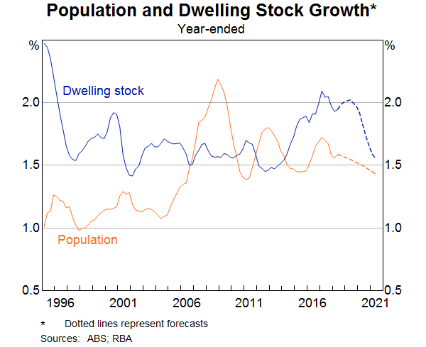
It is useful to start with the national picture (Graph 5). Australia's population growth picked up noticeably in the mid 2000s and it took the better part of a decade for the rate of home building to respond. It took time to plan, to obtain council approvals, to arrange finance and to build the new homes. Not surprisingly, housing prices went up. Eventually, though, the supply response did take place. Over recent times, the number of dwellings in Australia has been increasing at the fastest rate in more than two decades. Again, not surprisingly, prices have responded to this extra supply.
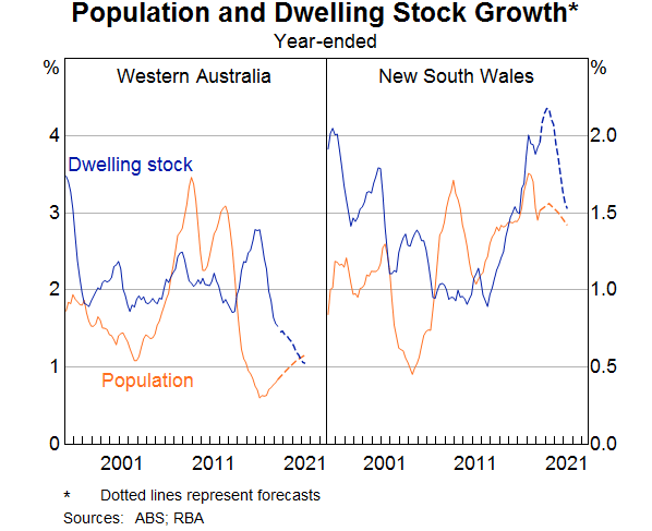
The population and supply dynamics are most evident in Western Australia and New South Wales (Graph 6).
During the mining investment boom, population growth in Western Australia increased from around 1 per cent to 3½ per cent. This was a big change. The rate of home building was slow to respond. When it did finally respond, it was just at the time that population growth was slowing significantly, as workers moved back east at the end of the boom. This explains much of the cycle.
In New South Wales it is a similar story, although it is not quite as stark. The recent rate of home building in New South Wales is the highest in decades. At the same time, population growth is moderating, partly due to people moving to other cities, attracted by their lower housing prices and rents. By contrast, in cities where population patterns and the rate of home building have been more stable, prices, too, have been more stable.
Another demand-side factor that has influenced prices is the rise and then decline in demand by non-residents.
One, albeit imperfect, way of seeing this is the number of approvals by the Foreign Investment Review Board (Graph 7). In the middle years of this decade, there was a surge in foreign investment in residential property, particularly from China. This was apparent not just in Australian cities, but also in ‘international’ cities in other countries. In Australia, the demand was particularly strong in Sydney and Melbourne, given the global profiles of these two cities and their large foreign student populations. More recently, this source of demand has waned, partly as a result of the increased difficulty of moving money out of China as the authorities manage capital flows.
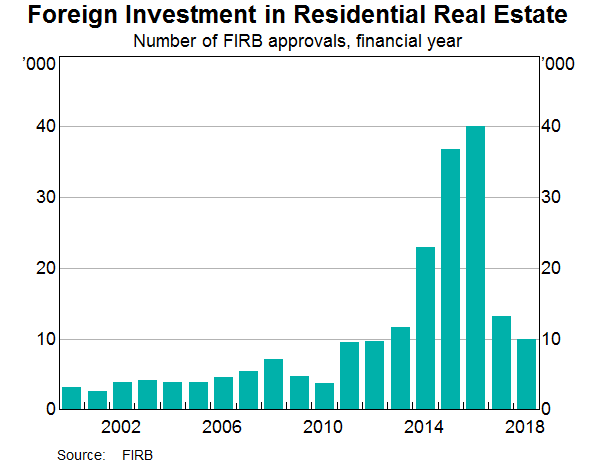
The timing of these shifts in foreign demand has broadly coincided with – and reinforced – the shifts in domestic demand. However, making a full assessment of their impact on prices is complicated by the fact that international property developers were also adding to supply in Australia at a time of very strong demand. More recently, these developers have scaled back their activity.
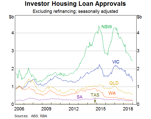
Domestic investors have also played a significant role in this cycle. This is especially the case in New South Wales, which was the epicentre of strong investor demand (Graph 8). At the peak of the boom, approvals to investors in New South Wales accounted for half of approvals nationwide, compared with an average of just 30 per cent over the five years to 2010. More than 40 per cent of the new dwellings built in New South Wales recently have been apartments, which tend to be more attractive to investors.
The strong demand from investors had its roots in the population dynamics. Low interest rates and favourable tax treatment added to the attraction of investing in an appreciating asset. The positive side to this was that the strong demand by investors helped underpin the extra construction activity needed to house the growing population. But the rigidities on the supply side, coupled with investors' desire to benefit from a rising market in a low interest rate environment, amplified the price increases.
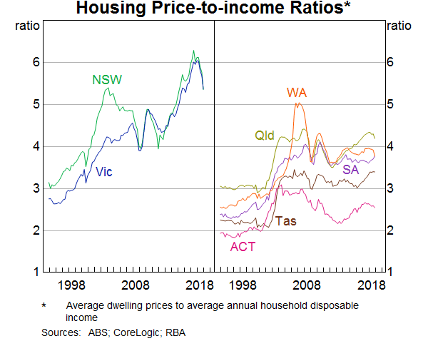
As I discussed earlier, there is an internal dynamic to housing price cycles, and this one is no exception. By 2017, the ratio of the median home price to income had reached very high levels in Sydney and Melbourne (Graph 9). Finding the deposit to purchase a home had become beyond the reach of many people, especially first home buyers if they did not have others to help them. At the same time, the combination of high prices and weak growth in rents meant that rental yields were quite low. So, naturally, momentum shifted. Given the big run-up in prices and the large increase in supply, a correction at some point was not surprising, although the precise timing is nearly impossible to predict.
No discussion of housing prices is complete without touching on interest rates and the availability of finance. The low interest rates over the past decade did increase people's capacity to borrow and made it more attractive to borrow to buy an asset whose price was appreciating. But the increase in housing prices is not just about low interest rates. The variation across the different housing markets indicates that city-specific factors have played an important role.
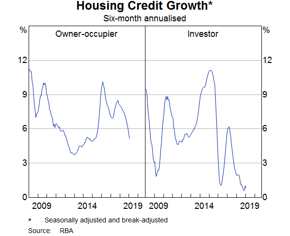
Recently, much attention has also been paid to the availability of credit. This attention has coincided with a noticeable slowing in housing credit growth, especially to investors (Graph 10).
It is clear there has been a progressive tightening in lending standards over recent years. The RBA's liaison suggests that, on average, the maximum loan size offered to new borrowers has fallen by around 20 per cent since 2015. This reflects a combination of factors, including more accurate reporting of expenses, larger discounts applied to certain types of income and more comprehensive reporting of other liabilities. Even so, only around 10 per cent of people borrow the maximum they are offered. Sensibly, most people borrow less than what they are offered, so the effect of this reduction in borrowing capacity has not been particularly large.
It has also been apparent through our liaison that some lenders became more cautious last year. There was a heightened concern by some loan officers about the consequences to them and their career prospects of making a loan that might not be repaid if the borrower's circumstances changed. So, lenders became more risk averse. This, along with greater verification of expenses and income, led to an increase in average loan approval times, although some lenders have invested in people and technology to address this. Our liaison suggests that application approval rates are largely unchanged.
Overall, the evidence is that a tightening in credit supply has contributed to the slowdown in credit growth. The main story, though, is one of reduced demand for credit, rather than reduced supply.
When housing prices are falling, investors are less likely to enter the market and to borrow. So too are owner-occupiers for a while. Consistent with this, the number of loan applicants has declined over the past year. There is also strong competition for borrowers with low credit risk, which is not something you would expect to see if it were mainly a supply story. This competition is evident in the significant discounts on interest rates on new loans compared with those on outstanding loans.
Even though the slowing in credit growth is largely a demand story, we are watching credit availability closely. It is perhaps stating the obvious to say that we want lenders who are both prudent and who are prepared to take risk. As lenders recalibrated their risk controls last year, the balance may have moved too far in some cases. This meant that credit conditions tightened more than was probably required. Now, as lenders continue to seek the right balance, we need to remember that it is important that banks are prepared to take credit risk. And it's important that they have the capacity to manage that risk well. If they can't do this, then the economy will suffer.
Impact on the Macroeconomy
This brings me to the issue of how developments in the housing market affect the broader economy.
Movements in housing prices affect the economy through multiple channels. They influence consumer spending, including through the spending that occurs when people move homes. They also influence the amount of building activity that takes place. Changes in housing prices also have an impact on access to finance by small business by affecting the value of collateral for loans. And finally, they can affect the profitability of our financial institutions.
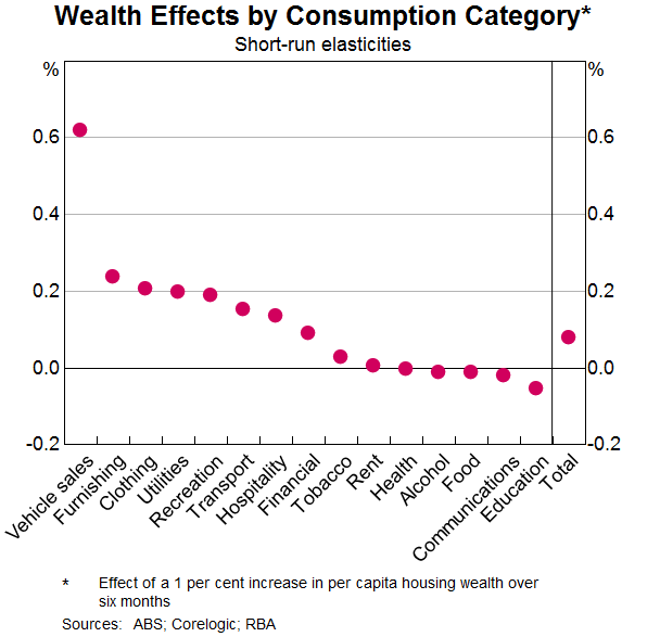
Today, I would like to focus on the effect of housing prices on household consumption. My colleagues at the RBA have examined how changes in measured housing wealth affect household spending.[1] They estimate that a 10 per cent increase in net housing wealth raises the level of consumption by around ¾ per cent in the short run and by 1½ per cent in the longer run. They have also examined how this wealth effect differs by type of spending. They find that it is highest for spending on motor vehicles and household furnishings and that for many other types of spending the effect is not significantly different from zero (Graph 11). Part of the effect on spending on furnishings is likely to come from the fact that periods of rising housing prices are often associated with higher housing turnover, and turnover generates extra spending.
Over recent years, spending by households has risen at a faster rate than household income; in other words, the saving rate has declined (Graph 12). The results that I just spoke about suggest that rising housing wealth played a role here. If so, falling housing prices, and a decline in measured household wealth, could have the opposite effect.
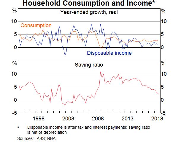
The more important influence, though, is what is happening with household income. For many people, the main source of their wealth is their human capital; that is, their future earning capacity. As I have discussed on previous occasions, growth in household income has been quite weak for a while. It is plausible that, for a time, this didn't affect people's expectations of their future income growth; that is the value of their human capital. So they didn't change their spending plans much, despite their current income growth being weak, and the saving rate fell. However, as the period of weak income growth has persisted, it has become harder to ignore it. Expectations of future income growth have been revised down and it is likely that this is affecting spending.
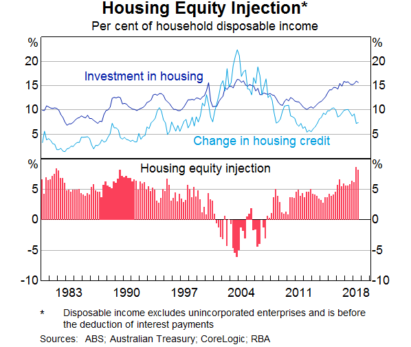
My conclusion here is that wealth effects are influencing consumption decisions, but they are working mainly through expectations of future income growth. Swings in housing prices and turnover in the housing market are also having an effect, but they are not the main issue. This assessment is consistent with the data on housing equity injection (Graph 13). Over recent years, households have been injecting substantial equity into housing and have not been using the higher housing prices to borrow to support their other spending. This is in contrast to the period around the turn of the century, when households were withdrawing equity.
Given this assessment, developments in the labour market are particularly important. A further tightening of the labour market is expected to see a gradual increase in wages growth and faster income growth. This should provide a counterweight to the effect on spending of lower housing prices.
Taking these various considerations into account, the adjustment in our housing market is manageable for the overall economy. It is unlikely to derail our economic expansion. It will also have some positive side-effects by making housing more affordable for many people.
A related issue that the RBA has paid close attention to is the impact of lower housing prices on financial stability.
In 2017, APRA assessed the ability of Australian banks to withstand a severe stress scenario, in which housing prices declined by 35 per cent over three years, GDP declined by 4 per cent and the unemployment rate increased to more than 10 per cent.[2] The estimated impact on bank profitability was substantial, but importantly, bank capital remained above regulatory minimum levels. This provides reassurance that the adjustment in our housing market is not a financial stability issue. We have not experienced the very loose lending practices that were common in the United States before the housing crash there a decade ago. Nor have we seen significant overbuilding around the country.
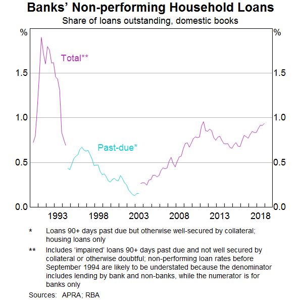
Non-performing housing loans in Australia have risen recently, but they remain low at less than 1 per cent (Graph 14). The increase is most evident in Western Australia, where the unemployment rate has risen.
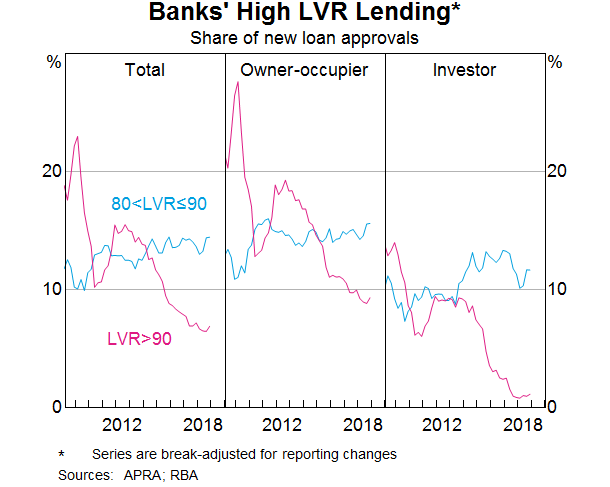
The national experience has been that low levels of unemployment and low interest rates allow most people to service their loans, even if weak income growth means that household finances are sometimes strained. Our estimate is that currently, less than 5 per cent of indebted owner-occupier households have negative equity, and the vast bulk of these households continue to meet their mortgage obligations. One factor that has helped here is that the share of new loans with high loan-to-valuation ratios (LVRs) has declined substantially (Graph 15). The nature of Australian mortgages – in which there is an incentive to make prepayments – has also helped.
Monetary Policy
I would like to conclude with some words about monetary policy and highlight some of the issues we focused on at yesterday's Reserve Bank Board meeting.
As you are aware, the current setting of monetary policy has been in place for some time. A cash rate of 1.5 per cent is very low historically and it is clearly stimulatory. It is supporting the creation of jobs and progress towards achieving the inflation target.
Looking forward, a key issue is the labour market. Achieving full employment is an important objective in its own right. But, in addition, a strong labour market is the central ingredient in the expected pick-up in inflation. We are expecting that as the labour market tightens, wages growth will increase further. In turn, this should boost household income and spending and provide a counterweight to the fall in housing prices. The pick-up in spending is, in turn, expected to put upward pressure on inflation. Of course, it is possible that inflation could move higher for other reasons, although the likelihood of this at the moment seems low. This means that a lot depends upon the labour market.
The recent data on this front have been encouraging. Employment growth has been strong, the vacancy rate is very high and firms' hiring intentions remain positive. The latest reading of the wage price index also confirmed a welcome, but gradual, pick-up in wage growth, especially in the private sector.
Other indicators of the economy, though, paint a softer picture. We will receive another reading on GDP growth later this morning, but growth in the second half of 2018 was clearly less than in the first half. This is similar to the picture internationally. In a number of countries, including our own, there is growing tension between strong labour market data and softer GDP data. We are devoting significant resources to understanding this tension.
The Board will continue to assess the shifts in the global economy, trends in household spending and how the tension between the labour market and output indicators resolves itself. We have the flexibility to adjust monetary policy in either direction as required. There are plausible scenarios under which the next move in interest rates is up. There are also plausible scenarios under which it is down. At the moment, the probabilities appear reasonably evenly balanced. Given these various cross currents, the Board's judgement remains that the most appropriate course is to maintain the cash rate at its current level.
Thank you for listening and I am happy to answer your questions.
Endnotes
I would like to thank Iris Day, Penny Smith, Andrew Staib and Andrea Brischetto for assistance in the preparation of these remarks. [*]
May D, G Nodari and D Rees (forthcoming), ‘Wealth and Consumption’, RBA Bulletin. [1]
APRA (2018), ‘Testing resilience: The 2017 Banking Industry Stress Test’, APRA Insight, Issue 3. [2]