RDP 2019-01: A Model of the Australian Housing Market 5. Model Responses
March 2019
We now bring the equations together. Specifically, this section presents full-model responses to interest rates, population, approvals and housing prices. Our model is nonlinear, so responses will vary somewhat in different conditions.[20] When we show deviations from baseline, it is from the model projection described in Online Appendix C.
5.1 Responses to Interest Rates
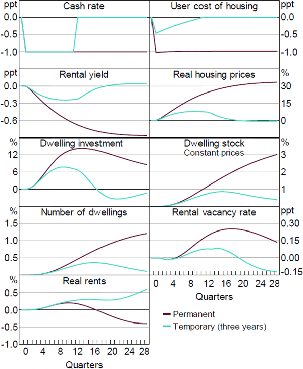
Figure 12 shows deviations from baseline arising from a 1 percentage point reduction in real variable interest rates. Aqua lines show a change that lasts – and is expected to last – for three years, which resembles some changes in monetary policy. Maroon lines show a change that is expected to last indefinitely, which is more relevant for longer-run effects and explaining some historical developments.
The two scenarios differ not only in the duration of effects but also in their strength. A cash rate change that is expected to be long-lasting feeds one-for-one into long-term interest rates and the user cost of housing (top right panel), with the temporary change having much less effect. Changes in the user cost give rise to similar, but lagged, changes in the rental yield (2nd row, left) which involves substantial increases in housing prices (2nd row, right).
The combination of lower interest rates, higher housing prices and higher income boost dwelling investment (3rd row, left, the maroon line is the total in the right-hand panel of Figure 6). That increases the dwelling stock (3rd row, right and 4th row, left) and rental vacancy rate (4th row, right). Rents (bottom left) initially rise due to the income boost from lower interest rates, but as extra supply builds, they begin to fall.[21] The signs of the effects on vacancies and rents both vary with time and with the expected duration of the shock.
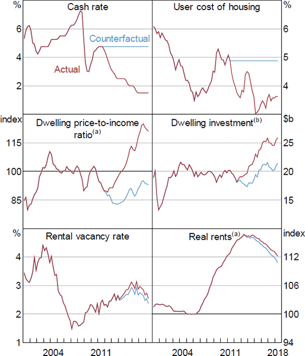
For a slightly different perspective, Figure 13 shows estimated effects of the recent decline in interest rates. Since its peak in 2011, the cash rate has fallen from 4¾ per cent to 1½ per cent, while the user cost has fallen from almost 5 per cent to around 3½ per cent. The decline in the user cost reflects a fall in long-term real interest rates, which in turn reflects falls in global rates and expectations that the decline in short rates will be persistent. Actual outcomes are in maroon and a counterfactual, in which interest rates remain at their June quarter 2011 levels, in aqua. The model estimates that the reduction in real interest rates accounts for most of the subsequent boom in dwelling prices (middle left panel) and a large part of the boom in dwelling investment (middle right).[22] The increase in housing supply boosts the vacancy rate and reduces rents. However, these effects are offset by the effect of higher income, with neither the vacancy rate (bottom left) nor rents (bottom right) being much changed on net.
Notes:
(a) 2005 average = 100
(b) Chain volume
5.2 Responses to Population Growth
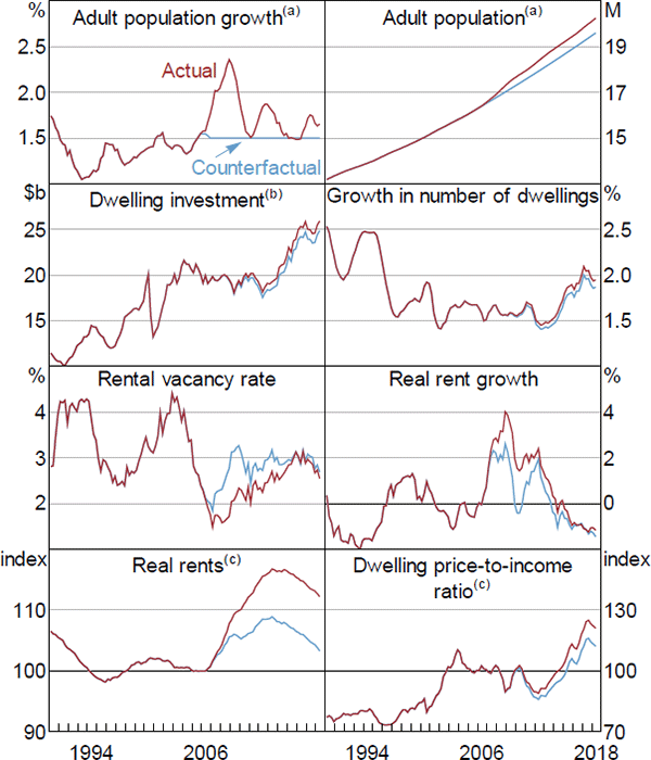
Figure 14 shows estimated effects of the population boom of the mid-to-late 2000s, with actual outcomes shown in red. Reflecting a surge in immigration, year-ended growth in the adult population (15 years and older) rose from 1.5 per cent in 2005 to 2.4 per cent in 2008.[23] To assess the effects of this surge, we run a counterfactual simulation, shown in blue, in which adult population growth continues to grow at its 2005 rate of 1.5 per cent.
Notes:
Growth rates are year-ended
(a) 15+ years
(b) Chain volume
(c) 2005 average = 100
The population surge is shown in changes (top left) and levels (top right). By 2018, it boosts the adult population by 3.3 per cent. With per capita income unchanged by assumption, total income (not shown), and hence dwelling investment (2nd row, left) also increase by about 3.3 per cent. This raises housing supply slightly (2nd row). However, the short-run boost to housing demand is much larger, leading to a fall in the rental vacancy rate to a near-record low of 1½ per cent in 2008 (3rd row, left). Rents, which were already growing quickly, accelerate to grow 4 percentage points faster than the overall rate of inflation. Without the extra population, our simulation suggests that real rents would have only grown by 2 per cent a year, as shown by the 3rd row, right panel. The cumulative result was that real rents were 9 per cent higher in 2018 than they would have been otherwise (bottom left). The increase in rents gradually flows on to a similar increase in dwelling prices (bottom right), although this effect is small relative to the effect of interest rates, discussed in the previous section.
Our estimate of the effect of population on real rents and housing prices is similar to that estimated for Spain by Gonzalez and Ortega (2013). It is larger than that estimated for the United States by Saiz (2007), presumably because land use regulations make housing supply more elastic in much of the United States. It is substantially larger than many studies find for local effects on house prices as surveyed by Larkin et al (2018). The effects of immigration on relative neighbourhood prices tend to be more negative than effects on aggregate prices, so estimates of the effect increase with the level of geographic aggregation.
5.3 Responses to Completions
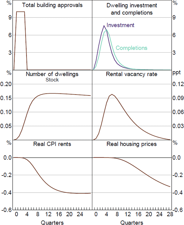
Figure 15 shows the effects of an exogenous increase in construction as a deviation from baseline. We assume that each component of building approvals increases by 10 per cent for one year (top left panel), which represents about 21,400 extra approvals for new dwellings. This would boost the total number of dwellings by about 18,200 (allowing for approvals not completed and demolitions) or 0.16 per cent (middle left). The extra ‘supply’ (as it is commonly termed) would increase the vacancy rate (middle right), and hence lower rents (bottom left) and housing prices (bottom right). The proportionate response of rents and prices (0.4 per cent) is 2.5 times as large as the increase in the number of dwellings (0.16 per cent). This ratio (2.5) represents the inverse of the elasticity of housing demand. It also applies to larger and more sustained shocks. As a rule of thumb, every 1 per cent increase in the number of dwellings (when driven by an increase in supply) lowers the cost of housing by 2½ per cent.
Our estimate of the elasticity of housing demand lies well within the range of other estimates. Abelson et al (2005) estimate that a 1 per cent increase in the Australian housing stock per capita leads to an estimated decrease in real housing prices of 3.6 per cent in the long run. Girouard et al (2006) summarise ten international studies, which have an average estimate of 3.1. Two recent and arguably more thorough studies point to smaller effects. Albouy, Ehrlich and Liu (2016, Table 3) find that a 1 per cent increase in real housing expenditure in the United States is associated with less than a 2 percentage point reduction in price. Oxford Economics (2016) find that a 1 per cent increase in the number of houses in the United Kingdom would reduce house prices by 1.8 per cent and cite (their Figure 20) several other elasticities that range between 1.1 and 2.2.[24]
5.4 Responses to Changed Price Expectations and the User Cost
Our measure of the user cost assumes that home buyers expect real constant-quality housing prices to continue rising at their post-1955 average rate of 2½ per cent a year. This is a simple assumption that is consistent with some of the main features of the data. However, forecasts from our model, such as the projection discussed in Online Appendix C, imply that real housing prices (measured with a different quality adjustment) will grow at an annual average rate of 0.2 per cent over the next ten years. Figure 16 shows the effect of a change in expectations about capital appreciation from the former assumption to the latter. This scenario can also be interpreted as capturing the effect of an exogenous fall in housing prices. Were the model to be extended to include taxes on housing, this is an important channel through which they would operate.
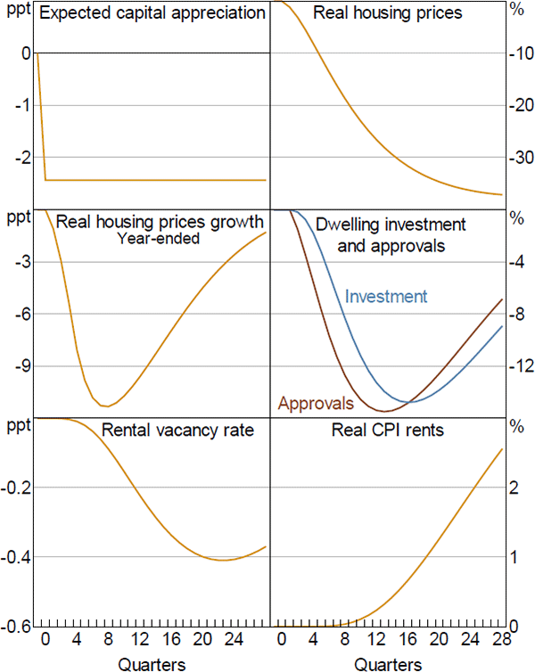
As shown in the top left panel, expected capital appreciation declines 2½ percentage points. The user cost (not shown) rises by the same amount. Housing prices (top right and middle left) then take a long time to adjust, falling gradually, but substantially, to be one-third lower after five years. As Krugman (2005) argues, housing bubbles do not ‘burst’, they gradually deflate. This scenario is extremely unlikely: nothing like it has happened in Australia before. However, in scale and duration, it resembles the largest housing collapses seen during the global financial crisis (Ireland, Spain, United States), so is relevant as a worst-case scenario to be guarded against. Falling house prices result in large falls in investment (middle right), which reduce vacancies (bottom left), boosting rents (bottom right). The decline in construction dampens the fall in prices.
The limitations of this partial equilibrium exercise should be emphasised. In a more complicated model, falling house prices would reduce household wealth and hence consumption. The net worth of financial intermediaries would fall. Offsetting this, interest rates would fall, moderating the macroeconomic impact. That said, the housing market response would be an important part of the overall effect.
Footnotes
The most important nonlinearity is that housing prices, and hence activity, are more responsive to interest rates when interest rates are low. [20]
Technically, we show a reduction in real rents, whereas the text above refers to changes in nominal rents. Empirically, changes in the price level are quite small relative to the changes shown in Figure 12, so the distinction can be ignored. [21]
Short- and long-term interest rates move together, so disentangling their separate contributions is not clearly meaningful. Nevertheless, as an accounting exercise, the reduction in long-term rates has a larger effect on prices than the reduction in short-term rates, while short-term rates are more important for investment. [22]
A small part of the increase in measured population growth represents a broadening of the definition of long-term migration, which increased net overseas migration by 19,000–29,000 a year (ABS 2007, Tables 2.6 and 2.7). [23]
Whereas estimates of the elasticity of supply vary between and within countries, reflecting differences in land use regulations, estimates of the elasticity of demand reflect household preferences and might be expected to be similar. [24]