RDP 2022-06: Do Australian Households Borrow to Keep up with the Joneses? 2. Local Income Inequality in Australia
November 2022
- Download the Paper 1.66MB
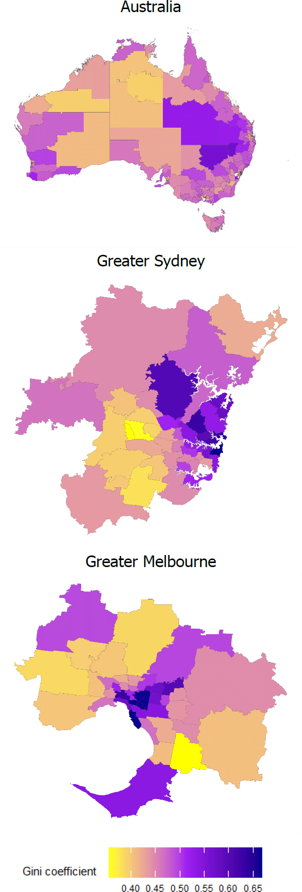
To illustrate local variation in income inequality, I map the Gini coefficient within each Statistical Area 3 (SA3) area for Australia, Greater Sydney and Greater Melbourne in 2018 (Figure 1).[1],[2] While the aggregate Gini coefficient is roughly 0.4, local Gini coefficients range from 0.35 to 0.7 with a standard deviation (SD) of 0.05. Income inequality appears relatively high in mining areas and major cities. This is unsurprising since the mining industry generally pays more than other regional industries, but at the same time employs fewer people in the region. On the other hand, there is a greater spread of occupations available in metropolitan areas, from lower-wage services industries, to high-wage professional services. The map of Greater Sydney, for instance, reveals that income inequality in the northern and eastern suburbs is much higher than in the west and south west of Sydney.

Note: Areas without SA3 codes in white and SA3 areas with missing values for Gini coefficient in grey.
Sources: ABS; Author's calculations
Next I look at how the distribution of income inequality across SA3 areas has changed over time. Figure 2 illustrates that for NSW from 2010 to 2018. What stands out is the effect of the mining boom in Bourke–Cobar–Coonamble and Upper Hunter, for instance, which resulted in a substantial increase in income inequality in those areas from 2010 to 2014 (a roughly 2 SD increase in the Gini coefficient). The end of the mining boom saw this inequality level drop significantly in 2018, to even lower than the 2010 level for some regions.

Note: Areas without SA3 codes in white and SA3 areas with missing values for Gini coefficient in grey.
Sources: ABS; Author's calculations
In contrast, the tourism industry experienced softer conditions in the years following the global financial crisis (GFC), reflecting the high exchange rate (Khandaker and Islam 2017). This appears to have led to a reduction in income inequality in areas that are tourism centric (for instance, Cottesloe and Uluru). However, from the mid-2010s to the onset of the COVID-19 pandemic, conditions facing the industry have become more favourable, supported by the depreciation of the Australian dollar (Dobson and Hooper 2015). This is reflected in a pick-up in income inequality in those regions. Thus, there is evidence for both the variation in inequality across small areas in Australia and also variation over time within areas.
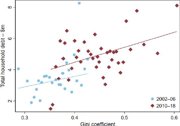
But is there a link between the degree of inequality in the regional income distribution and household indebtedness? Figure 3 plots total household debt in real monetary terms against the Gini coefficient for each SA3 region. The positive correlation between the two measures is quite apparent, both before and after the GFC, suggesting that household debt is generally higher in regions with a higher degree of income inequality. While these correlations are interesting, they could be driven by numerous factors. For example, areas with greater inequality might also have higher average income, and it may be that the higher incomes account for the higher total debt. Similarly, as highlighted above, in areas with large, cyclical industries such as mining and tourism, the degree of inequality may be procyclical, as may be debt. Therefore, to assess the effect of local income inequality on the debt-taking behaviour of Australian households, I have to employ a regression approach at the household level.

Notes: The figure is a binscatter, where an observation is an SA3–year. Each line represents the linear fit of the relationship between total household debt and Gini coefficient using OLS, for the respective sampling period.
Sources: ABS; Author's calculations; HILDA Survey Release 19.0
Footnotes
The Gini coefficient is defined as the ratio of the area between the actual Lorenz curve and the diagonal (or line of equality) and the total area under the diagonal. The Gini coefficient ranges between zero when all incomes are equal and one when one unit receives all the income, that is, the smaller the Gini coefficient the more even the distribution of income (ABS 2022). [1]
SA3s are designed to provide a regional breakdown of Australia and often closely align to Local Government Areas. There are 358 SA3 areas in Australia, with a population of between 30,000 and 130,000 people (ABS 2022). [2]