RDP 2023-04: Can We Use High-frequency Yield Data to Better Understand the Effects of Monetary Policy and Its Communication? Yes and No! Appendix B: Additional Results
May 2023
- Download the Paper 1.43MB
| Baseline sample | Orthogonalised | No GFC | Bootstrapped | |
|---|---|---|---|---|
| Action shock(a) | 9.84 | 6.62 | 7.68 | 8.89 |
| Path shock(b) | 0.14 | 0.34 | 0.32 | 1.31 |
| Premia shock(b) | 1.46 | 1.73 | 0.08 | 2.05 |
| 3-month OIS change(a) | 9.21 | na | na | na |
| 24-month yield change(a) | 8.32 | na | na | na |
| Action shock – quarterly(a) | 15.37 | na | 3.96 | na |
| Path shock – quarterly(b) | 1.77 | na | 0.47 | na |
| Premia shock – quarterly(b) | 2.12 | na | 0.56 | na |
| Action shock – all events(a) | 13.32 | na | na | 14.03 |
| Path shock – all events(b) | 0.90 | na | na | 1.01 |
| Premia shock – all events(b) | 1.82 | na | na | 7.01 |
|
Notes: (a) Instrumenting for first principal component of yield curve. (b) Instrumenting for second principal component of yield curve. |
||||
Figure B1: Factor Loadings
Factors for average expected rates, different event sets
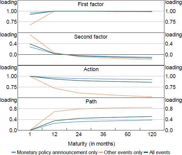
Figure B2: Decomposition of High-frequency Yield Curve Changes
Other events
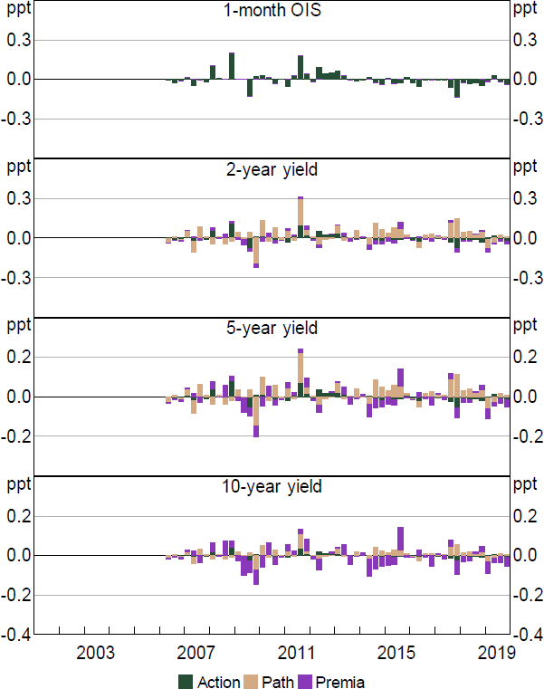
Notes: Decomposition based on regression of yield changes on shock. Residuals excluded. Quarterly sum.
Figure B3: Response to Action Shock
Scaled to unit increase in first principal component of yield curve
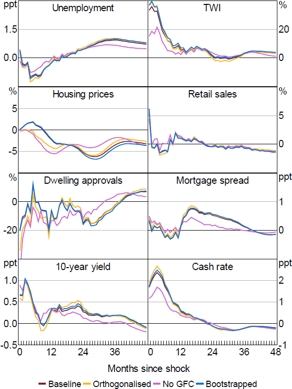
Figure B4: Response to Path Shock
Scaled to unit increase in second principal component of yield curve
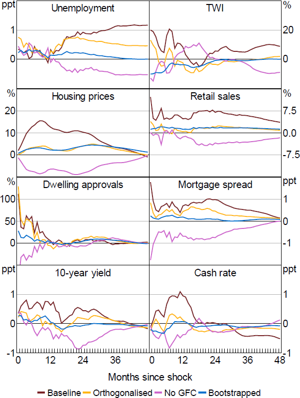
Figure B5: Response to Premia Shock
Scaled to unit increase in second principal component of yield curve
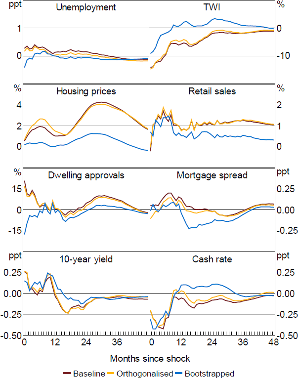
Figure B6: Response to Simpler Shocks
Scaled to unit increase in first principal component of yield curve
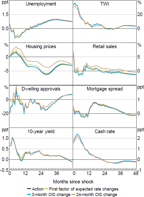
Figure B7: Response to Action Shock – All Events
Scaled to unit increase in first principal component of yield curve
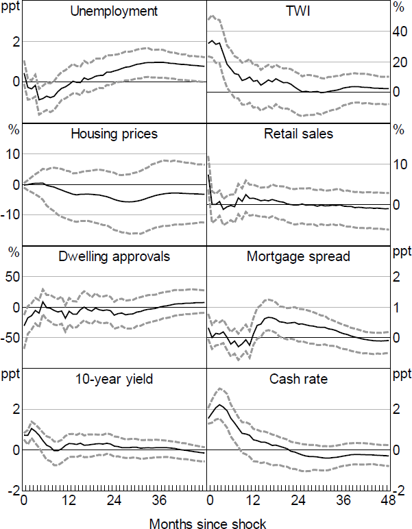
Note: Dashed lines denote 90 per confidence intervals (bootstrapped).
Figure B8: Response to Action Shock – Local Projections
Scaled to unit increase in first principal component of yield curve, selected
variables
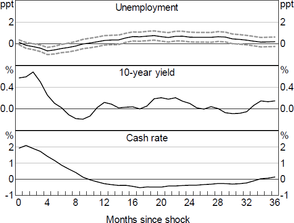
Notes: Dashed lines denote 90 per cent confidence intervals. 10-year yield and cash rate bands excluded as their responses are constructed based on factor responses.