Speech Lumps, Bumps and Waves
Thank you to the Ai Group for the invitation to speak to you today. It's great to be in Geelong. It's been a big week for the Bank in Victoria, with the Board meeting in Melbourne on Tuesday and the Governor's speech that evening. I don't plan to repeat what he said or speak in detail about the Board's decision. Rather, I'd like to take a step back and talk about some aspects of how the Bank's economics team understand and interpret economic developments, so we can do the analysis that is an important input into the Board's decisions.
Most of our job is interpreting recent data and using that to forecast the future. We lean heavily on our intellectual frameworks in economics for thinking about how economies work. But we also need to account for an array of special factors and big-picture trends that don't sit neatly in top-down, whole-economy models, such as standard economic forecasting models. So today I'd like to talk about how we handle special factors in our understanding of the economy. I'll also give some examples of the kinds of factors that have been relevant of late.
How do we know if there is a special factor at play? One source of information is our liaison teams across the country. They meet with all sorts of organisations and groups to better understand these special factors and trends.[1] In many cases, the story behind the numbers is as important as the numbers. The Ai Group and many of its members have been generous partners in our liaison program for many years. We truly appreciate your insights into those stories.
If you are facing some special factor, how do you make sense of it? You can get the story behind the numbers from the players on the ground. But how do you incorporate those insights into your view of the overall economic outlook? I'd argue that it helps to look at the basic shape of that special factor, so you can form a view about how it will play out. Informally put, you need to work out if what you're looking at is a lump, a bump, or a wave.
‘Lumps’ occur when single firms, industries or products have a discernible, outsized effect on overall outcomes. Examples include the recent effect of the Victorian nurses' pay equity agreement on overall public sector wages growth, or of individual large projects on mining investment.
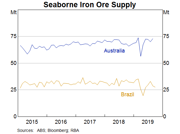
‘Bumps’ are the factors we can't or don't typically model that push economic outcomes around temporarily. Examples include the effect of the drought on rural exports and food prices, and the effect of Cyclone Veronica on iron ore exports.
‘Waves’ are the large, long-lasting and often ‘structural’ forces that take the economy to a new state. Examples here include technological change, climate change and demographic change.
Just these simple, non-technical descriptions can show why it's useful to know something about the underlying shape of a particular special factor. If something is a lump or a bump, it doesn't mark the beginning of a change in trend. Its effect may not last. In developing our forecasts or setting monetary policy, we might want to look through those lumps and bumps, and focus instead on the longer-term trends.
On the other hand, if it's a wave, it might represent a change in trend. Often the economy needs to transition to that new trend or new normal. It might not be obvious exactly where that new end-point is or how long that transition will take. This is very different from a lump or bump, where things can be expected to revert to previous norms quite quickly.
Lumps, bumps and waves also differ in how well they can be anticipated and quantified. Lumps come from single industries, firms, products or policies having an outsized effect on the total. Often these effects can be anticipated. In particular, if they come from a policy change, they are often pre-announced. For the same reason, they can usually also be quantified, at least approximately. Bumps can be a bit trickier. By their nature they are often impossible to anticipate. After all, who could have predicted the dam collapse at an iron ore mine in Brazil, or the more recent drone attacks on Saudi oil processing facilities? Certainly not central bank economists. And although some aspects of their effects can often be quantified – the production loss, for example – the effect on prices or the subsequent effects on behaviour can be harder to assess.
The waves are in many ways the hardest. By definition, they persist for some time, so you know you need to take them into account in your view of the outlook, even if you didn't anticipate their beginnings. But because they have such pervasive effects, it is often unclear exactly how to take them into account.
The Signal in the Noise
Lumps and bumps are in some sense both noise. In principle, noise should wash out of the total figures. But in real-world economies, it doesn't. Like pop songs or movies, where a few blockbuster hits far overshadow the long tail of minor releases, industries and economies also often follow something like a ‘power law’, with a large number of small entities and a small number of very large ones. This kind of structure is probably more prominent in a country like Australia than a larger, more diverse economy like the United States. What's important, though, is that idiosyncratic shocks to a large entity can be enough to affect the total, on its own or by propagating to other entities.[2]
When thinking about how these lumps and bumps affect the economy, and our forecasts, it's important to consider what the bounce-back looks like. We need to ask: is this a shock to the level, or to the growth rate? Consider the case where a natural disaster or some other event disrupts production at a particular facility. When things return to normal, is there a period of catch-up, where production is temporarily higher than normal? Or does production just revert to the previous normal level, in which case the production that would otherwise have occurred in the disrupted period is simply lost? Or is the effect on production levels more permanent, so that the growth rate returns to normal, but the level of production now follows a persistently lower trend track?
These lumps and bumps can affect how you interpret the data, and they're not always about natural disasters. A recent example can be seen in public sector wages growth. The Bank has for some time been noting that government wages policies are restraining wages growth in the public sector. In some cases, these policies also apply to workers in the private sector doing work on behalf of governments, such as on construction projects or in parts of the health sector. So it might have been thought a little surprising that public sector wages growth actually picked up noticeably in the June quarter of this year. But it wasn't a surprise – it was a fully anticipated lump. A longstanding agreement to bring wages of Victorian nurses and midwives in line with those in New South Wales accounted for essentially all of this pick-up in the growth rate (Graph 1). And because it is an adjustment to the wage level, we expect the rate of wages growth to fall back to its recent averages in subsequent quarters.
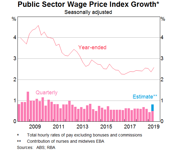
A ‘lump’ like this is relatively easy to anticipate and incorporate into your analysis, as long as you know it is happening. That isn't always feasible: sometimes lumps, such as large investment projects or certain wage deals, are not public information, or at least not until after they've happened. By contrast, natural disasters are the canonical example of bumps that you can't fully predict, but you can anticipate as a possibility. And it's obvious when they've happened.
The effect of the drought on rural production and food prices is a good example of this. So were the two recent disasters affecting the iron ore market. The early months of the year are cyclone season in the Pilbara, so some disruptions to production can be reasonably anticipated, but Cyclone Veronica was far more disruptive than most. Together with the Brazilian mine disaster, this greatly reduced supply into the seaborne market for iron ore (Graph 2), and boosted iron ore prices. Because iron ore is such an important export for Australia, export revenue, the terms of trade and fiscal revenue all increased noticeably. And yes, this means some things didn't turn out as we had forecast.
Weather-related and other disasters aren't the only cause of bumps. Sometimes people's actions are the root cause. These can be as prosaic as maintenance schedules that affect shipments of exports, or as alarming as the recent attacks on Saudi oil facilities. The impact of these events depends on how sustained the effect on production and prices will be.
Higher oil prices flow through fairly directly to petrol prices, and thus generate short-term fluctuations in CPI inflation, both here and abroad. The broader implications depend on how strong global demand might be, how quickly production is restored, and on how easily replacement sources of supply can ramp up. In the case of the recent attacks, it seems that Saudi supply has been mostly restored already. So the effect on prices has been small and transient. But it is easy to see how these kinds of events can have more pervasive effects.
Surfing the Waves …
Now we come to the big waves, the secular trends or transitions to new states of the world. These might be easy to identify and name, but they are often hard to anticipate, and their effects can be pervasive and hard to disentangle. It's also easy to be struck by just how many ‘waves’ there are, and how diverse their causes can be.
Non-economic waves
Many of these waves come from causes that are in some sense outside the economic system.[3] Demographic forces are perhaps the best-known of these. Because these forces play out over long periods, they are usually thought of as being outside the system, though of course policy can affect demography to some extent. The rise of China and its wave of urbanisation is a good example where policy and underlying demography have both mattered. With that urbanisation has come a lot of housing and infrastructure construction. This in turn has increased demand for steel and related commodity prices, with profound effects on the world economy, especially Australia.
Perhaps the best example here, though, is the demographic shift that is the ageing of the population. This is something the Bank has talked about publicly in recent years, and it has been a priority of the Japanese Presidency this year in the G20.
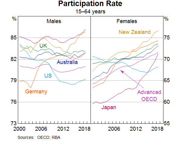
Today I'd like to highlight the implications of population ageing for labour force participation. It is often assumed that population ageing will reduce participation, because more people will be elderly and retired. But in Australia the opposite has occurred. This is also true for other advanced economies, with the United States being the exception. Although there are more older people, and older people do tend to participate less in the labour force than people in their middle years, participation rates in each age group have increased enough to more than offset this. Older people have increased their participation, and so have women across many age groups.
Part of this effect could be cyclical. Women in their middle years and older workers of both sexes are two of the groups who increase their labour supply noticeably when demand for labour is strong (Evans, Moore and Rees 2018). But there is also a structural element to these increases. In fact we should have expected it. That is because these two groups are also the groups whose participation you'd expect would increase as part of population ageing. Population ageing comes from two drivers – lower fertility, and increasing longevity. If women are having fewer children on average, then fewer women are out of the labour force caring for children at any one time. This arithmetic applies even if there is no change in the cultural presumption that women, not men, should be the ones staying home to care for their children. This trend comes on top of the more general shift of women entering the workforce as social, educational and legal barriers to female participation were removed over past decades. Thus female participation has increased almost everywhere and, most recently, especially in Japan (Graph 3).
And if people are living longer, healthier lives, fewer people will be retiring early due to ill health. So more people in older age groups will be able to continue working (and will need to in order to fund longer retirements). We shouldn't be surprised, then, that this group will also see a trend increase in their participation (Graph 4).
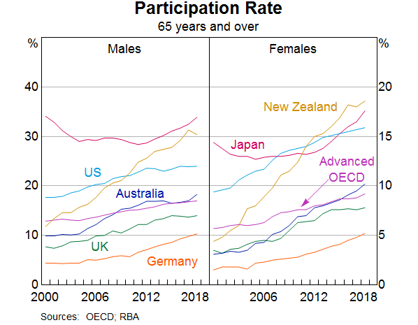
It is hard to disentangle the cyclical from the trend. Still, many observers focused on the idea that, with a higher proportion of the workforce in older age groups that have lower average participation, total participation would fall. But (except in the United States) the opposite happened, because the underlying drivers of the wave – lower fertility and longer healthy lifespans – necessarily also created the conditions for higher participation in some groups in the population.
Waves from ideas
Some waves of change are initially spurred by something outside the economic system but their effects are heavily mediated by subsequent business decisions. The best example here is probably the adoption of technology. Invention of a new technology could easily be seen as outside the economic system: while research funding, property rights and other incentives no doubt influence the rate of invention, in the end, somebody has to have an idea, and that probably can't be forced.
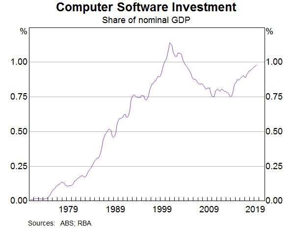
Once the idea is out there, though, adoption depends on many factors. It matters whether a technology is generally applicable, how much it costs, and whether people need new or rare skills to make best use of it. Over recent decades, computer software has become an increasingly important set of tools supporting many different kinds of work. You can see the computer and internet revolutions in firms' spending on software investment, culminating in a peak around the dot-com boom and Y2K rectification work, which can be seen as bumps on top of the wave (Graph 5). More recently, this type of investment has again been increasing faster than the economy as a whole, as firms adopt mobile, cloud and other new technologies.
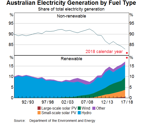
Sometimes technological change is less about the invention of a new technology and more about policy incentives, as well as the subsequent iterative development that makes the technology cheaper. As the Deputy Governor pointed out a few months ago, the cost of generating renewable energy has declined significantly over the past decade (Debelle 2019). It is now cost-competitive with traditional generation methods. Partly in response to this price signal, as well as policy incentives, we are seeing a wave of private sector investment in renewable energy in Australia and elsewhere. This investment is clearly visible in the aggregate investment data, and we take this shift into account in our forecasts.
The result of that investment wave is also increasingly visible in the shift to renewables in total electricity generation (Graph 6). So far much of the increase has been in wind and small-scale rooftop solar generation. As renewable generation technologies continue to develop (including energy storage), this shift can be expected to continue.
Waves from decisions
Other waves can come from ‘inside’ the system, from the business decisions people make and the business models people adopt. A change in business structure can change how the economy operates and how economic variables relate to each other. A good example of this in Australia has been the increasing degree of competition in retailing, partly resulting from the entry of large global retailers to the Australian market. It wasn't so long ago that Australia's retail landscape looked very different, with few of the global retailers that populated the shopping centres of large cities overseas. That has changed over the past decade, especially in groceries and clothing retail (Graph 7).
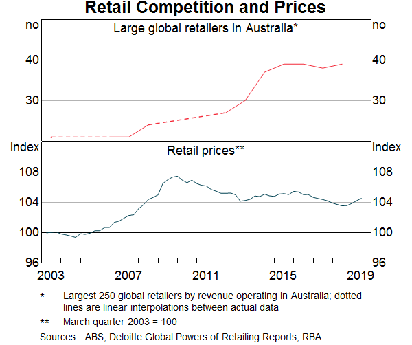
The effect on pricing models has been profound. After a long period where retail prices tended to rise at roughly the same rate as inflation generally, for the past decade or so, these prices have been flat to falling. This is a big change in pricing behaviour for some important parts of the Consumer Price Index. The question of how long this shift will last has been a key issue for us as we compile our inflation forecasts.
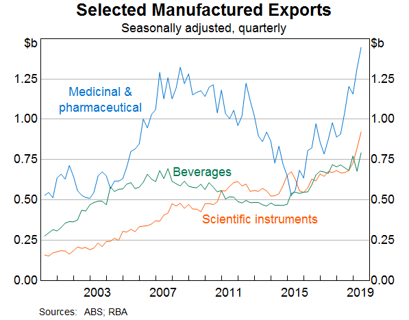
Markets can open up to new players right across the economy. As we mentioned in our most recent Statement on Monetary Policy in August, some parts of Australia's manufacturing sector are performing strongly and seeing their exports increase. This upswing is most evident in scientific instruments and in medicinal and pharmaceutical products (Graph 8). In some cases this is driven by a small number of Australian firms, so you could argue that these are lumps not waves. But once markets open up to one player, they generally stay open. This is another development that we have factored into our forecasts, and again we have to grapple with the question of how long it will go on.
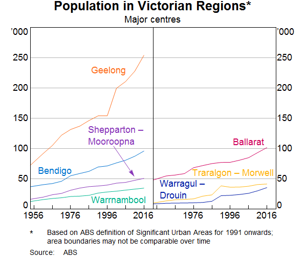
Decisions by firms and other economic actors can also have wave effects at the regional level. Even if they wash out at the national level, they can still have a big effect on some people's lives. Certainly Geelong has seen the effects of these decisions, with a number of government agencies locating here in recent years, and the opening up of some transport infrastructure better connecting the whole region to Melbourne and beyond. Both of these factors have been at work in attracting people to the Geelong and Surf Coast regions (Graph 9).
… Without Being Dumped
There are many lessons to draw from the existence of lumps, bumps and waves. First, lumps and bumps aren't always forecastable, except policy changes that are announced before they are implemented. So we can forecast the effect of the low and middle-income tax offset on household disposable income, or the childcare subsidy changes on inflation, but we can't predict dam collapses and cyclones in advance.
Second, tracking the lumps, bumps and other temporary special factors doesn't always feel a whole lot like the economics we learned at university. But if we don't do it, we will end up missing important developments and could seriously misinterpret the aggregate data.
Third, there are established techniques for looking through the noise in data. This is important for avoiding ‘excuse-making’ – stripping out the inconvenient movements while leaving in the ones that line up with the story you want to tell. We do need to look through the lumps and bumps and noise to discern the underlying trend. But if we just excluded certain movements in an ad hoc way, we could be accused of bias, or we could miss something important. So even though our policy target is specified as a medium-term average of overall CPI inflation, we use the trimmed mean measure in our forecasting because it strips out extremes on both the high and low sides, and it doesn't presume where the noise comes from. There are other techniques for getting at the underlying trend in a series like inflation, and we look at those measures too.
Finally and most importantly, the real art, and the value-add, is in identifying and quantifying the waves. This is more like the economics that we were trained to do. But it is still hard because a lot of standard economic theory necessarily starts from a presumption that the environment is stable. Waves, by definition, are a period of transition between two different states of the world. This doesn't mean that our economic understanding is all superfluous. The standard models need not be thrown out completely. And we have to be careful to avoid seeing paradigm shifts in every wiggle in the data. But structural change permeates the economy, and always will.
I hope these examples have given a flavour of some of the issues and trends we grapple with as we try to understand economic developments. Our engagement with the business sector and with community groups is very important to our understanding. So as well as thanking you for your time today, I'd like to thank all of the firms and community groups we meet with. Among the lumps, bumps and waves, there are many important stories that we need to hear. Without you, it would be much harder to do so.
Endnotes
Thanks to Sharon Lai for her assistance in preparing this talk. [*]
See RBA (2014). [1]
See Gabaix (2016) for a discussion of how and where power laws can arise in economies, and Gabaix (2011) for an analysis of how power law distributions can lead to firm-level shocks having economy-wide effects. [2]
In the economic jargon, these are called ‘exogenous’. [3]
References
Debelle G (2019), ‘Climate Change and the Economy’, Public Forum hosted by the Centre for Policy Development, Sydney, 12 March.
Evans R, A Moore and D Rees (2018), ‘The Cyclical Behaviour of Labour Force Participation’, RBA Bulletin, September, viewed 2 October. Available at < https://www.rba.gov.au/publications/bulletin/2018/sep/the-cyclical-behaviour-of-labour-force-participation.html>.
Gabaix X (2011), ‘The Granular Origins of Aggregate Fluctuations’, Econometrica, 79(3), pp 733–772.
Gabaix X (2016), ‘Power Laws in Economics: An Introduction’, Journal of Economic Perspectives, 30(1), pp 185–206.
RBA (2014), ‘The RBA's Business Liaison Program’, RBA Bulletin, September, pp 1–6.
