RDP 1978-02: Unemployment: An Econometric Dissection 2. The Labour Market: Some Facts and Figures[4]
December 1978
Since 1960, conditions in the labour market have deteriorated markedly on two occasions – 1961 and in the period since 1974 – and to a lesser extent in 1972, as illustrated by figure 2.1. The intervening years were characterised by low rates of unemployment and sustained increases in the level of employment; this was especially true in the second half of the 1960's when unemployment was stable at around 1½ per cent of the labour force and employment increased steadily by 2½ per cent to 3 per cent each year.
The most recent downturn in the labour market differs from the earlier ones because of two major factors. Firstly, the unemployment rate moved higher. Secondly, unemployment did not decline as it did in earlier cycles; indeed, it has tended to rise since the initial sharp increase. The unemployment rate at end-1977 was about 5½ per cent compared with a little over 4 per cent early in 1975. These movements in unemployment have gone hand in hand with large increases in the average duration of unemployment; this has increased from about 8 weeks in the second half of the 1960's to about 20 weeks in 1977.
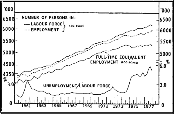
The large increase in unemployment in recent years reflects a marked weakening in employment at a time when the labour force has continued to increase at a relatively fast rate. From the middle of 1974 to the end of 1977, the number of employee persons increased by only 90,000, an annual rate of increase of ½ per cent. The full extent of the weakness in the demand for labour becomes apparent with it is noted that, over this period, government employment increased by 140,000 (i.e. private employmen fell) and that part-time employment increased by 135,000 (i.e. full-time employment fell).[5] A lot of the fall in private employment has been concentrated in the manufacturing sector and has been reflected in employment of both males and females. The increase in part-time employment has been accounted for mostly by females.
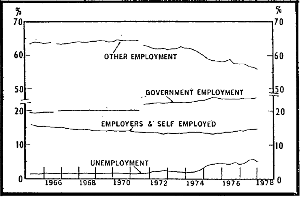
The employment status of the labour force is shown in figure 2.2. The shift to government employment, employers and self-employed and unemployed is clearly illustrated. The proportion of the labour force in the “other” category (mainly wage and salary earners in private employment) was fairly steady up to 1973 but fell from 62 per cent in 1973 to a little under 57 per cent in 1977.
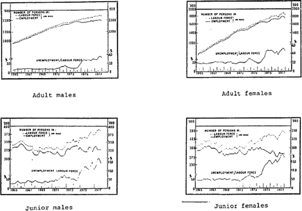
Employment for the four age/sex groups is shown in figure 2.3. All groups have experienced weaker demand since 1974 with rates of growth well below those in the early 1970s. Growth in female employment seems to have slowed the most, despite the big rise in employment of this group by the government sector; employment of females in the manufacturing sector has fallen sharply since 1974. For all four groups, the performance of part-time employment has been stronger than that of full-time employment, although as noted above, this is particularly true in the case of adult females.
The series for total labour supply is plotted in figure 2.1 while figure 2.3 illustrates this series for each category. These charts show that, in the 1960's and early 1970's, periods of weak demand for labour were accompanied by some slowing in the rate of increase in the supply of labour. This cyclical pattern in labour supply (resulting from discouraged worker effects) moderates the effect on measured unemployment of weakening labour demand. However, in the mid-1970's, the slowing in the rate of increase in labour supply has been less apparent; in the three and a half years to end-1977 the labour supply increased on average at an annual rate of 1½ per cent, well above the rate of increase in 1961 and 1971/72, even though the deterioration in labour market conditions was more severe in recent experience.
Over the period under review, trends in the supply of labour (and participation rates) of the four groups have diverged. The supply of adult female labour maintained a strong upward trend reflecting an increase in the participation rate from about 30 per cent in the mid-1960's to over 40 per cent at the end of 1977. The number of adult males in the labour force has also maintained an upward trend although the rate of increase has been slower than that of adult females (about 1½ per cent per year since the mid-1960's compared with 4¾ per cent for adult females) The participation rate for adult males was fairly steady at around 86 per cent from the mid-1960's through to 1970. Since then it has declined steadily and at the end of 1977 was about 83 per cent. This decline is largely due to two sub-groups – the 20–24 age group and the 55+ age group. Factors explaining these movements could include the increased popularity of tertiary education and a lowering of the average age of retirement. For juniors, the downward trend in participation rates during the second half of the 1960's was replaced by a more level trend during the 1970's.
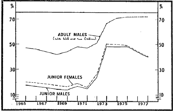
Also shown in figure 2.3 are unemployment rates for the four age/sex groups. It can be seen from the graphs that junior females tend to experience the highest rates of unemployment with rates commonly five to six times that of adult males. On average, the rate for junior males has been only slightly lower than that for junior females. The unemployment rate for adult females has averaged about 1½ to 2 times that of adult males. These higher unemployment rates could be due to factors such as the wage structure; low work attachment, slow absorption into employment of new labour force entrants and lower opportunity costs of being unemployed as a result of higher ratios of unemployment benefits to possible earnings.
The changes in labour market quantities described above were accompanied by some marked changes in the price of labour (especially for some groups). The most noticeable of these changes was the explosion in average earnings in 1973 and 1974. Over these two years, the weighted average (nominal) earnings of all employees rose by about 55 per cent. Other labour costs – e.g. payroll taxes – also increased over this period.
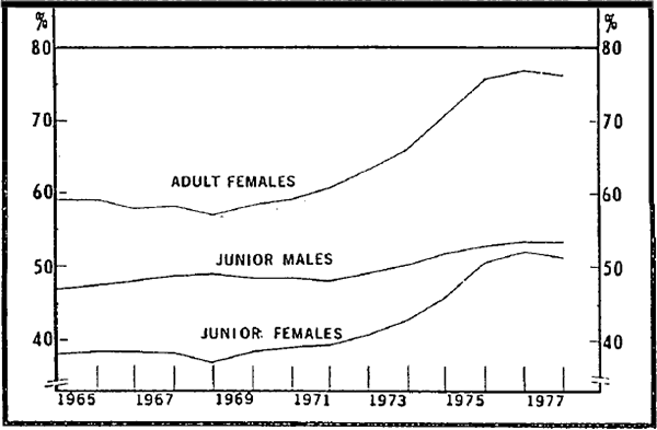
Within the average, earnings of some groups (especially adult females and junior females) increased particularly quickly. Consequently, there have been some marked changes in relativities in the 1970s. These are shown in figure 2.4. The ratio of adult female to adult male earnings increased from about 60 per cent in 1970 to over 75 per cent in 1977. Over this period, there was also a fairly substantial increase in the relative earnings of junior females and a less marked increase in earnings of junior males.
With various forces limiting the extent to which firms could pass on the higher labour costs, real costs rose sharply over 1973 and 1974. The increases over these years were greatly above the average rates of increase recorded during the 1960s causing a breakdown of the close relationship between the rate of increase in real labour costs and productivity that existed over most of the 1960s (see figure 2.5).
The series plotted in figure 2.5 are discussed further in Appendix A. The trend productivity line, growing at 2.6 per cent per year, is based on the average annual rate of increase during the 1960s in product per full-time equivalent employed for the economy as a whole. This figure is much lower than that calculated for some definitions of the market sector,[6] since it includes the government sector. However, since real labour costs on this basis are lower than in the market sector by the same amount (the offset to lower measured productivity growth in the government sector is in faster growth of prices) the econometric relationships should not be distorted.[7]
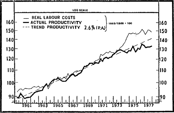
Wage indexation since mid-1975 has limited the change in real labour costs so that the “wage overhang” that developed over 1973 and 1974 would not have been fully corrected by the end of 1977, even if productivity had continued to increase at the average rate of the 1960s.[8]
A further influence on the labour market has been changes in output of goods and services. All three periods of high unemployment have been characterised by weakness in aggregate demand and output, especially in 1961 and in the second half of 1974 when total spending fell (from peak to trough) by 9 per cent and 5 per cent respectively. Although the fall was smaller in the more recent period, recovery has taken longer.
The sharp increase in unemployment benefits (particularly those of juniors) in 1973 may also have contributed to a higher level of unemployment by reducing the cost of time spent searching for employment. Increases in unemployment benefits payable to juniors in 1973 made benefits equivalent to about 50 per cent of after-tax award wages of this group compared with 15–20 per cent during the 1960s. This ratio has fallen in recent years as, unlike those of adults, unemployment benefits of juniors have not been indexed to the consumer price index. Figure 2.6 shows the ratio of unemployment benefits to after-tax award wages for adult males and juniors.
Structural and demographic changes have also been considerable since 1960. These include the tariff cuts of 1973, the large increase in the size of the public sector, changes in the level of migration and changes in social attitudes.
The deterioration in the labour market since the middle of 1974 has been severe in comparison with previous postwar experience; all age/sex groups have been affected. The formal model in the next section attempts to determine the contribution of changes in real wages and total product to this deterioration.
Footnotes
Details of the data used are given in Appendix A. [4]
The compositional change between the number of full-time workers and the number of part-time workers is allowed for in the model by expressing variables in terms of full-time equivalents. For details see Appendix A. [5]
For example Sheehan (1978) calculates a figure of 4.1 per cent per annum for productivity in the market sector using data published by the ABS. [6]
A more complete analysis would begin with a two sector (government and non-government) model and investigate the links between demand, supply and wages in each sector. [7]
It is difficult to be precise when specifying the size of the overhang; the results vary depending on the sector under consideration, the base period chosen, etc. However, the measure on figure 2.5 shows that the overhang (defined as the excess of real labour costs over trend productivity) was about 7 per cent at the end of 1977 compared with a peak of 14 per cent at the end of 1974 and about 5 per cent in 1972 and 1961. [8]