RDP 8302: Economic Forecasts and their Assessment II. Is it Possible to Pick Good Forecasters?
August 1983
- Download the Paper 762KB
(a) The issues
Despite the rather chequered history of economic forecasting, there is a natural curiosity to know whether there is, perhaps, one forecaster who is consistently better than the others (or one who is consistently worse). The problem of assessing the relative accuracy of different forecasters is an extremely difficult one. So much so that the most experienced writer in this field – Zarnowitz – concluded that “the search for a consistently superior forecaster is about as promising as the search for the philosophers' stone”.[11] The problems faced are both practical and conceptual. The main practical problems are that different forecasters may:
- use different definitions or measures of variables;
- forecast different periods – some use calendar years while others use financial. Some use end of quarter, while other use average of quarter;
- use different growth rates e.g. year-on-year, twelve months ended;
- be made at different times e.g. before the year being forecast, early in the year being forecast, half way through the year etc.;
- use different policy assumptions e.g. “no policy change” or “most likely policy outcome”.
The above differences can cause a lot of difficulty especially if a large number of forecasters are being assessed. There is little that can be done to overcome these differences other than to avoid comparing the non-comparable. It is also wise to spell out the differences so that those wishing to make judgements are aware of the areas of non-comparability. An advantage of the constant group of twelve forecasters used in the present discussion is that these problems do not arise; they all forecast for the same period using the same definitions and types of growth rate and the forecasts are all made in late December/early January.
Another related practical problem, and one that is rarely overcome, is the need to find a long enough evaluation period. A relatively large number of observations is needed for purposes of statistical significance. More importantly, a period long enough to include a reasonable range of cyclical events is necessary before economic judgements can be made. It has already been pointed out that the five year period used in this paper can lead to uncharacteristic (and probably misleading) results such as the comparison between forecasts of prices and GDP. The same problem arises with comparing different forecasters; an evaluation period that includes a deep recession but not a boom will favour the habitual pessimist (and vice versa).
Even if these practical problems are overcome there are still conceptual difficulties. Indeed these are much more serious than are the practical ones. The main conceptual difficulties are:
- Forecasts may not be independent. Some forecasters are very serious about their job and can back up their numbers with strong arguments and a lot of background calculations. Others feel obliged to have a forecast but arrive at it by merely ‘adding a point to, or subtracting a point from’, one of the widely circulated serious forecasts. This factor, plus the natural risk-averting strategy of seeking ‘safety in numbers’, gives rise to a tendency towards a bunching of forecasts around one or two market leaders.[12] The interdependence of various forecasters would not cause a problem if the other conceptual problems could be overcome. That is, if an effective means of assessing forecasts could be devised, then it should sort out the serious forecasters from the ‘followers’. However, if there are defective assessment criteria, or a small number of observations, as is almost always the case, the forecasting prize could go to one of the “followers”.
-
There is no accepted criterion by which to judge forecasts. It is generally agreed
that the criterion of minimising the difference between forecasts and outcomes, such as root
mean square error, tells only part of the story. This is because it gives an advantage to
the “play-safe” forecaster who may look good on this criterion even though he
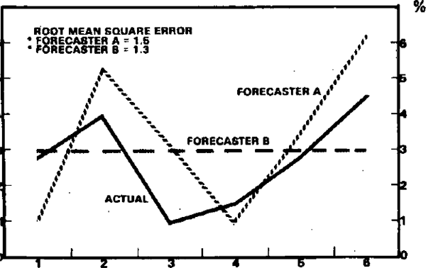
failed to pick any of the changes of direction in a cyclical series. Diagram 2(a) shows such
a situation; forecaster B would be judged as the better forecaster over this six year period
using the usual error minimisation rules. A better criterion is often thought to be the
ability to pick turning points.[13]
This certainly sounds fairer and is more in keeping with the needs of people who use
economic forecasts. Unfortunately, it is extremely difficult, if not impossible, to apply.
The main difficulties are:
- A long run of years is needed to make a fair judgement. For example, in the five years shown in Table 1, GDP has only one turning point – the slowdown in 1980. If we want to have enough observations (i.e. turning points) to avoid the errors of small samples, we would need a very long run of years or decades.
-
It is hard to know what to define as a turning point. Business cycles do not show up
as smoothly as sine curves. Monthly and quarterly data contain a lot of erratic
movements and, in general, forecasters are not expected to be able to forecast
the “noise” in the series. In principle, annual data are supposed to
overcome this problem but they introduce further problems. For example
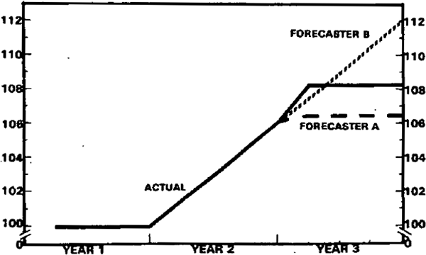
- Year-on-year growth rates are very crude indicators of turning points. Diagram 2(b) shows a situation where a forecaster (A) who picked a slowdown (but one quarter too early) appears to be inferior to a forecaster (B) who failed to pick the slowdown at all. This is largely due to the distortions introduced by looking at year-on-year growth rates. The figures underlying this example are shown in the appendix. This effect is much more likely to occur (in the realistic case) where there is a lot of erratic quarterly fluctuation rather than in the smoother example shown in Diagram 2(b).
- It is difficult to decide what constitutes a turning point. If levels are used, there is only one downturn for GDP in the post-war period. It is common to use growth rates and so measure a downturn as a significant fall in the growth rate. But this still presents problems – e.g. was the fall from 4.2 to 2.0 per cent in the growth of GDP in Australia between 1979 and 1980 a downturn? On the basis of GDP alone it would appear to be significant. On other criteria it was a relatively minor bump e.g. employment grew 2.9 per cent in 1980 (year-on-year) and the average unemployment rate was lower than the previous year.
- The foregoing suggests that the recognition of turning points requires evidence from a variety of indicators. This means that a reference cycle has to be constructed in the manner of the NBER cycles before assessment can begin. Not only is this time consuming, it also introduces a host of arbitrary assumptions about series to be used, weights etc.
The consequence of the above difficulties is that most assessors of forecasts pay lip service to turning points and then go ahead and use error minimisation criteria,[14] often based on a very short sample, and in some unfortunate cases, one observation.
(b) Some Australian Results
This section looks at characteristics of different forecasters and illustrates the difficulties of making judgements about their relative merits. In particular it attempts to address the issue of whether it is possible to identify a forecaster who consistently gets closer to the outcome than the others.
- On the basis or error minimisation there is little to choose between most of the forecasters. For example, for GDP, the RMSE of the average of the forecasts was 1.6 percentage points and only three forecasters were below this; the lowest having a RMSE of 1.4 percentage points.
- On the basis of correlation coefficients there was more dispersion (this measure having the effect of magnifying differences). However, the bunching of forecasts still showed up in that eight of the twelve forecasts for GDP were more closely correlated with the mean forecast than with the outcome. This is in line with the usual findings.[15]
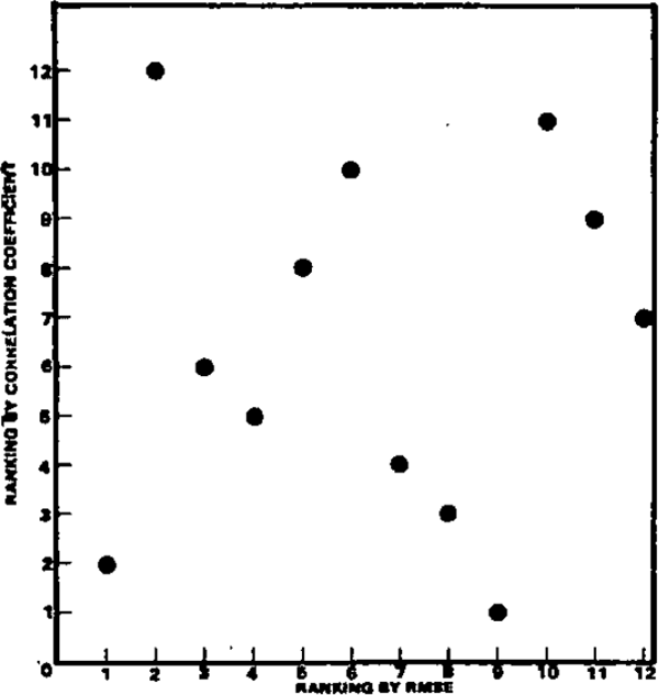
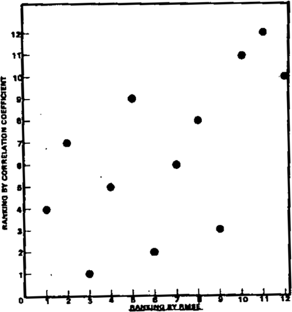
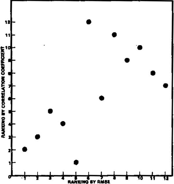
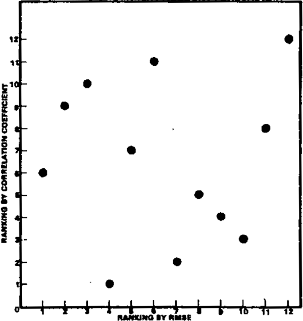
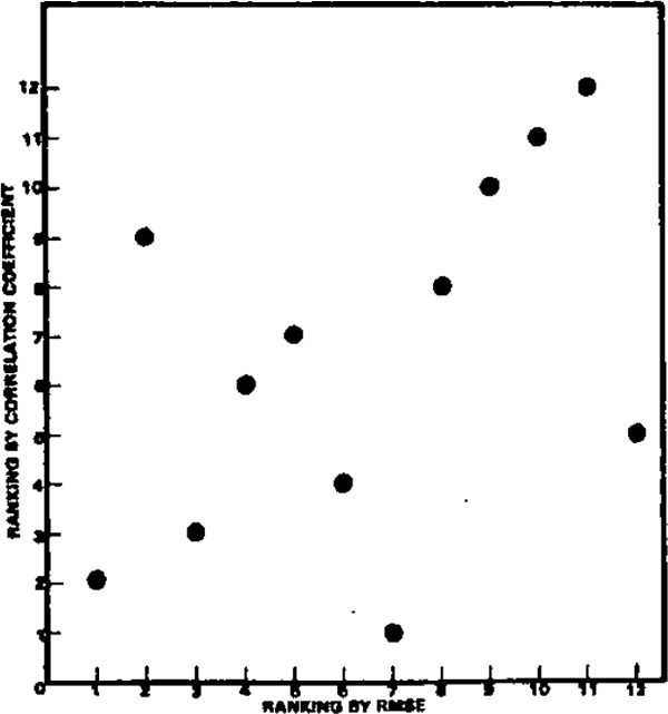
- It is tempting to award points to the forecasts that did best on average, judged by both RMSE and correlation. Unfortunately, there is only a weak relationship between success as judged by each criterion. Diagram 3 illustrates this relationship by scatter diagrams of rankings by the two criteria for each variable. A high correlation between success by each criterion would show as a tight scatter along a 45° line from the origin. This is not apparent for any of the variables; the only two for which the correlation is significantly different from zero are GDP and unemployment. In the case of the former, this is due to the three outlying observations (those that did badly by both criteria). If these three are disregarded, there is no correlation between the remaining nine (those from which the “best” forecaster would be selected).
- Success in any one year does not increase the likelihood of success in the following year. In fact there is no correlation between performance in successive years. Table 3 shows rank correlation coefficients for each variable for each set of adjacent years. That is, the forecasters were ranked from one to twelve by the size of their RMSE for each variable for each year. Rank correlation coefficients were then calculated for adjacent years for each variable.[16] As can be seen from Table 3 the positive values are quite small, and would not pass the usual tests of statistical significance. The conclusion is that ranking by success in forecasting is distributed in a random fashion year by year.
CORRELATION BETWEEN ALTERNATIVE CRITERIA
DIAGRAM 3(A)
| 1978 to 1979 | 1979 to 1980 | 1980 to 1981 | 1981 to 1982 | |
|---|---|---|---|---|
| GDP growth | −0.22 | 0.06 | −0.28 | 0.04 |
| Inflation | 0.03 | 0.17 | 0.10 | −0.52 |
| Unemployment | 0.19 | −0.43 | 0.38 | 0.21 |
| Current Account | 0.05 | 0.41 | −0.01 | 0.03 |
| Bond Rate | −0.31 | 0.21 | 0.22 | 0.37 |
Another way of looking at this question is to ask whether an evaluation of forecasts over the period 1978 to 1980 would have told you anything about performance in the following two years. The rank correlation coefficients shown below indicate that such an exercise would have been of little value.
| GDP Growth | 0.30 | Current Account | −0.22 |
| Inflation | −0.18 | Bond Rate | 0.29 |
| Unemployment | 0.01 |
The foregoing should not be taken to suggest that no characteristics are systematic from year to year; some forecasters are usually optimistic and some pessimistic. However, since the outcome varies from being near the top of the range in some years, to being near the bottom in other years, the size of error among forecasters shows no systematic variation from year to year.
Footnotes
Zarnowitz (1978) [11]
This bunching is the norm among published forecasts; for example Zarnowitz (1979) finds a higher correlation between different forecasts than between forecasts and outcomes. Among unpublished forecasts, it is not necessarily the case. In a recent interest rate forecasting competition run by the Australian Business Economists, only the winning forecast (and its forecaster) were made public. This anonymity, among other things, may explain the wide range of forecasts being put forward: between 13 and 21 per cent for the bill rate two weeks hence. [12]
While several authors stress the need for analysis of turning points, Zarnowitz (1967)(1978), Christ (1975) and Su (1978), there is not a great deal of enthusiasm in their pleas. It is much more convenient to stick with error-minimisation as the criterion. [13]
An exception is Zarnowitz (1978). He uses correlation coefficients of rates of change in series to see “how well the predicted changes have tracked the actual changes over time”. Two other alternatives are the Theil decomposition procedure, see Theil (1961), and simple regression between forecasts and outcomes. Although these techniques have much in their favour, they each yield at least three criteria by which to judge forecast accuracy. In the case of regression, the three criteria would be (a) the extent to which the constant term approached zero, (b) the extent to which the coefficient approached +1 (and was significant) and (c) the R2. [14]
There is a common view that the best forecast to use is the mean forecast. One expression of this is the widely read American forecasting newsletter produced by Eggert Economic Enterprises. Eggert subscribes to forty three commercial forecasting series, averages the forecasts received, then sells the resulting “consensus forecast” in their newsletter. The business seems to be flourishing and its consensus forecast is widely quoted. [15]
A rank correlation coefficient of +1.0 would indicate the rankings were exactly the same and −1.0 that they were exactly reversed. [16]