RDP 2021-09: Is the Phillips Curve Still a Curve? Evidence from the Regions 4. Data
September 2021
- Download the Paper 1,707KB
4.1 Local labour markets
We assume that Australia can be carved up into a number of distinct local labour markets. Theory tends to define local labour markets as geographic areas with similar wages, unemployment rates and housing costs, along with strong commuting links within the area (Moretti 2011). The challenge is to translate this notion into classifications suitable for empirical analysis. As mentioned earlier, one option would be to use states to represent local labour markets as is often done in the US literature. However, as there are only eight states and territories in Australia this would leave us with little cross-regional variation.
Another option would be to use the ABS ‘Statistical Area’ classifications to represent local labour markets. However, these classifications have a number of drawbacks. Namely, ‘Statistical Area Level 4’ regions (SA4s), although designed to represent local labour markets, have a minimum population limit (100,000 people) that can result in several distinct labour markets being grouped together, particularly outside of the major cities. At the other end of the spectrum, ‘Statistical Area Level 2’ regions (SA2s) (the smallest areas for which data on wages and unemployment are available) are so small (roughly 3,000 to 25,000 people) that people in cities are likely to live in a different SA2 to the one in which they work. This inter-regional commuting would muddy our analysis.
This suggests that an optimal classification of local labour markets is some combination of SA2s (in regional areas) and SA4s (in major cities).[25] Rather than simply classifying local labour markets based on whether they are located in major cities or regional areas, we apply a cluster analysis algorithm to data on intra-regional commuting patterns from the Census to group together SA2s with the strongest commuting ties. This approach is similar to the ‘commuting zones’ commonly used in US research dealing with local labour markets. Our approach provides more than three times the number of distinct labour markets than SA4s, without compromising on the notion that local labour markets should have a high degree of overlap between where people live and where they work. We end up with 291 local labour markets covering the entire continent. Our approach is described in Appendix B.
4.2 Unemployment and wages growth
The building blocks of our regional dataset are the many SA2s in Australia, which are the smallest areas for which data on wages and unemployment are available. We collect annual data on average wage income and unemployment rates for each of these SA2s from 1998/99 to 2017/18. We then aggregate these areas into 291 local labour markets using the classification approach outlined above.
4.2.1 Wages growth
Our measure of wages growth is derived from the ABS ‘Personal Income in Australia’ release, which provides regional data on average employee income based on the tax records of 12 million–14 million people each year. Specifically, it provides the total employee income per employee in each SA2 for each financial year from 1995/96 to 2017/18.[26] We use these data to construct wages growth in a region as the percentage change in average employee income in that region relative to the previous year.[27]
Because our measure of wages growth is sourced from administrative data covering most employees, it is accurately measured even for fine geographic areas like SA2s. Other measures of inflation such as the WPI, average earnings from the national accounts (AENA) per hour and the consumer price index (CPI) are only available at the state and territory or capital city level.
Employee income is a broad measure of labour costs that includes wages, bonuses, allowances, superannuation and redundancy payments. This contrasts with narrower measures of wages growth, such as WPI growth, which is limited to wage payments.[28] Another difference is that, unlike the WPI, our measure of average employee income is affected by changes in hours worked per employee and changes to the composition of the workforce. We discuss this issue in Section 8.2. While we refer to our measure as ‘wages growth’ for brevity, these measurement and conceptual differences should be kept in mind.
4.2.2 Unemployment rates
Our data on regional unemployment rates are from the ‘Small Area Labour Markets’ statistics published by the National Skills Commission. Being available at the SA2 level, these data provide a finer geographic disaggregation of unemployment rates than available in the Labour Force Survey (LFS) (at the SA4 level), making it relatively easy to map them across to our 291 local labour markets.
The National Skills Commission construct these data based on Newstart Allowance/JobSeeker and Youth Allowance payment data along with data on SA4-level unemployment rates from the LFS. They measure the average unemployment rate in each region over each financial year from 1998/99 onward. Although these measures make use of reliable administrative data, the administrative data are primarily used to interpolate the LFS SA4 data, so the SA2-level data will inherit some of the sampling variability of the LFS estimates. To the extent that our data on regional unemployment rates are measured with error, this would generally be expected to bias our estimates of the slope of the Phillips curve towards zero.
4.2.3 Variation in unemployment rates
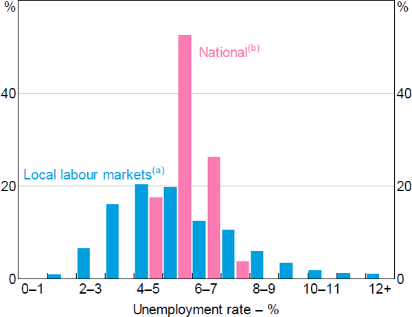
As discussed earlier, a key advantage of using regional data is that it provides more observations with very tight labour markets compared to the national time series data. This can be seen in Figure 5, which shows the distribution of unemployment rates in both the national time series and our regional panel. Over the inflation-targeting period there have been only seven quarters (2007:Q2–2008:Q4) in which the national quarter-average unemployment rate was below 4½ per cent, and in no instance did it fall below 4 per cent. For this reason, the power of tests for nonlinearities would be low when using aggregate data. In contrast, there is substantial variation in unemployment rates at the local labour market level; more than one-fifth of all region–year observations have unemployment rates below 4 per cent.[29]

Notes:
(a) Weighted by the number of wages and salary earners in each labour market, annual
(b) Seasonally adjusted, quarterly
Sources: ABS; Authors' calculations; National Skills Commission
4.2.4 Graphical evidence
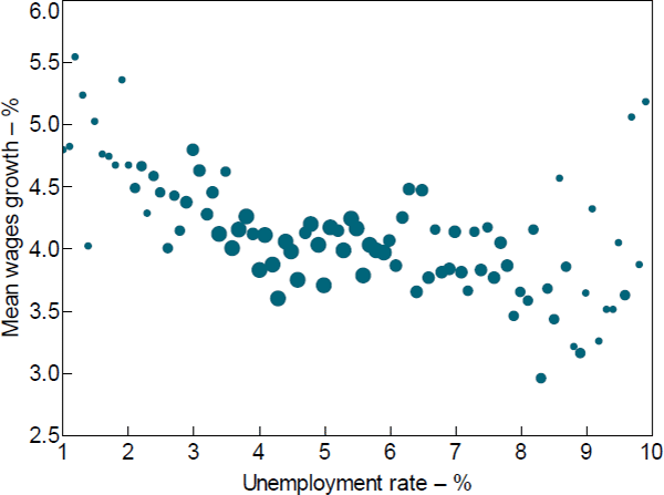
Before moving to the regression analysis, we first present a visual inspection of the wage Phillips curve relationship in our regional dataset. Figure 6 shows a binned scatter plot of unemployment rates (x-axis) against annual wages growth (y-axis) based on the 5,639 region–year observations in our data.[30] Each unemployment rate ‘bin’ is 10 basis points wide (e.g. all unemployment rates ≥5 per cent but <5.1 per cent constitute a single bin), and for each of these bins we calculate the sample average wages growth for all region–year observations within that bin.[31] The size of the markers in the figure is proportional to the number of region–year observations in the respective bin. Because the sample sizes for these narrow bins becomes very small for unemployment rates above 10 per cent, in Figure 6 we exclude all observations above that level.

Notes: Grouped to nearest 0.1 percentage point by unemployment rate; the size of each dot is proportional to the employee-weighted number of region–year observations in each unemployment rate bin; in the figure unemployment rates are bottom-coded at 1 per cent and unemployment rates above 10 per cent are not shown
Sources: ABS; Authors' calculations; National Skills Commission
Figure 6 provides strong visual evidence of potential nonlinearity in the relationship between unemployment and wages growth in our dataset. More specifically, the data suggest a convex wage Phillips curve that is quite flat for unemployment rates above 5 per cent, but negative and steep for unemployment rates below 5 per cent, and particularly below 4 per cent. In the next section, we examine if this relationship holds when we control for a range of region-specific and aggregate-level factors.
Footnotes
Although SA3s may appear like a suitable intermediate option, they have the same limitations as SA2s in major cities and SA4s in regional areas. SA3s are also designed with administrative boundaries, rather than labour markets, in mind. [25]
The scope of these data includes anyone who lodged individual tax returns within 16 months of the end of the financial year or who received pay as you go (PAYG) payment summaries from an employer. We compile these data using a number of ABS releases, including ‘Personal Income in Australia’, ‘Estimates of Personal Income for Small Areas’ and ‘Experimental Estimates of Personal Income for Small Areas, Taxation and Income Support Data’. The data for 2004/05 and earlier are available for Statistical Local Areas, which we correspond to SA2s using correspondence files provided by the ABS (please see our online supplementary information files for more detail). [26]
Our analysis excludes region–year observations with fewer than 100 individuals contributing to the annual wage data. [27]
The WPI is published both excluding and including bonuses, although only the excluding bonuses series is available at the state level. [28]
The share of regions with unemployment rates below 4 per cent ranged from a low of 10 per cent in the late 1990s and early 2000s, to a high of 50 per cent in the mid 2000s mining boom. [29]
We show a binned scatter rather than a regular scatter of all region–year observations because the latter are noisy, particularly for smaller regions. [30]
Averages are weighted by regional population to be consistent with the regression analysis. [31]