Research Discussion Paper – RDP 2024-03 Demand in the Repo Market: Indirect Perspectives from Open Market Operations from 2006 to 2020
1. Introduction
In some financial markets where trading occurs bilaterally between two counterparties (over-the-counter) rather than through an exchange, it can be difficult to obtain reliable metrics that allow analysis. Sometimes this is because when prices are bilaterally agreed between counterparties, there is no public record of the transaction price or volume traded. This lack of information is compounded in those over-the-counter markets where there is no common electronic platform that quotes executable prices. There might also be a significant difference in transaction characteristics between counterparties depending on the degree to which they are integrated into the overall market network. Peripheral participants that deal with larger participants at the core of the market might be subject to different pricing practices and unable to easily substitute to other forms of funding. Many of these considerations are relevant to the Australian repo market. Market conditions are therefore not easy to assess and are often dependent on anecdotal evidence.[1] The Reserve Bank has been analysing the repo market by providing indirect perspectives using data from its own open market operations that are conducted using repos and by publishing data on repo market activity.
Prior to the COVID-19 pandemic, the Reserve Bank typically conducted open market operations to provide settlement balances for the smooth functioning of the payments system, manage liquidity in the interbank market, and for the implementation of monetary policy.[2] Lending cash against collateral under repo is an integral part of these operations. The eligible private sector counterparties to the Reserve Bank in these operations have a variety of reasons for participating. We use the preferences they reveal through behaviour in the auction bidding process to draw inferences about the overall demand for repo and hence market conditions.
Arranging cumulative repo rate bids from highest to lowest is akin to estimating a downward sloping demand curve. This mimics the auction process where bids are filled, beginning with the highest, until the central bank's willingness to supply is exhausted. This is a simple way of assessing the relationship between the price and quantity outcomes observed in open market operations. However, there are some caveats when drawing inferences about the broader repo market. Importantly, the Reserve Bank only deals with those participants accredited to be eligible, and hence our analysis omits important segments of the market such as highly leveraged institutions. The private market itself also has more international linkages than the central bank requires for the conduct of domestic monetary policy operations. Finally, the terms at which the Reserve Bank operates are not very representative of typical market practice. The market typically contracts repos at much shorter durations than the central bank and has different standards with respect to eligible collateral.
Nonetheless, this framework contributes to our understanding of the repo market in three ways. Firstly, the properties of the estimated demand curve, such as the slope and direction of shifts, allow us to infer how attitudes toward repo and its importance as a funding source change over time. Secondly, the interaction between demand and supply indicates the market-clearing equilibrium price and characteristics of unsuccessful bids. Thirdly, we can address hypothetical questions related to repos. For example, the supply of liquidity required to compress the equilibrium price to a particular repo rate for an estimate of demand on a given day.
The remainder of the paper explains our approach to these points. Section 2 provides an overview of the Reserve Bank auction process for repos prior to March 2020, which is key to understanding the data-generating process. In Section 3, the methodology of aggregating bids is illustrated through a worked example. In Section 4, the methodology is applied to actual auction data, and in Section 5 the elasticity of demand is estimated. The final section offers some concluding comments.
2. Open Market Operations
In the period we choose for our sample (2006 to early 2020), the Reserve Bank conducted open market operations almost every business day through a competitive auction process.[3] The purpose of the auction was to inject or withdraw liquidity, primarily using repos collateralised by eligible securities.[4] In the first leg of a reverse repo, the Reserve Bank provides the counterparty with exchange settlement balances in return for collateral on the auction date. In the second leg, this trade is reversed on a pre-agreed future date.
Over this sample period, prior to the auction the Reserve Bank published its intentions to inject or withdraw liquidity. The intended size of operations in millions of dollars, a set of preferred terms which specify the duration that cash is lent, and various measures of the aggregate system cash position were published on electronic platforms.[5]
Prior to the auction, eligible participants submitted bids specifying the size and rate they were willing to offer for a set of terms. These terms were either those proposed by the Reserve Bank, or those nominated by banks. The minimum size of a bid was $20 million with $1 million increments. No limit applied to the total size or number of bids that each participant could make, although only Australian dollar-denominated transactions were contracted.[6]
For each term, the Reserve Bank first allocated cash to the bid which offered to pay the highest repo rate. The auction was therefore based on the presumption that the highest bid revealed that the counterparty had the highest demand for funding on the day. Additional bids were met in descending order until the target size of operations was supplied. The lowest rate dealt to in an auction is referred to as the cut-off rate. Bids that were uncompetitive remained unfilled after intended supply was exhausted. There are some exceptions to this allocation process. Most fundamental was the regime shift between April and November 2020, when the cut-off rate was fixed at 0.18 per cent, and again since November 2020 when the rate was fixed at 0.10 per cent. The size of operations was no longer fixed, and more recently, the frequency of operations has ceased to be weekly. Changes for the framework are ongoing (see Kent (2022, 2024) for recent changes).
Becker and Rickards (2017) argue that since 2016 there has been a demand-driven increase in repo rates, which can be linked at least in part to non-residents becoming more active managers of their portfolios of Australian dollar-denominated securities. This appears to also have been the same time that pricing anomalies emerged, which made it profitable to trade the bases in markets such as foreign exchange swaps and bond futures (Becker, Fang and Wang 2016). The rise in repo rates between 2016 and the end of 2019 was accompanied by an increase in volatility for reasons that were very different to the crises-related market conditions observed during the global financial crisis or the onset of the COVID-19 pandemic. At the onset of these crises, cut-off repo rates spiked for a short period, reflecting an increase in demand for precautionary liquidity (Figure 1). Provision of central bank liquidity was able to meet that demand and market conditions became more settled relatively quickly. In contrast, repo rates remained elevated and volatile between 2016 and 2019. To a degree, it can be shown that the observed flows in the repo, bond futures, and foreign exchange markets are an indication that investors respond to arbitrage opportunities. Some of this heightened demand for funding might also be identified in banks' bidding behaviour in open market operations. Money markets are therefore interconnected, even if there are some barriers to perfect and riskless arbitrage (Cheung and Printant 2019). This paper is linked to earlier work through an explicit derivation of demand in open market operations.
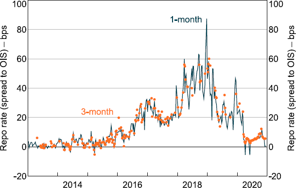
Notes: If the term of the repo is between 23 and 37 days, it is classified as a 1-month repo. If the term is between 75 and 105 days, it is classified as a 3-month repo.
Sources: Authors' calculations; RBA.
3. Estimating the Demand Curve in Open Market Operations
We derive an estimate of a downward sloping demand curve for liquidity obtained under repo in Reserve Bank open market operations. Since this involves cumulating successive bids at the auction, and our approximation of demand is imperfect, we also refer to this as a cumulative bid function (CBF). The CBF shares many similarities with demand curves and can be thought of as the sum over all participants' individual bid functions.[7] An individual participant's bid function captures the prices and quantities submitted at Reserve Bank auctions.
3.1 Methodology to construct the cumulative bid function
We begin by defining coordinates for the CBF, for the auction on day t, using individual bid-level data:
To illustrate the first part of this calculation, we use a hypothetical auction shown in Table 1. Each row lists a unique repo rate as a spread to overnight indexed swaps and the corresponding bid amount. Repo rates are ranked in descending order. In the third column, the cumulative value of the bids is calculated.
| Repo rates(a) (bps) |
Bid amount ($m) |
Cumulative bids ($m) |
|---|---|---|
| 25 | 200 | 200 |
| 24 | 250 | 450 |
| 23 | 100 | 550 |
| 22 | 600 | 1,150 |
|
Note: (a) In descending order as a spread to overnight indexed swaps. |
||
The CBF for this example involves plotting the four points (200, 25), (450, 24), (550, 23) and (1,150, 22). Each point on the CBF can be thought of as a marginal rate for each ranked approach and the corresponding total bid amount. For example, at a marginal rate equal to 25 basis points $200 million is bid, and similarly, at a marginal rate of 24 basis points $450 million is bid in total ($200 + $250).
In the next step to estimate a CBF over a specified sample period, we first plot all coordinate pairs for each day in the sample period, creating a scatter plot. Using this scatter plot, we estimate a curve by fitting a locally weighted regression (LOESS), with smoothing parameter = 0.75 and a quadratic specification.[8] This two-step process is illustrated in Figure 2 below.
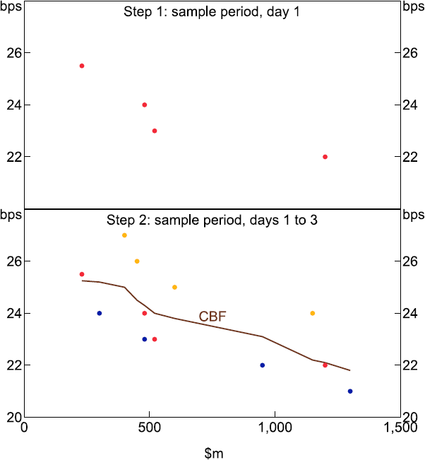
Note: Each dot colour represents a different sample day.
3.2 Interpretation of the estimated curve
The shape of the curve reflects the cumulative quantity bid at different prices. It indicates the revealed willingness to pay at Reserve Bank auctions. While the revealed bid might not always be an exact reflection of the marginal valuation attached to repo funding, the overall interpretation as an estimate of demand is familiar (see also Appendix A).
The height of the curve approximates the willingness to pay for a given quantity of repo funding. A shift higher indicates an increased willingness to pay, which we associate with an increase in demand. In normal times there is probably little variation in demand for liquidity to meet underlying settlement and payment system obligations. It is more likely that demand for these purposes only rises noticeably during times of high uncertainty, as was the case in 2008–09 and early 2020. However, an increase in profitable investment opportunities in other markets that can be financed using repo might lead to a parallel upward shift. This could indicate a willingness to pay more for each dollar of repo funding to rechannel liquidity into another investment, either directly or through on-lending to clients.
The elasticity of the curve reflects the quantity response to a given price change. For a given decline in price, a negatively sloped and more elastic (flatter) curve is associated with a larger amount of repo funding contracted than when the curve is relatively inelastic (steeper). The curve might become more elastic when market participants become increasingly confident that funding obtained under repo can be rechannelled into secondary investments. That is, a small fall in the repo rate will be associated with a much larger willingness to borrow for reinvestment or on-lending when the curve is elastic.
Without pre-empting the statistical results in this paper, we note the importance of the basic theoretical point that an exogenous shock might simultaneously lead to both a shift in bids and changes in elasticity. We will revisit this point in the discussion of our findings.
The intersection between the demand and supply curves is where cumulative bids equal the allocation of cash supplied. It is an estimate of the cut-off rate, when all bids are filled from highest to lowest until the desired supply is exhausted.
4. Application to Reserve Bank Open Market Operations Data
We identify several distinctive phases that can be identified as important developments in the repo market over the past decade or so. Since the average daily supply of cash to the system prior to March 2020 was largely dictated by the relatively stable liquidity needs of the payments and settlements systems, the net supply available did not tend to fluctuate as much as other market variables.[9] Many of the phases identified below are therefore mainly defined by different types of demand pressures.
Demand is estimated using the approach outlined above. In the figures below, each dot represents a unique set of coordinates associated with bids in open market operations on a particular day during the designated sample period. Pink dots are associated with the most competitive bids that were successfully filled during the auction. The blue dots represent less competitive bids which were not successful and remained unfilled. Our best estimate of demand is represented by the curve fitted to the data. The shaded region around the estimated demand curve represents the 95 per cent confidence interval. The average daily supply made available by the Reserve Bank during the sample period is represented by the vertical supply curve, which indicates that supply is exogenously determined by the central bank. The minimum and maximum auction value during the period is indicated by the grey range around the average supply curve.[10] Interactions between supply and estimated demand define the average repo rate outcomes in open market operations.
4.1 Before the crises: 2006 to 2007
Prior to the 2008–09 financial crisis, secured repo rates at Reserve Bank auctions traded around 2 basis points below the overnight indexed swap (OIS) rate (Figure 3).[11] This relationship between secured repo rates and unsecured rates can be largely explained by differences in default risk premia. Repo is typically collateralised by highly rated government and privately issued securities, while unsecured transactions are not collateralised. Because collateral reduces potential loss if the borrower defaults, the lender should be willing to accept a lower rate of interest on the loan for the reduction in risk. Hence, repo rates tended to be lower than swaps prior to the financial crisis.
Successful bids were tightly clustered in the segment of the demand curve that lies in the range of average supply during the sample period. Given that on almost all days the system required an injection of cash, demand is also relatively inelastic to changes in rates in this segment. However, demand becomes more elastic and flatter as the repo rate falls, indicating that when the repo rate is below other market rates, participants are increasingly willing to accept more cash. Supply averaged around $1.2 billion a day and ranged from zero to $2.9 billion. Unsuccessful bids exhibit an increasingly wide dispersion as the cumulative bid increases along the horizontal axis. This could reflect either unrealistic price formations or bids that contain an ambit or ‘wildcard’ element given that bidding is costless.
Notes: Pink dots represent successfully filled bids and blue dots represent unsuccessful bids that remained unfilled. The fitted curve represents our best estimate of demand with the shaded area showing the 95 per cent confidence interval. The vertical black line represents the mean supply of cash and the vertical shaded region represents the range between the minimum and maximum supplied.
Sources: Authors' calculations; RBA.
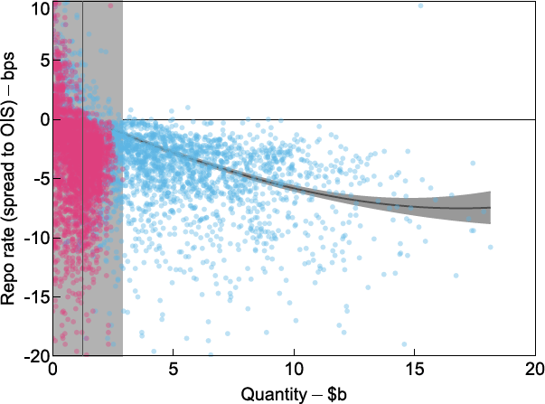
4.2 During the financial crisis: 2008-09
During the financial crisis, precautionary demand for liquidity rose and became more inelastic at lower quantities (Figure 4). The inelasticity of demand at low quantities reflected the high willingness to pay of most institutions. Amidst uncertain and unsettled financial market conditions, many institutions bid higher rates to secure liquidity for precautionary reasons. As a result, repo rates increased and became more variable. Notably, demand drove up the repo rate to be above the unsecured swap rate benchmark so that the spread was positive. During this time, the Reserve Bank supplied substantially more liquidity to meet precautionary demand and the largest amount of $6 billion provided was considerably larger than in the pre-crisis period described above. European markets exhibited a further bout of volatility in 2011 to 2012, which had some spillover effects around the world, but rates once again subsided relatively quickly in Australia. However, repo rates did not return to negative spreads to swaps for any length of time.
Notes: Pink dots represent successfully filled bids and blue dots represent unsuccessful bids that remained unfilled. The fitted curve represents our best estimate of demand with the shaded area showing the 95 per cent confidence interval. The vertical black line represents the mean supply of cash and the vertical shaded region represents the range between the minimum and maximum supplied.
Sources: Authors' calculations; RBA.
There was also a strong increase in demand for longer-term repo (Table 2). Even though the rates bid for longer terms were high, many of these remained unfilled because of the term offered by counterparties in their approach. Most of the unsuccessful approaches were for terms that were not consistent with the Reserve Bank's dealing intentions. Preferred terms are associated with those maturity dates that coincide with the liquidity management task undertaken by the central bank. On most occasions, the Reserve Bank nominated between one and three such terms. Non-preferred terms might have conflicted with liquidity management objectives and hence the approach might have been rejected, even at very high repo rates. This is also why we observe a cluster of unfilled bids at high repo rates during this period (Figure 4).
| Terms in days | Frequencies | Mean repo rate (spread to OIS) | |||
|---|---|---|---|---|---|
| All bids | Filled bids | All bids | Filled bids | ||
| term ≤ 90 | 2,995 | 935 | 1.73 | 5.01 | |
| 90 < term ≤ 180 | 57 | 3 | 9.61 | 4.70 | |
| 180 < term ≤ 270 | 15 | 1 | 22.61 | 22.60 | |
| 270 < term ≤ 360 | 58 | 0 | 39.46 | 0.00 | |
| term > 360 | 37 | 5 | 25.65 | 38.68 | |
|
Source: RBA |
|||||
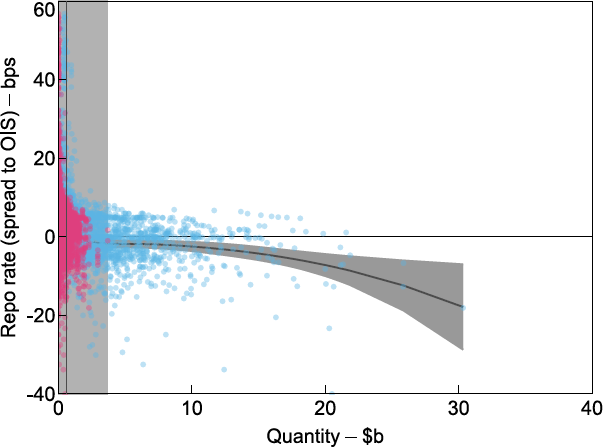
4.3 Escalating repo rates: 2016 to 2019
From 2016, there were renewed upward pressures on repo rates that were not related to the precautionary demand registered during the financial crisis. The source of demand for cash in this period appears to have been a more market-based phenomenon derived from funding investments in associated markets (Becker and Rickards 2017). This was particularly notable around the peak in repo rates in 2018 to 2019 (Figure 5).
The extra demand for cash is evident from the significant upward shift in the estimated curve as the average repo rate settled at around 40 basis points above swaps. Demand also became less stable and there was a much wider dispersion in bids during this time. This outcome may have reflected the link between demand in open market operations and developments in other markets which can often exhibit higher volatility in price outcomes.
Another notable observation relates to a significant flattening of demand. Compared to previous episodes, bids appear to have become considerably more price sensitive as elasticity increased around the elevated spread where supply meets demand. One possible interpretation of this is to consider the quantity implications. It is possible that auction participants were willing to accept a higher allocation of cash in open market operations because the willingness of their third-party clients to pay a high spread also indicated demand for larger quantities to be funded. There were more investments that needed to be funded, even at the higher rate, and repo dealers might have become more confident that they could on-lend large amounts of cash. In other words, liquidity demand rose for non-crisis related reasons and repo rates rose, but dealers were also confident that they could channel the funding they obtained into profitable investments without having to hold the cash in their exchange settlement accounts at the Reserve Bank.[12]
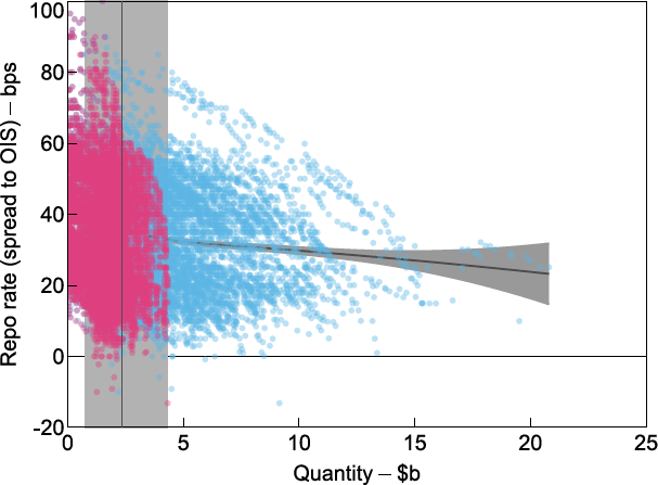
Notes: Pink dots represent successfully filled bids and blue dots represent unsuccessful bids that remained unfilled. The fitted curve represents our best estimate of demand with the shaded area showing the 95 per cent confidence interval. The vertical black line represents the mean supply of cash and the vertical shaded region represents the range between the minimum and maximum supplied.
Sources: Authors' calculations; RBA.
The source of this demand could have been related to banks reinvesting their repo funding, either directly themselves or possibly by on-lending cash to their clients who then entered into transactions that more than covered the rising cost of repo. The repo market might therefore have been part of arbitrage in money markets. Persistent price misalignments that occurred at this time, such as the bond futures and foreign exchange swap bases, are among some plausible sources for these developments (Becker et al 2016). We therefore observe a correlation between the repo rate, height of the demand curve, and its elasticity. See also Section 5 for more detail on estimating elasticity.
The height and shape of the demand curve in this sub-sample period also indicates that on any given day the supply of cash that would have been required to push repo rates back down to more normal spreads would have been significantly larger than previously.
4.4 The onset of the COVID-19 crisis in 2020
Market conditions were relatively benign just prior to the pandemic. In our estimations for February 2020, we see a number of interesting market features (Figure 6). The repo rate had declined from its peaks and bids in open market operations were once again more tightly clustered. We estimate that demand had declined and reverted to being more inelastic. Also of note is that demand was truncated at much lower quantities than observed earlier as cumulative bids petered out at around $7 billion. From Becker and Rickards (2017) one could imply that a reduction in bond futures- and foreign exchange bases-related trades may have contributed to these developments. However, we note that this explanation would benefit from further research to more formally link co-movements in markets.
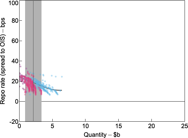
Notes: Pink dots represent successfully filled bids and blue dots represent unsuccessful bids that remained unfilled. The fitted curve represents our best estimate of demand with the shaded area showing the 95 per cent confidence interval. The vertical black line represents the mean supply of cash and the vertical shaded region represents the range between the minimum and maximum supplied.
Sources: Authors' calculations; RBA.
As the COVID-19 crisis spread in March, liquidity deteriorated and volatility spiked in several markets (Debelle 2020; Finlay, Seibold and Xiang 2020; Kent 2020). One effect was that it led to margin calls and demand for short-term liquidity to meet these calls. As such, financial institutions might have placed bids at higher rates and for larger quantities in open market operations (Figure 7). This bidding behaviour translated into a higher and more elongated demand curve than observed in February. In response, the Reserve Bank deviated from its previous target for exchange settlement balances and significantly increased the supply of liquidity, as indicated by the widening band around the supply curve. Another important response was to significantly extend the duration of repo terms to give market participants more certainty about their funding.
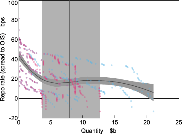
Notes: Pink dots represent successfully filled bids and blue dots represent unsuccessful bids that remained unfilled. The fitted curve represents our best estimate of demand with the shaded area showing the 95 per cent confidence interval. The vertical black line represents the mean supply of cash and the vertical shaded region represents the range between the minimum and maximum supplied.
Sources: Authors' calculations; RBA.
As total system liquidity was allowed to rise significantly, access to short-term liquidity quickly became less of a concern. Financial institutions were able to increase their holdings of cash to meet their precautionary demand. Beyond covering the need for short-term liquidity, increased supply of cash in open market operations, long-dated government bond purchases, and the Term Funding Facility provided assurance that access to liquidity would remain ample. This improved the financial outlook, demand shifted lower, and bids became smaller and less volatile (Figure 8). The liquidity supplied to the repo market successfully lowered the repo rate relative to indexed swaps.[13]
From 3 April 2020 until the November 2020 monetary policy decision, the Reserve Bank accepted only bids at, or above, 18 basis points. At the November 2020 monetary policy decision, the cut-off rate was set to 10 basis points. This led to a truncation of bids at this threshold. Under this new regime an increase in demand can only be observed through an increase in quantities. Hence estimated demand is flat.
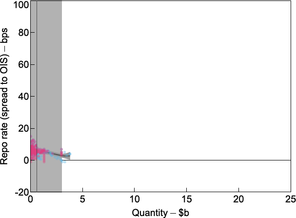
Notes: Pink dots represent successfully filled bids and blue dots represent unsuccessful bids that remained unfilled. The fitted curve represents our best estimate of demand with the shaded area showing the 95 per cent confidence interval. The vertical black line represents the mean supply of cash and the vertical shaded region represents the range between the minimum and maximum supplied.
Sources: Authors' calculations; RBA.
5. Elasticity of Demand and What It Can Tell Us
We define elasticity as the percentage change in the quantity of liquidity demanded in response to a 1 per cent change in the spread between the repo cut-off rate (the lowest rate accepted in the auction) and OIS. We consider the demand response to percentage changes in the spread, rather than absolute changes in basis points, because the magnitude of any pricing shock is likely to be proportional to the level of the repo spread. For example, if the repo spread was narrow and stable, a 2.5 basis point increase from 5 basis points to 7.5 basis points would be regarded as a significant event (i.e. a 50 per cent increase). However, if the repo spread was 50 basis points, an increase to 52.5 basis points would most likely be considered as less significant. Using an empirical framework, we estimate the price elasticity of demand for liquidity obtained under reverse repo in open market operations. We produce a quarterly estimate for repo elasticity, with the model controlling for fixed effects due to the repo term and specific dealing days (such as quarter-end; for details see Appendix B).
Knowing the price sensitivity of demand is informative because it helps explain market conditions and the likely price response to a given increase in liquidity supplied. To elicit the same percentage decrease in the repo spread, the Reserve Bank does not need to supply as much liquidity when demand is inelastic as it would when demand is elastic. Generalising this finding from open market operations to the broader market implies that participants have reason to be more or less willing to accept cash lent under repo for a given fall in the price. This finding opens up avenues for further research to determine the drivers of such changes in behaviour.
5.1 The evolution of elasticity
As was the case with our visual representation of the data, our estimate confirms that elasticity varies considerably over time and is positively correlated with the repo spread (Figure 9). Between 2009 and 2014, the repo spread averaged around 3 basis points. Demand was relatively inelastic, with a 1 per cent decrease in the repo spread associated with an average increase in quantity demanded of just 0.5 per cent. This result can also be used to estimate the percentage increase in supply that would be needed to narrow the repo spread by 1 per cent (since the supply curve was vertical over this period). Our findings imply that in response to a 1 per cent increase in the daily supply of liquidity, the repo spread would have narrowed by 2 per cent. Over the period, the average quantity supplied in a given day was about $1.3 billion. To narrow the spread by 1 per cent would therefore have required an increase in daily supply of only around $6.5 million.[14]
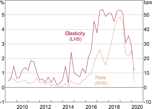
Note: Absolute value of estimated demand elasticity; mean OMO cut-off rate as a spread to OIS.
Sources: Authors' calculations; RBA.
Between 2016 and 2019, the estimated demand curve became notably more elastic. At the time the repo spread was also much higher than in the earlier period, averaging around 26 basis points. In this period, a 1 per cent increase in the daily supply of liquidity would have narrowed the repo spread by just 0.3 per cent. Given that the average supply of liquidity each day was $2,098 million, a 1 per cent narrowing of the repo spread would have required an increase in daily supply of $61 million. Compared with 2009 to 2014, this is about ten times the increase in daily liquidity needed to achieve a similar percentage narrowing in the repo spread. Extrapolating this, a rough estimation of the increase in supply required to bring the average repo rate back down to a zero spread in a single day during this period is around $6.1 billion. This is significantly more than in the 2009 to 2014 sample. When the repo spread peaked at around 50 basis points in 2018, the amounts in question would likely have been much larger. In other words, between 2016 and 2019 the increase in supply necessary to narrow the repo spread was significantly larger than in 2009 to 2014.
Although there are other factors that also would have influenced these outcomes, it is hardly surprising that when prices are higher due to rising and more elastic demand, more supply than usual is required to meet that demand in order for prices to fall back to their starting point.
5.2 The COVID-19 period
After peaking in 2018, the repo spread began to narrow and elasticity trended lower. This narrowing of the repo spread accelerated after the Reserve Bank's response to the pandemic, where the supply of liquidity was increased significantly. The relatively low elasticity of demand leading into the crisis may have also increased the impact of these liquidity injections on repo spreads.
The price elasticity of demand cannot be estimated from April 2020 onwards, because the repo rate over this period has been constant (aside from the change in policy rates in November 2020). Auction participants at that time typically bid at the single fixed repo rate. Therefore, there was no longer a range of repo spreads over which elasticity can be estimated. The demand curve effectively became close to perfectly elastic (flat). Notably though, demand was truncated at relatively low quantities given ample system cash since March 2020.
6. Conclusion
The demand for repo was relatively stable prior to the 2008–09 financial crisis and associated with a secured repo rate that was lower than unsecured rates. Precautionary demand rose during the global financial crisis and rates increased accordingly. Repo rates then declined again as market conditions settled but their spread to unsecured rates remained positive. Over the period between 2016 and 2019 there was a notable increase in both the demand for repo and its variability. This was reflected in high and variable repo rates that may have been linked to the emergence of basis trades in domestic securities and foreign exchange swaps.
We find evidence that as demand for repo rises and drives up the associated repo rate, at the margin market participants also become increasingly willing to acquire repo funding. One possible, although not exhaustive, explanation for this might be that as demand for repo funding of other investments rises, dealers become increasingly confident that they can either invest or on-lend such funding in larger quantities than when demand is lower. This conclusion is admittedly an inference drawn from Reserve Bank open market operations for the broader market and is subject to several important caveats. A useful area for future research might be to more formally link such investment opportunities to the demand and price outcomes we describe for the repo market.
Appendix A: Demand, Marginal Valuation and the Cumulative Bid Function
The Reserve Bank auction is a multi-unit discriminatory price (pay-your-bid) auction. Before each auction commences, the Reserve Bank publishes an intended size of operation in millions of dollars, denoted by K, and preferred repo terms in days. Suppose that bidders, each denoted by participate in the auction. We restrict our attention to repo approaches and exclude approaches for outright sales of securities.
We assume that each participant has their own downward-sloping demand schedule for repo funding which summarises their marginal valuation of successive units. This demand schedule varies by the term of repo funding on a given day and over time. The term dimension allows participants to have different demand for different terms and the time dimension allows demand for each term to vary over time. On each day t, bidder i 's private valuation for each unit of available repo funding at a term of d days is given by the vector where is i 's marginal valuation of obtaining the k th unit. We assume, by construction, that i 's marginal valuation is decreasing in the number of units obtained: Each unit is equal to $1 million of exchange settlement balances; the smallest allowed increment in bid size.[15] Since xidt maps each unit to a marginal valuation, it represents i 's inverse demand function (Krishna 2002, p 180). By inverting xidt we obtain i 's demand function for term d on day t:
Thus, for a given repo rate r we have:
An aggregated demand function for each term and day is obtained by adding the demand functions for each term for all bidders:
Since we do not observe the true private valuations of bidders, we cannot construct the demand function. However, we do observe the bids submitted by participants and we can use these bids to construct the cumulative bid function which serves as a close approximation.
On each day, bidder i submits a vector of bids for each term satisfying indicating how much is bid for each unit. Since bidt maps each unit to a bid, it represents the inverse bid function. By inverting bidt we obtain i 's bid function for term d on day t:
By aggregating over N bidders, we can construct the cumulative bid function:
In equilibrium, it must be that for all repo rates . To see this, suppose that there exists some repo rate such that . This is the case if, and only if, for some unit , meaning that for some unit a bid is made that exceeds the marginal valuation of that unit. Assume that there is some positive probability that this will be the winning bid for that unit. This is true if there exists a bidder j such that the support of j 's valuation distribution intersects with that of bidder Then, bidder i would be better off by submitting a lower bid (than her true marginal valuation). This is because paying a bid that is greater than the marginal valuation results in a negative pay-off.
This means that the cumulative bid function lies on or below the demand function. The cumulative bid function is our best proxy for demand but not necessarily the same as the private marginal valuation held by auction participants. Our working assumption is that this approximation is very close to the true demand curve.
Appendix B: Estimation of Demand Elasticity
To estimate the elasticity of demand, we assume the following specification:
where bdt is a bid rate (as a spread to OIS) and Qdt is the cumulative quantity bid for at that bid for term d on day t. and are term and day fixed effects.
Day fixed effects control for all that affects the quantity bid (for each term) equally in a given day, (e.g. quarter-end effects, the level of exchange settlement balances, risk aversion).
Term fixed effects control for any time-invariant term premia that may exist.
Because of this specification, the coefficient does not vary across terms or time. Thus, we estimate the price elasticity of demand over a given period as:
where is estimated using Equation (B1) and all observations over the period and is the mean cut-off rate calculated for the period.
| Mean cut-off rate as a spread to OIS (bps) |
Mean quantity supplied Qdt ($m) |
Estimated elasticity |
Response to 1 per cent price change ($m) |
|
|---|---|---|---|---|
| 2009–14 | 3.3 | 1,303 | −0.5 | 7 |
| 2016–19 | 25.7 | 2,098 | −2.9 | 61 |
|
Sources: Authors’ calculations; RBA |
||||
Appendix C: Glossary of Technical Terms
Cash rate – The Reserve Bank of Australia's measure of the cash rate is the interest rate which authorised deposit-taking institutions (ADIs) pay or charge to borrow funds from or lend funds to other ADIs on an overnight unsecured basis. This measure is also known as the interbank overnight cash rate. The Reserve Bank publishes the cash rate each day on the basis of data collected directly from financial institutions. This measure of the cash rate has been published by the Reserve Bank since June 1998.
Australian Government Securities – The Australian Government issues Australian Government Securities (AGS) in the form of Treasury bonds, Treasury indexed bonds and Treasury notes. These securities are AAA-rated. Note that prior to 2015 these securities were referred to as Commonwealth Government Securities or CGS.
Exchange Settlement Account – An account held at the Reserve Bank by financial institutions to settle financial obligations arising from the clearing of payments. These balances are sometimes also referred to as central bank reserves.
General collateral – is the range of assets that are accepted as collateral in the repo market by the majority of market intermediaries and at a very similar repo rate. That is, repo market participants are indifferent between securities that are generally accepted to be in the ‘general collateral basket’. General collateral assets are high quality and liquid. See also Wakeling and Wilson (2010).
Interest rate corridor – The interest rates on the overnight lending and deposit facilities provide a ceiling and a floor respectively for the overnight market interest rate.
Liquidity – Is a characteristic of an asset that allows the holder to sell it quickly without significantly affecting the price of that asset. In the context of this paper, we refer to liquidity as exchange settlement balances held at the central bank.
Open market operations – The buying and selling of eligible securities by the central bank in the open market in order to expand or contract the amount of liquidity in the system.
Repurchase agreement (repos) – Involve the sale (repo) or purchase (reverse repo) of securities with an undertaking to reverse the transaction at an agreed price and date in the future. Repos provide flexibility in that they allow the Reserve Bank to inject liquidity on one day and withdraw it on another with a single transaction.
An open repo (also known as an on demand repo) is a repurchase agreement that is agreed without fixing the maturity date. Instead, the repo can be terminated on any day in the future by either party, provided notice is given before an agreed deadline. Until an open repo is terminated, it automatically rolls over each day.
References
Becker C, A Fang and JC Wang (2016), ‘Developments in the Australian Repo Market’, RBA Bulletin, September, pp 41–46.
Becker C and P Rickards (2017), ‘Secured Money Market Transactions: Trends in the Australian Repo Rate’, JASSA: The Finsia Journal of Applied Finance, 2017(1), pp 13–21.
Becker C and S Woon (2019), ‘A Case Study of Liquidity Management on 3 August 2016’, RBA website, Teacher Materials, Presentation Notes, January.
Cheung B and S Printant (2019), ‘Australian Money Market Divergence: Arbitrage Opportunity or Illusion?’, RBA Research Discussion Paper No 2019-09.
Cleveland RB, WS Cleveland, JE McRae and I Terpenning (1990), ‘STL: A Seasonal-trend Decomposition Procedure Based on Loess’, Journal of Official Statistics, 6(1), pp 3–73.
Debelle G (2020), ‘The Reserve Bank's Policy Actions and Balance Sheet’, Address to the Economic Society of Australia, Online, 30 June.
Domestic Markets Department (2019), ‘The Framework for Monetary Policy Implementation in Australia’, RBA Bulletin, June.
Finlay R, C Seibold and M Xiang (2020), ‘Government Bond Market Functioning and COVID-19’, RBA Bulletin, September.
Kent C (2020), ‘The Reserve Bank's Operations – Liquidity, Market Function and Funding’, Address to KangaNews, Online, 27 July.
Kent C (2022), ‘Changes to the Reserve Bank's Open Market Operations’, Remarks to the Australian Financial Markets Association, Sydney, 22 February.
Kent C (2024), ‘The Future System for Monetary Policy Implementation’, Keynote address to Bloomberg Australia Briefing, Sydney, 2 April.
Krishna V (2002), Auction Theory, Academic Press, San Diego.
Wakeling D and I Wilson (2010), ‘The Repo Market in Australia’, RBA Bulletin, December, pp 27–35.
Acknowledgements
Participants in a seminar at the Reserve Bank of Australia, as well as Sean Dowling and Richard Finlay (both RBA) and Michael Callaghan and Kate Le Quesne (both RBNZ), provided helpful comments. Most of this work was completed while the authors were working on monetary policy implementation, liquidity and portfolio management in the Domestic Markets Department. The views expressed in this paper are those of the authors and not necessarily those of the Reserve Bank of Australia. Any errors are our own.
Footnotes
For an earlier description of the Australian repo market see also Wakeling and Wilson (2010). [1]
In March 2020, the Reserve Bank announced a comprehensive package to support the Australian economy and made changes to the way monetary policy was implemented. At the same time, it also announced that open market operations would continue, albeit with a different focus. Aspects of operations described in this paper are mainly relevant for understanding repo market conditions in the pre-pandemic era. [2]
Open market operations date back to much earlier than 2006, but we chose the start of our sample to coincide with the period just prior to the global financial crisis. [3]
For many years, the Reserve Bank has also used outright bond purchases and foreign exchange swaps to manage domestic liquidity. [4]
For a detailed illustrative example of the auction process, see Becker and Woon (2019). [5]
Details related to domestic market operations can be found on the Reserve Bank of Australia website at <https://www.rba.gov.au/mkt-operations/domestic-market-ops-and-standing-facilities.html>. [6]
See also Appendix A for the distinction between demand and the cumulative bid function. [7]
LOESS is a non-parametric method to fit a curve to a set of data points. The method assumes that points within a window are locally linear. The size of each window is equal to the parameter multiplied by the size of the dataset. The parameter also controls the smoothness of the curve. For further details, see Cleveland et al (1990). [8]
The Reserve Bank manages net liquidity flows in a forward-looking manner to stabilise the daily provision of cash. For an explanation of how these operations were conducted in the pre-pandemic era see Domestic Markets Department (2019). [9]
Successful bids (pink) must always lie to the left of the maximum cash supplied. [10]
OIS are a bilaterally traded, or over-the-counter (OTC), derivative in which one party agrees to pay the other party a fixed interest rate in exchange for receiving the average cash rate recorded over the term of the swap. They therefore provide a useful benchmark to base the repo spread on to abstract from actual and expected monetary policy changes. [11]
Exchange settlement balances were a relatively unattractive investment as they earned the floor of the cash rate corridor operated by the Reserve Bank at that time. This deliberate design feature ensured that banks would aim to only hold the balances they required for settlement and payments system needs by the end of every day. [12]
Daily surplus system cash averaged around $2½ billion in February 2020 prior to the crisis but a variety of policies pushed this up to an average of around $45½ billion in the July-November 2020 period shown in Figure 8. This represents a substantial increase in the provision of cash, which increased significantly further to exceed $400 billion by the end of 2021. [13]
Our results are best interpreted using small changes from the point at which the elasticity is calculated. In our specification we assume that the demand curve is convex to the origin; an assumption justified by the data. With a convex demand curve, a simple linear extrapolation would underestimate the required increase in daily supply. [14]
Although the minimum bid is $20 million, for simplicity this can be thought of as 20 bids for $1 million. [15]