RBA Annual Conference – 2011 The Australian Labour Market in the 2000s: The Quiet Decade Jeff Borland[*]
1. Introduction
The 2000s were a ‘quiet decade’ for the Australian labour market. Outcomes in the labour market were not sufficiently strong to excite great interest or attention, nor sufficiently weak to arouse major concern. No substantial increase in unemployment occurred, there were no big disputes about the appropriate theory for understanding labour market activity, and changes to labour market policy for the most part involved tinkering rather than rebuilding.
In all these ways, the 2000s were very different to the decades that came before (see, for example, Gregory and Duncan (1979); Chapman (1990); and Dawkins (2000)). Certainly the labour market received less attention from policy-makers in the 2000s. In contrast to previous decades, there was no Reserve Bank conference on unemployment (Debelle and Borland 1998); no Industry Commission review of the Australian labour market (Industry Commission 1997); and no Economic Planning Advisory Commission (EPAC) survey of literature on the labour market (Norris and Wooden 1996). At the same time, the growing availability of unit-record data (most notably the Household, Income and Labour Dynamics in Australia (HILDA) Survey; the Department of Families, Housing, Community Services and Indigenous Affairs (FaHCSIA) administrative data set; and Australian Bureau of Statistics (ABS) survey data) meant that academic research became (quite sensibly) more oriented towards micro-level topics.
Lack of newspaper headlines and attention from policy-makers and researchers does not, however, mean that the Australian labour market was not an interesting place. The fact that the decade was quiet is itself of interest. That a mining boom was accommodated without a breakout in wage inflation or a worsening in matching efficiency, and that the global financial crisis (GFC) was navigated without a large increase in the rate of unemployment, can be considered considerable achievements. More generally, wellbeing in the Australian labour market improved during the decade as the incidence of long-term unemployment and jobless families declined, and there were increases in real earnings for workers throughout the earnings distribution.
Interesting questions also emerged in the 2000s. I will suggest that one question relates to the sources of increasing labour force participation by older males and immigrants – reversing the previous trend for both groups. Another question is about the causes of a decline in average working hours and why there appears to have been a greater role for average hours of work in adjustment to downturns in the 2000s. Yet another is why the Phillips curve would have shifted to show a weaker relation between inflation and labour demand in the 2000s. These are some examples of issues that will come from an analysis of the Australian labour market in the past decade.
In this paper, I have taken the instruction to write about the 2000s quite literally; for the most part I focus quite narrowly on this period which I take to be from 2000:Q3 to 2010:Q3. Where appropriate, however, I use a longer time horizon; such as in trying to understand whether adjustment processes in the labour market were different in the 2000s from earlier time periods.
There is one (knowing) major omission from the paper. Ideally, a paper about the Australian labour market in the 2000s would have drawn on the range of unit-record data sources available for this period (thereby giving recognition to the fantastic work of Mark Wooden and FaHCSIA in creating HILDA, of Bruce Chapman and others in negotiating the Australian Vice-Chancellors' Committee (AVCC) agreement to provide easier access to ABS data, and to James Jordan and Chris Foster for developing the FaHCSIA administrative data set). Unfortunately I haven't done this here – in trying to cover as broad a range of aspects of labour market activity as possible, I have restricted my attention to using ABS data. Hopefully, I can rectify the omission in future work.
The rest of the paper is organised as follows. I commence with a variety of background information for an understanding about the Australian labour market in the 2000s: a description of main labour market developments in the 1990s (Section 2); a review of key features of the Australian economy in the 2000s (Section 3, see also Kearns and Lowe in this volume); and a summary of recent labour market policy developments (Section 4). My empirical overview begins with a summary of the main outcomes in the Australian labour market in the 2000s (Section 5). Those outcomes are then explored in more detail, including: labour force participation (Section 6); employment (Section 7); and unemployment (Section 8). The regional dimension of labour market outcomes (distinguishing between ‘mining’ and ‘non-mining’ states) is examined (Section 9); and labour market adjustment in the 2000s is considered – first, by comparing what happened in downturns in the 2000s with previous episodes in the 1980s and 1990s (Section 10); and second, by considering job matching and wage-setting processes via the Beveridge and Phillips curves (Section 11).
2. The Labour Market in Australia at the Start of the Decade – An Upswing Phase
The 1990s divided quite neatly into two phases (see Table A1; and Dawkins (2000)). The decade began with the aftermath of the ‘recession we had to have’, where the rate of unemployment increased from 5.8 to 11.0 per cent between November 1989 and August 1993. Thereafter it declined fairly consistently to reach 6.1 per cent in August 2000 (putting aside the ‘five minutes of economic sunshine’ blip of the mid 1990s; to give equal time to the two main occupiers of the Prime Ministerial office in this period). The 2000s began then in an upswing phase of economic activity, quite different to the 1990s.
By the end of the 1990s, the aggregate employment-to-population rate and labour force participation rate were little different to the beginning of the decade; however, compositional changes evident from the 1980s had continued – for example, growing female and part-time employment, declining employment in the manufacturing industry, and an increasing proportion of long-duration jobs (associated with increases in female employment). Average hours of work were steady over the 1990s.
The rate of unemployment may have decreased, considering the decade as a whole, but the rate of labour underutilisation was higher in 2000 than it had been at the start of the decade, as were the rate of long-term unemployment, the proportion of jobless families, and the rate of receipt of disability-related income support payments.
Quite strong growth in real earnings occurred in the 1990s, combined with an increase in earnings dispersion. High rates of growth in labour productivity were achieved in the mid 1990s, but rates of growth appeared to be slowing by the end of the decade.
3. The Australian Economy in the 2000s – Boom but no Crisis
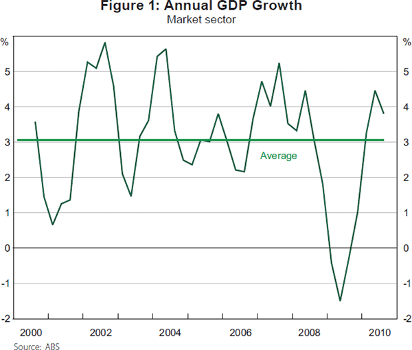
GDP growth averaged 3.1 per cent per annum over the 2000s. Figure 1 shows that consistently strong output growth occurred from 2004 to 2008, with relatively slower growth from 2000 to 2004 and during the GFC from 2008 to 2009. GDP growth in the 2000s was less than in previous decades, with average rates of 3.6 and 3.3 per cent, respectively, having occurred in the 1990s and 1980s.
Downturns in the Australian economy in the 2000s were much less severe than the recessions of the 1980s and 1990s. In particular, Australia managed to avoid a major recession during the GFC at the end of the decade. The strength of the Chinese economy, successful macroeconomic policy management and the Australian financial sector's lack of exposure to toxic securities sheltered the Australian labour market from the forces that buffeted US and European labour markets.
The composition of output in Australia in the 2000s continued to shift away from agriculture and manufacturing – for example, the share of GDP accounted for by manufacturing declined from 11.1 to 8.7 per cent. Industries that accounted for higher shares of GDP included: mining; construction; professional, scientific & technical services; and health care & social assistance.
In the 1980s and 1990s, globalisation and technological change were identified as major influences on patterns of labour demand. Usage of information technology (IT) continued to increase throughout the 2000s. There was rapid growth in internet usage and broadband subscriptions in the 2000s; the number of secure internet servers per million people increased from 176 in 2001 to 1716 in 2010 (World Bank 2011). Changes to international trade, however, appear to have been less pronounced over the most recent decade. In the 1990s the ratio of exports plus imports to GDP grew from 32 per cent to 40 per cent, but by 2008 had only reached 42 per cent (World Bank 2011).
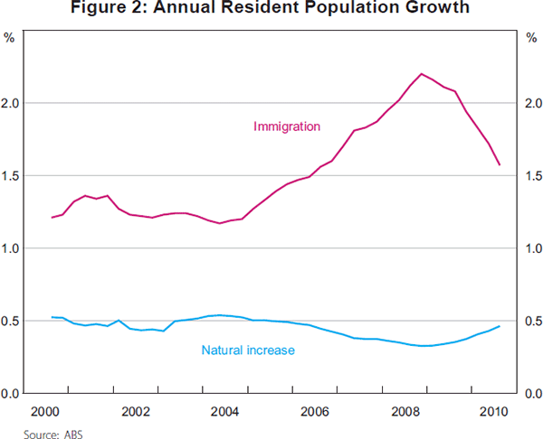
Population growth in the 2000s was relatively rapid, averaging 1.8 per cent per annum. Figure 2 shows that growth was particularly strong in the second half of the decade, caused by an expansion of immigration. In the late 2000s immigration accounted for almost 70 per cent of population growth, compared to only about 50 per cent in the early 2000s. The ageing of the Australian population continued in the 2000s. The proportion of the population aged 55 years and above grew from 21.4 per cent to 24.8 per cent, whereas the proportion aged less than 25 years declined from 34.6 per cent to 33.0 per cent.
4. Policy in the 2000s
4.1 Wage-setting and industrial relations
Significant reform of Australia's industrial relations system commenced in the late 1980s and early 1990s (see Dawkins (2000); Wooden (2001); and Borland (2003)). A series of reforms (including the Industrial Relations Amendment Act 1992 and 1994, and the Industrial Relations Reform Act 1993) encouraged the spread of enterprise bargaining, allowing a collective agreement for an individual enterprise registered with the Industrial Relations Commission to replace the award that would otherwise apply to those workers, provided a no-disadvantage test was met. Awards were defined to constitute a ‘safety net’. New unfair dismissal provisions were also introduced.
The Workplace Relations and Other Legislation Amendment Act 1996 introduced further reform: scope for agreements with individual workers; restrictions on the role of unions and multi-employer agreements; a reduced role for the award system, with the IRC restricted to setting minimum wages and conditions regarding 20 allowable matters, and no scope to arbitrate on matters above the minimum safety net; outlawing of union preference clauses, and discrimination in favour of union members; and limits on the right to strike.
As the reforms to the IR system were spread throughout the 1990s, and during that period were not ‘tested’ by a major downturn or by a booming sector in the economy, the 2000s take on significance as a period where any effects of these reforms might be revealed.
There was also further reform to the IR system in the 2000s. In the middle of the decade, the Howard Government introduced the new Work Choices system (2005/06). This system expanded the flexibility for negotiating new agreements by abolishing the no-disadvantage test, and restricting the safety net in awards to six minimum standards. A Fair Pay Commission was established to set minimum wage rates. Some restrictions on agreement content and union rights were introduced, and the scope for unfair dismissal claims against ‘small’ employers (100 or less employees) was removed. The scope of federal industrial relations regulation was expanded using the corporations power of the Constitution (Stewart 2006).
As part of its policy platform in the 2007 federal election, the ALP had committed to ‘wind back’ the Work Choices system. The outcome was the former Rudd Government's Fair Work Act 2009. The Act abolishes individual agreements, introduces requirements for parties to engage in collective bargaining in ‘good faith’, and restores the ‘no-disadvantage’ test in the form of a ‘better overall’ test. The Act initiated a process of award modernisation to create a reduced number of standardised awards that are consistent with a set of common National Employment Standards (NES). A greater role is provided for unions in agreement-making and for multi-employer agreements. Unfair dismissal conditions have been restored under ‘adverse action’ provisions. The 12-month window for preservation of wages and conditions for transferring employees is removed, and the coverage of these provisions has been expanded to include outsourcing. Referred powers from the states mean that all private-sector workers (except in Western Australia) are covered by the legislation (Sutherland and Riley 2010).
The effects of the Work Choices and Fair Work reforms have been much discussed and much contested in recent times. The relatively short periods in the 2000s for which the reforms were in place, however, are likely to make it difficult to ascertain their effects in a study of aggregate labour market outcomes in the past decade.
4.2 Active labour market programs
Major changes to active labour market programs in Australia occurred in the late 1990s with the introduction of the Job Network (JN) system. This system brought a ‘managed’ market with private sector provision of government-funded services for persons out of work. The JN model was the basis for labour market programs through the greater part of the 2000s. In 2009/10, the former Rudd Government introduced Job Services Australia (JSA), and Disability Employment Services – a new vehicle for provision of assistance to persons with a disability. JSA integrates previously separate services (such as JN and the Placement Employment and Training program), and has introduced new categories to characterise job seekers' extent of disadvantage and the timing and type of services they will receive from their chosen JSA provider (see Taskforce on Strengthening Government Service Delivery for Job Seekers (2011), Appendix C).
4.3 Welfare policy
Effects on labour supply from income support payments can derive from their eligibility requirements, or the level and structure of payments. The main reforms of these aspects of payments in Australia in the 2000s were to the Age Pension. The age of eligibility for the Age Pension for females is being progressively increased (from 61½ years in 2000 to 64 years in 2010, to reach 65 years on 1 July 2013). The Pension Bonus Scheme (PBS) for deferral of retirement was introduced in 1998, along with a reduced taper rate and increase in the free area in 2000; both designed to promote work activity among the aged population. In 2009 the PBS was closed and replaced with a Work Bonus Scheme, and the earlier changes to the taper rate were reversed. Changes for eligibility for the Disability Support Pension were also made on 1 July 2006, reducing the threshold number of hours for which a person must not be able to work from 30 hours to 15 hours per week.[1]
Activity test requirements have been progressively increased since the early 1990s, most notably for unemployment payment recipients. For Newstart Allowance and Youth Allowance recipients, extra job search monitoring was introduced via the Job Seeker Diary in 1996; and the Mutual Obligation Initiative requiring recipients aged 18 to 24 years and unemployed for more than six months to undertake an activity such as training, working as a volunteer or for a community work project was introduced from 1 July 1998 (and from 1 July 1999 for those aged 25 to 34 years). For Parenting Payment (single) recipients, the activity test requirement was changed on 1 July 2006 to apply from when their youngest child reached 6 years rather than 13 years of age. Extension of activity test requirements is consistent with the principle of Mutual Obligation, enshrined as a core principle of the welfare system by the Reference Group on Welfare Reform in its 2000 report (Reference Group on Welfare Reform 2000).
5. The Labour Market in the 2000s – An Overview
The 2000s saw relatively rapid growth in employment and the labour force in Australia – certainly by comparison with the 1990s. Table 1 shows that employment grew at an average of 2.3 per cent per annum over the decade, and labour force participation grew at 2.2 per cent; whereas population growth was 1.8 per cent per annum. The rate of growth in hours worked was less than in employment, due to a shift in the composition of employment from full-time to part-time jobs.
| Employment(a) | Aggregate monthly hours | Labour force(a) | Population(a) | GDP | Real unit labour costs (non-farm) | |
|---|---|---|---|---|---|---|
| 1980s | 2.2 | 2.0 | 2.3 | 2.0 | 3.3 | |
| 1990s | 1.4 | 1.4 | 1.3 | 1.4 | 3.6 | −0.1 |
| 2000s | 2.3 | 1.8 | 2.2 | 1.8 | 3.1 | −0.7 |
|
Note: (a) Based on civilian population aged 15+ years Source: ABS |
||||||
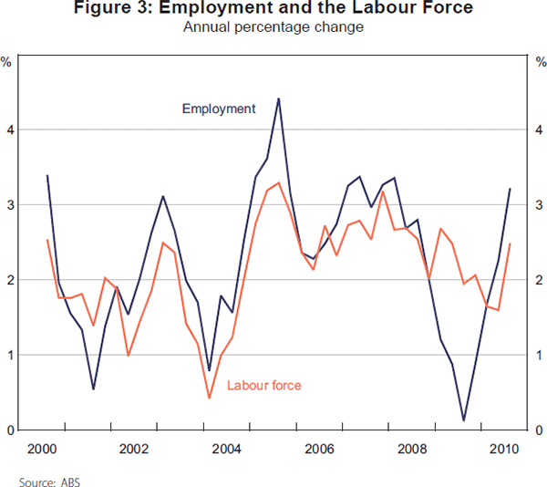
Growth in employment and the labour force is shown in Figure 3 to have been strongest from 2004 to 2008, with slower rates of growth in 2000/01, 2003/04 and 2008/09. To develop this point in a little more detail, Table 2 shows the average rates of growth for sub-periods during the 2000s. The annual rate of employment growth in 2004–2008 was about double that in the periods before and after. Variation in labour force participation between the sub-periods was more muted, but still evident.
| Employment | Labour force participation |
Population | |
|---|---|---|---|
| 2000:Q3–2004:Q3 | 1.5 | 1.4 | 1.6 |
| 2004:Q3–2008:Q3 | 3.2 | 2.6 | 1.9 |
| 2008:Q3–2010:Q3 | 1.7 | 2.2 | 2.2 |
|
Source: ABS |
|||
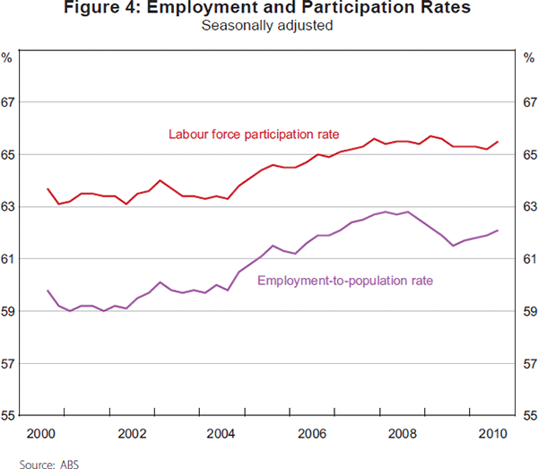
The employment-to-population rate and the labour force participation rate (LFPR) over the 2000s are displayed in Figure 4. Both can be seen to have increased strongly between 2004 and 2008, and been relatively steady in other periods – although both series show some decrease during the downturns of 2000–2001 and 2008–2009.
Growth in the part-time employment-to-population rate occurred consistently throughout the 2000s, explaining all of the increase in the aggregate employment-to-population rate over the decade. Cyclical variation in the aggregate employment-to-population rate was therefore explained by changes in the full-time employment-to-population rate. For example, the full-time employment-to-population rate increased by 3 percentage points from 2004 to 2008 (August), and then declined by 1.3 percentage points during the GFC downturn. As well as the share of part-time employment increasing in the 2000s, the share of female employment is shown in Table 3 to have continued to grow.
| August 2000 | August 2010 | |
|---|---|---|
| Female – full-time | 25.0 (27.9) | 24.7 (28.0) |
| Female – part-time | 19.4 (8.7) | 20.6 (10.3) |
| Male – full-time | 48.4 (60.2) | 45.6 (57.2) |
| Male – part-time | 7.2 (3.2) | 9.1 (4.5) |
|
Note: Figures in brackets are for aggregate monthly hours worked Source: ABS |
||
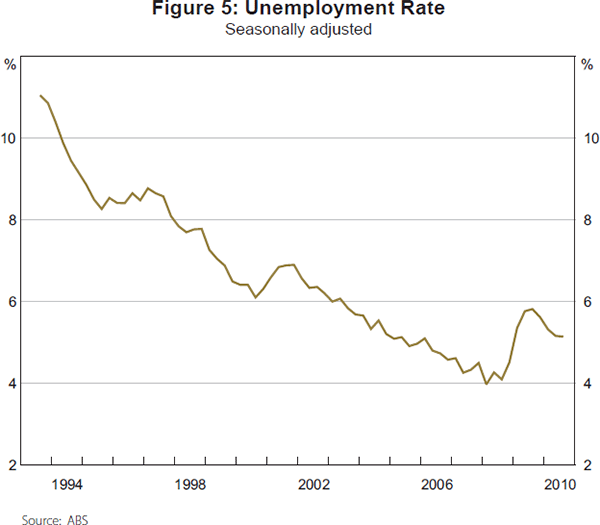
The evolution of the unemployment rate from its most recent peak in 1993:Q3 to the end of the 2000s is shown in Figure 5. After decreasing fairly steadily to reach 6.1 per cent in 2000:Q3, the rate of unemployment then increased for a short period, rising to 6.9 per cent in 2001:Q4. After this brief downturn, the downward trajectory resumed, and the rate of unemployment fell to 4.1 per cent in 2008:Q3. The GFC caused a rise in the rate of unemployment over four quarters to 5.8 per cent, before it fell again to 5.1 per cent by 2010:Q3.
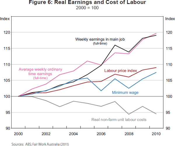
Changes in real earnings and labour costs in the 2000s are displayed in Figure 6. All measures reported show that workers across the earnings distribution appear to have had increases in their real (CPI-adjusted) earnings during the 2000s. Average real weekly earnings increased by about 20 per cent from 2000 to 2010. The real labour price index (LPI) measure shows labour costs increasing steadily over the decade, by a total of about 10 per cent. Given that the LPI measure does not incorporate the effects of changes to the skill composition of the workforce, and to some extent will exclude the effects of increases in capital per worker, it is to be expected that it would show a slower rate of growth than the weekly earnings series. Workers who earn minimum wages also had higher real earnings over the 2000s, but only by about 5 per cent. Finally, real non-farm unit labour costs are shown to have declined consistently, by a total amount of about 6 per cent over the decade. This compares with the 1990s, where real unit labour costs showed little change (see Table 1).
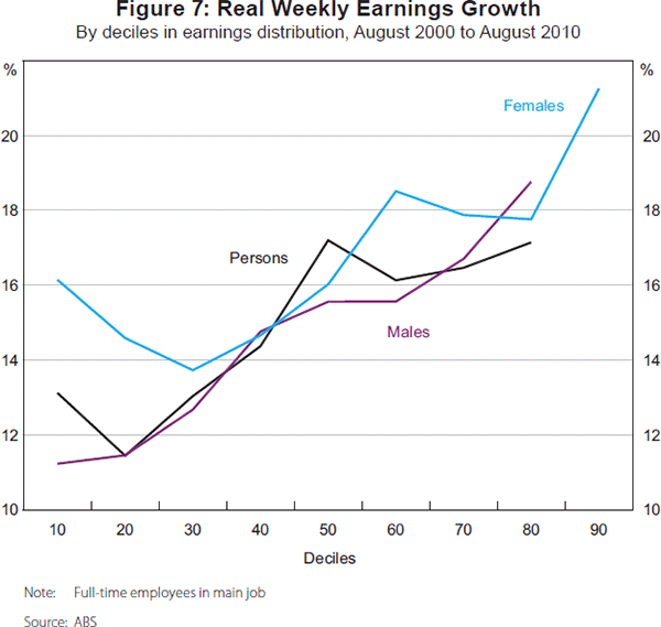
Increases in earnings inequality continued in the 2000s. Figure 7 shows changes in real weekly earnings for full-time workers in main job by deciles in the earnings distribution. Growth in real earnings was generally positively related to position in the earnings distribution. For example, female workers at the 90th percentile had earnings increases that were about 5 percentage points higher than for workers at the 10th percentile. Increases in earnings inequality in the 2000s do, however, seem to have been less than in the 1990s; primarily because of smaller increases in inequality in above-median earnings.
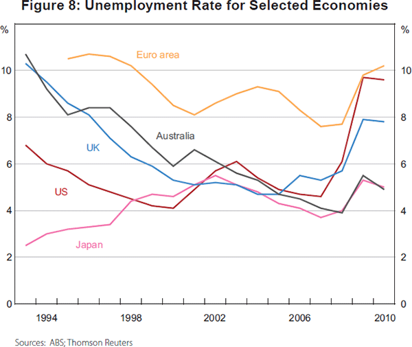
Australia's labour market performance in the 2000s compared favourably with other industrial economies. As an illustration, Figure 8 shows the rate of unemployment in Australia and other developed economies over the past two decades. Following the early 1990s recession, Australia's rate of unemployment was similar to that in the United Kingdom and the euro area countries, and well above the United States. In the period to 2008 it fell to be below the average in euro area countries, converging to that of the United States. A much smaller increase in its rate of unemployment than in the euro area countries, the United Kingdom or United States during the GFC left Australia, at the end of the 2000s, with a rate of unemployment considerably lower than in those economies.
6. Labour Supply
6.1 Aggregate labour force participation
The 2000s saw strong growth in the LFPR, which increased by 1.9 percentage points over the decade, after a puzzling lack of growth in the 1990s recovery (Dawkins 2000, p 324). The sources of the increase in the LFPR can be decomposed into the effects of changes to the age composition of the population and changes to the LFPR within age groups. This exercise is reported in Table 4. Ageing of the population would have caused the participation rate to decline by 1.5 percentage points due to older age groups having relatively lower participation rates. Against this, increases in participation rates within age groups for both the Australian-born and immigrant populations caused the participation rate to increase by 3.3 percentage points.
| Contribution of: | Percentage points |
|---|---|
| Change in composition of Australian-born population by age | −1.0 |
| Change in LFPR within age groups in Australian-born population | +2.2 |
| Change in composition of immigrant population by age | −0.5 |
| Change in LFPR within age groups in immigrant population | +1.2 |
| Total change in LFPR | +1.9 |
|
Source: ABS |
|
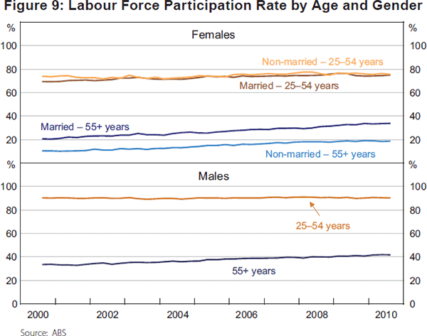
Therefore, the next question to ask is which age groups experienced increases in their LFPR that explain the rise in the aggregate LFPR. Table 5 reports the findings from the decomposition analysis disaggregated by age and gender. The main sources of the increase in the aggregate LFPR are shown to have been increases in the LFPR of females aged 25 to 54 and 55 years and above, and males aged 55 years and above. These results are reinforced in Figure 9, which displays the LFPR of disaggregated age and gender groups from 2000 to 2010. For example, the LFPR of males aged 55 years and above is shown to have increased from 33.5 to 41.8 percentage points during the 2000s.
| Contribution of: | Percentage points |
|---|---|
| Females | |
| Married – 15–24 years | +0.1 |
| Married – 25–54 years | +1.1 |
| Married – 55+ years | +1.0 |
| Not married – 15–24 years | −0.3 |
| Not married – 25–54 years | +0.1 |
| Not married – 55+ years | +0.6 |
| Males | |
| 15–24 years | −0.3 |
| 25–54 years | 0.0 |
| 55+ years | +1.0 |
| Composition effect | −1.5 |
| Total change in LFPR | +1.9 |
|
Source: ABS |
|
6.2 Female participation continues its upward trajectory
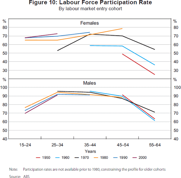
A variety of potential explanations exist for the growth in the LFPR of females aged 25 to 54 years during the 2000s. In part, this growth was due to cohort effects, as influences such as increasing educational attainment and changing attitudes to female labour participation have caused labour force participation to rise with date of entry to the labour market, an effect that then extends through the age distribution as each cohort gets older.
The top panel of Figure 10 shows the pattern of cohort effects for females who were aged 15 to 24 at 10-year intervals from 1950 to 2000. Each line shows the participation rate for a particular cohort as they move into different age brackets over time. The line labels reflect the year in which that particular cohort was in the 15–24 age bracket. Each observation is the participation rate of that cohort at 10-year intervals from 1950 to 2010. Profiles of labour supply for these cohorts are clearly ordered by time of entry to the labour market. More recent cohorts have rates of labour force participation that are higher, and less variable, throughout the life cycle.
Other possible explanations for increases in female participation that have been discussed are the growing availability of part-time and flexible employment, improvements to the availability of child care (Breunig et al 2011), and debt-servicing costs for home owners (for example, Connolly, Davis and Spence (2011) describe increases in the proportion of females aged 30–60 years with home loans, and an approximately 10 percentage point differential in LFPR between females in households with and without home loans; see also Belkar, Cockerell and Edwards (2007)).
6.3 The mature age population bounces back
Increases in labour force participation by the older population, similarly, can be ascribed to a variety of sources. For females, cohort effects are again a potential explanation, together with the rising pension age and increases in household indebtedness (Connolly et al 2011). However, for males, cohort effects appear to have been less important. The bottom panel of Figure 10 shows that the recent growth in the LFPR of older males is a departure from what would be expected based on cohort patterns; most notably, the profile for the cohort aged 15 to 24 in 1970 crosses those of older cohorts.
Kennedy and Da Costa (2006) make the point that the bounce back in participation by older males is common across industrialised economies. This suggests that we should be looking for a set of causes that are also largely shared between those economies. Possible explanations might therefore be increasing life expectancy, strong business cycle conditions (at least until the late 2000s), the growth in service sector jobs (which are less physically demanding), and improved health of the older population.[2]
Kennedy, Stoney and Vance (2009) found that for the first half of the 2000s the strongest increases in participation for the older population in Australia occurred for the group with no post-school qualifications, which suggests that strong economic conditions and health improvements may have played a role. Warren (2011) considers whether increases in female participation might have caused married males to delay retirement in order to be able to co-ordinate retirement with their partners. Her analysis of retirement decisions of males and females aged 55 to 70 years, using the HILDA database for 2002–2008, finds that the hazard rate for exit to retirement for both males and females is significantly lower when their partner remains in the labour market.
6.4 Immigrants – how composition affected the LFPR
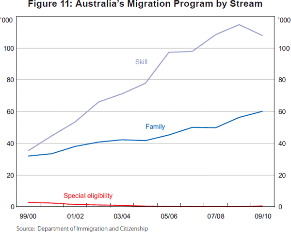
Prior to the 2000s, the LFPR for immigrants had declined for the previous 20 years – from 63.8 per cent in 1980 to 57.8 per cent in 2000. The reversal of this pattern in the past decade, with the LFPR increasing to 60.3 per cent, is therefore striking. There are several possible explanations for the growth in labour force participation by immigrants: increased emphasis on skilled and employer-sponsored migration in the permanent migration program (see Figure 11); increasing openness to temporary migrants such as working holiday-makers and skilled workers who have high rates of participation; and policy reform that restricted access to welfare payments for permanent immigrants in their first two years after arrival (for analysis, see Hsieh and Kohler (2007), Connolly et al (2011) and Cully (2011)).
7. Employment
7.1 Aggregate employment
The 2000s was a period of relatively strong growth in aggregate employment and hours worked. Increases in employment were particularly strong in the years from 2004 to 2008, which matches the timing of the highest rates of growth in GDP. Comparison with previous decades (see Table 1) suggests that the rate of growth in employment over the decade was larger than might have been expected given the rate of GDP growth.
One explanation for the relatively strong employment growth may have been favourable labour cost conditions in the 2000s. It has already been noted that real unit labour costs declined in the 2000s (Figure 6). An extra perspective on labour costs is provided in Figure 12, which graphs a series of weekly ordinary time earnings for full-time adult male workers adjusted by the CPI (consumer real wage), along with GDP per hour worked. Labour productivity can be seen to have increased more quickly than the consumer real wage up until the mid 2000s, and while this gap then narrowed, it still increased by about 1.5 percentage points more over the decade.[3]
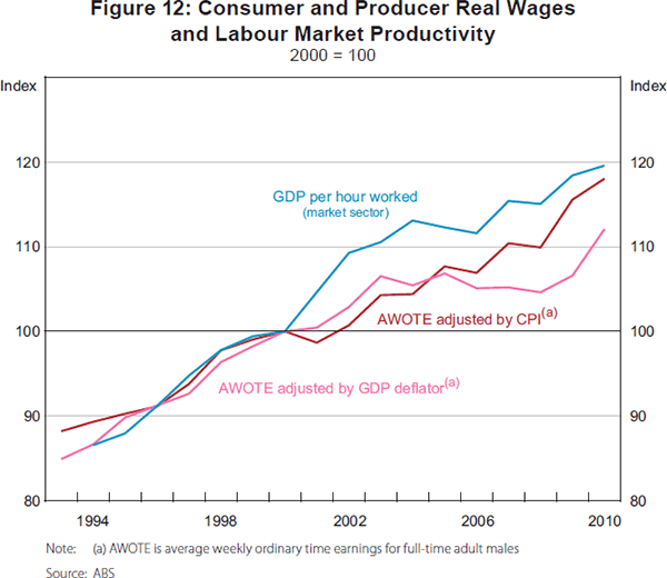
Figure 12 also shows the weekly earnings series adjusted using the GDP deflator (producer real wage). Whereas growth in the producer real wage was slightly higher than the consumer real wage in the 1990s following the early 1990s recession, in the 2000s growth in consumer wages was higher than producer wages by 6 percentage points. This pattern can be explained by the dramatic improvement in Australia's terms of trade in the second half of the 2000s.
7.2 The industry composition of employment – a story of services, mining and manufacturing
The shares of employment growth by industry in Australia for the whole decade and for sub-periods in the 2000s are shown in Table 6. One feature that stands out is the consistent importance of service sector employment as a source of employment growth. Over the 2000s, increasing employment in the three service sectors shown in the table (professional, scientific & technical services; education & training; and health care & social assistance) accounted for 41 per cent of total employment growth in Australia. A second feature is the role of increases in mining employment (after 2004), and construction employment (up to 2008), which were the source of about 20 per cent of total employment growth. The timing of changes to mining and construction employment is important for explaining the concentration of growth in total employment in the years from 2004 to 2008, when almost 60 per cent of employment growth for the decade occurs. A third feature is the decline in manufacturing employment, continuing a pattern from previous decades.
| 2000–2004 | 2004–2008 | 2008–2010 | ||||||
|---|---|---|---|---|---|---|---|---|
| Entire period | (25.9) | (57.7) | (16.4) | |||||
| By industry: | ||||||||
| Mining | 2.8 | (0.7) | 6.1 | (3.5) | 6.7 | (1.1) | ||
| Manufacturing | −2.8 | (−0.7) | −1.1 | (−0.6) | −14.8 | (−2.4) | ||
| Construction | 17.8 | (4.6) | 15.6 | (9.0) | 1.5 | (0.2) | ||
| Professional, scientific & technical services | 6.4 | (1.6) | 11.3 | (6.5) | 22.3 | (3.6) | ||
| Education & training | 11.4 | (2.9) | 9.4 | (5.4) | 12.1 | (2.0) | ||
| Health care & social assistance | 21.4 | (5.5) | 10.8 | (6.2) | 46.2 | (7.6) | ||
|
Note: Figures in brackets report the share of total employment growth over the entire period 2000–2010 Source: ABS |
||||||||
The description of employment growth by industry is further developed in Figure 13. It shows the share of total employment in each industry in 2000, and the share of growth in total employment from 2000 to 2010 accounted for by each industry. From the figure it can be seen that the employment shares of health care & social assistance, professional, scientific & technical services, mining, and construction increased quite substantially, and shares of agriculture, forestry & fishing, and manufacturing declined. For example, the health care & social assistance industry, which had 9.8 per cent of total employment in 2000, accounted for 19.3 per cent of the increase in employment in the 2000s.
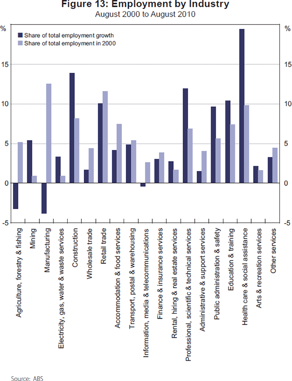
The changes to the industry composition of employment in the 2000s appear to largely reflect changes to the structure of economic activity – such as the increase in mining and construction activity, growth in demand for child care and aged care, and the declining share of manufacturing output. For example, the share of construction in GDP increased from 5.2 to 7.3 per cent during the 2000s, and correspondingly its share of employment grew from 8.1 to 9.4 per cent.
7.3 The occupational composition of employment – insecurity in routine jobs?
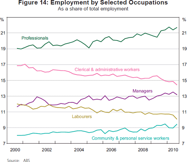
Shares of total employment for selected occupations in Australia from 2000 to 2010 are shown in Figure 14. The composition of employment shifted towards managerial, professional, and community & personal service workers, and away from clerical & administrative workers and labourers. For example, the share of workers in managerial and professional occupations increased from 30.6 to 34.8 per cent over the decade.
Changes in the occupational composition of employment appear to be partly related to changes in the industry structure of employment. A decomposition analysis (see Table A2) found that changes in employment by industry appear able to explain a large fraction of changes in employment in the professional, community & personal service, machinery operator & driver, and labourer occupations.
In the United States and Europe, recent attempts to explain changes in the occupational distribution of employment have emphasised the effects of IT adoption. In both locations there is evidence of a U-shaped pattern of relative demand for labour by skill level, with increases in relative demand for workers at the bottom and top of the skill distribution (Goos, Manning and Salomons 2009; Acemoglu and Autor 2010). This pattern, it has been argued, reflects changes in the demand for tasks (and the labour to perform those tasks) due to IT adoption. This explanation classifies tasks according to the role of cognitive skills and their degree of routine. Computer-based technologies are regarded as being able to substitute for workers performing tasks that are cognitive and routine (such as basic clerical jobs) or non-cognitive and routine (such as operation of basic machinery), but not for tasks that are cognitive and non-routine (such as management), or non-cognitive and non-routine (such as aged care). Therefore, IT adoption will, for example, decrease relative demand for medium-skill labour that performs basic clerical or machine operated-related tasks. Empirical analysis appears to confirm that changes to the occupational distribution of employment in the United States and Europe can be explained in this way (see, for example, Autor and Dorn (2009) and Goos et al (2009)).
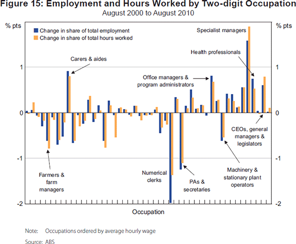
To examine whether the same effects of IT adoption might explain changes in the occupational distribution of employment in Australia, Figure 15 graphs the change in the share of employment by two-digit occupation, with occupations ordered by their average hourly wage. The pattern can not be described as a U-shape; nevertheless, there is some evidence that appears consistent with effects of IT adoption on demand for tasks by their degree of routinisation and the cognitive skills required. The largest increases in demand have occurred for the cognitive non-routine tasks of management and professional activities, and the non-cognitive non-routine task of caring. The largest decreases in demand have occurred for the cognitive routine tasks of numerical clerical work and secretarial assistance, and the non-cognitive routine task of machinery & plant operation.
7.4 Hours of work – the decline of the long work week
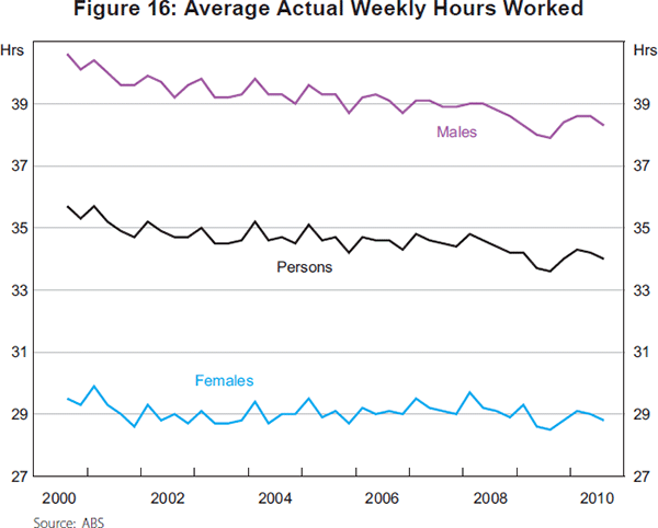
A notable aspect of the evolution of employment in the 2000s has been a decrease in average hours of work. After remaining relatively stable from 1980 to 2000, Figure 16 shows that during the 2000s average (actual) weekly hours worked declined from 35.7 to 34.0. Table 7 reports the findings from a decomposition analysis of the sources of this change. It shows that the decrease occurred mainly due to a decline in the proportion of males working 50 to 59 hours and more than 60 hours.
| Hours | |
|---|---|
| Change in average actual weekly hours worked | −1.68 |
| Change in average actual weekly hours worked due to changes in the ‘distribution’ of hours worked | −1.65 |
| Decomposition of ‘distribution’ effect: | |
| 1–15 hours | +0.03 |
| 16–29 hours | +0.35 |
| 30–34 hours | +0.55 |
| 35–39 hours | +0.45 |
| 40 hours | −0.24 |
| 41–44 hours | −0.27 |
| 45–49 hours | −0.37 |
| 50–59 hours – males | −0.54 |
| 50–59 hours – females | −0.14 |
| 60+ hours – males | −1.34 |
| 60+ hours – females | −0.13 |
|
Source: ABS |
|
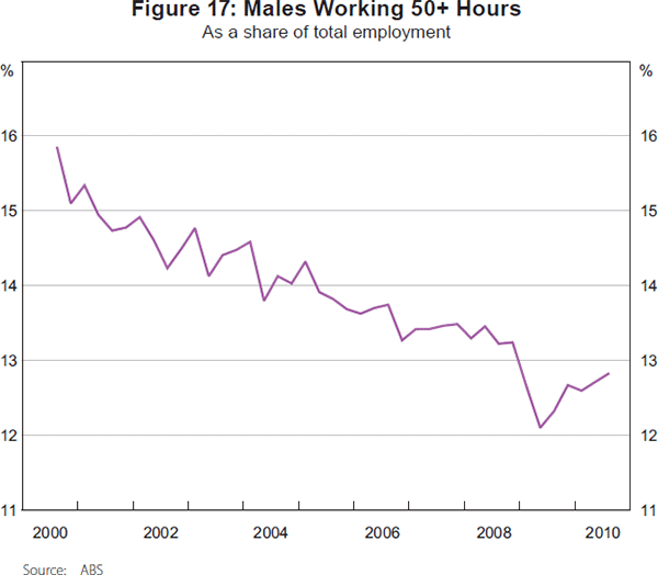
The proportion of males working more than 50 hours is shown in Figure 17. Over the 2000s it declined from 15.8 per cent to 12.8 per cent. Analyses of the effects of changes to the industry and occupational composition of employment (available on request from the author) found that virtually none of the change in the distribution of hours worked can be explained by these changes. Hence, the explanation for the reduced proportion of males working long hours must be one that has a broad impact across industries and occupations.
7.5 Did a rising tide lift all boats?
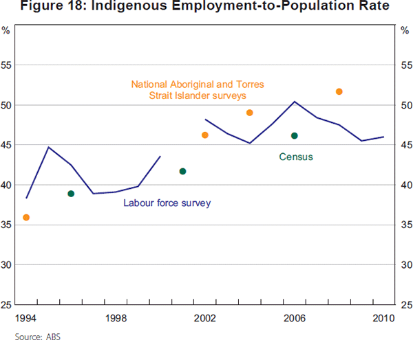
A question that has arisen in other economies which have experienced sustained periods of strong growth is whether the ‘rising tide has lifted all boats’. At least to some extent this occurred in Australia in the 2000s. First, Figure 18 provides data from a variety of sources on employment-to-population rates for the indigenous population. Each of the sources suggests that some increase has occurred between the 1990s and the 2000s; although obviously there is still a significant margin to close the gap to the non-indigenous population (Hunter 2010). Second, the significance of the jobless family problem declined. The fraction of families with children under 15 with no adult employed fell from 16.4 per cent to 9.8 per cent (Table A1, row 18). Third, some studies have suggested improved labour outcomes for the population group with low education attainment (see, for example, Kennedy et al (2009)).
8. Unemployment
8.1 The rate of unemployment
Over the decade of the 2000s, the rate of unemployment fell by 1 percentage point. In the period from the end of 2001 until the GFC in late 2008 it declined by 2.8 percentage points. But this effect was offset by the downturn at the beginning of the decade where it rose by 0.8 percentage point, and during the GFC where it increased by 1.7 percentage points.
Table 8 reports the findings of a decomposition of the sources of change in the rate of unemployment for the whole decade and during these sub-periods. The difference between sub-periods where the unemployment rate increased and decreased can be seen to be primarily explained by differences in changes in the male and female full-time employment-to-population rate. During upswing phases, increases in the full-time employment-to-population rate contribute to decreasing the rate of unemployment, whereas in downturns, decreases in the full-time employment-to-population rate are the major cause of a higher rate of unemployment.
| Change in unemployment rate |
Effect of: | |||||||||
|---|---|---|---|---|---|---|---|---|---|---|
| Males | Females | |||||||||
| FTE/POP | PTE/POP | LF/POP | FTE/POP | PTE/POP | LF/POP | |||||
| 1993:Q3–2000:Q3 | −5.0 | −0.7 | −1.9 | −0.5 | −2.0 | −2.9 | +3.0 | |||
| 2000:Q3–2010:Q3 | −1.0 | +1.3 | −2.2 | 0.0 | −0.8 | −2.1 | +2.8 | |||
| 2000:Q3–2001:Q4 | +0.8 | +1.1 | −0.7 | −0.4 | +0.9 | −0.3 | −0.5 | |||
| 2001:Q4–2008:Q3 | −2.8 | −2.0 | −0.5 | +0.5 | −2.3 | −1.3 | +2.7 | |||
| 2008:Q3–2009:Q3 | +1.7 | +2.3 | −0.9 | −0.2 | +1.1 | −0.4 | −0.1 | |||
| 2009:Q3–2010:Q3 | −0.7 | −0.1 | −0.1 | +0.1 | −0.5 | −0.1 | +0.7 | |||
|
Note: The decomposition is derived from: ut ≈ −ln[α mt ( (FTE/POP) mt • (POP/LF) mt) + α mt( (PTE/POP) mt • (POP/LF) mt) + (1 – α mt) ( (FTE/POP) ft • (POP/LF) ft) + (1 – α mt)((PTE/POP) ft· • (POP/LF) ft)] where ut is the rate of unemployment, α mt = proportion of males in labour force at time t,(FTE /POP) mt and (PTE/POP)mt are the full-time and part-time employment-to-population rates for males, and (POP/LF)mt is the inverse of the labour force participation rate for males. The decomposition of the change in the rate of unemployment between periods t and t + 1 is undertaken by sequentially varying components of the expression for the rate of unemployment (from period t to period t + 1 values) in the order shown in the table. Sources: ABS; author's calculations |
||||||||||
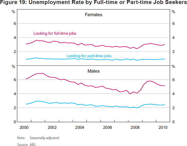
A further perspective on the role of variability in full-time employment in explaining cyclical movements in the rate of unemployment is provided in Figure 19. It shows that it is fluctuation in the size of the group of unemployed looking for full-time jobs (mainly males) that is the main source of changes in the rate of unemployment.
8.2 Okun's Law
To consider how the rate of unemployment has evolved with changes to growth in output, Figure 20 graphs Okun's Law – showing the four-quarter change in the rate of unemployment and the annual rate of growth in GDP, using quarterly data from 1979:Q1 to 2011:Q1. A linear regression, reported in the figure, implies that the rate of unemployment is stabilised at a rate of GDP growth of 3.2 per cent; and that a 1 per cent increase in the rate of growth of GDP will cause a 0.4 percentage point reduction in the rate of unemployment (quite close to estimates by Hughes (2000) for the period from the mid 1970s to the end of the 1990s).
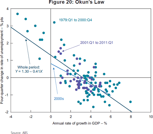
The figure also identifies separately the periods prior to and after 2000, in order to examine whether there might have been a change in the relation between changes to the rate of unemployment and GDP growth during the 2000s. Some clustering of observations for the 2000s below the regression line is evident, suggesting a change in the relationship.
Extending the regression by including a dummy variable for the 2000s and an interaction of the dummy with the rate of GDP growth provides some limited support for a statistically significant change in the nature of Okun's Law in the 2000s. These extra variables are jointly significant at the 10 per cent level. They indicate that the stabilisation rate of GDP growth decreased to 2.7 per cent in the 2000s; and that the increase in the rate of unemployment from a given rate of GDP growth is generally lower. This shift is consistent with there being higher rates of employment growth in the 2000s due to favourable labour cost conditions; however, the effect represented by the Okun relation will also reflect the relatively high rate of growth in labour force participation in the 2000s.
8.3 Other dimensions – long-term unemployment and underemployment
Looking within and beyond the rate of unemployment is important for gaining a complete picture of the state of labour supply and labour demand, and for understanding the wellbeing of labour force participants. First, there is the issue of the proportion of unemployed who are long-term unemployed. Second, there is the question of whether the rate of unemployment provides a satisfactory measure of the underutilisation of labour.
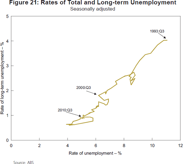
The rate of long-term unemployment fell during the 2000s from about 1.5 per cent to less than 1 per cent (see Figure 21). The relation between the rates of unemployment and long-term unemployment remained stable in the 2000s and the ‘loop’ pattern that has characterised the relation during previous downturns (where changes in the rate of long-term unemployment lag changes in the rate of unemployment) is also evident in the downturns of the 2000s.
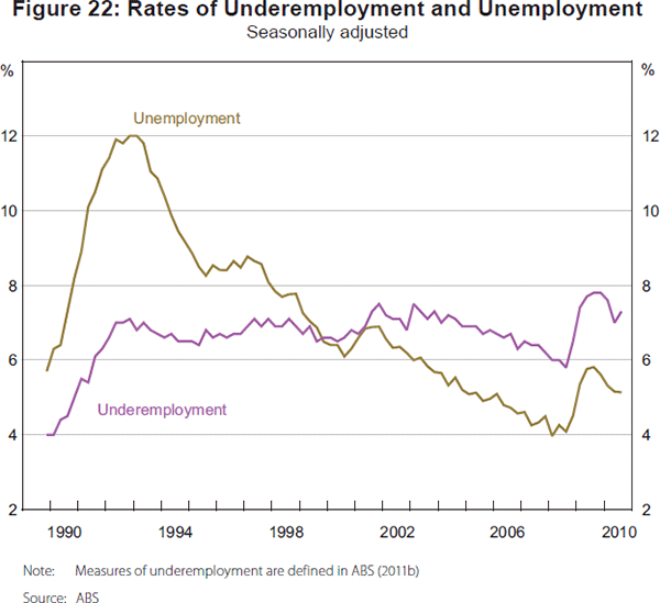
The rates of underemployment and unemployment from the beginning of the 1990s recession onwards are shown in Figure 22. The rate of underemployment is the number of persons currently employed who want, and are available, to work more hours, expressed as a proportion of the labour force. It increased during the early 1990s, and since that time has remained relatively stable. Hence, the rate of labour underutilisation, calculated as the sum of the rates of unemployment and underemployment, has shown a weaker downward trend since the early 1990s than the rate of unemployment. In August 2010 the rate of labour underutilisation remained at 12.4 per cent. Underemployment is known to be concentrated disproportionately among the younger population (over 30 per cent for those aged 15 to 24 years) and among females (almost 60 per cent).[4]
9. The State Dimension – Is There a Two-speed Labour Market?
9.1 The mining boom, services and state-level employment growth
Geographic concentration of the mining boom of the 2000s, particularly in Western Australia, Queensland and the Northern Territory, has meant that there has been considerable interest in state-level labour market outcomes.
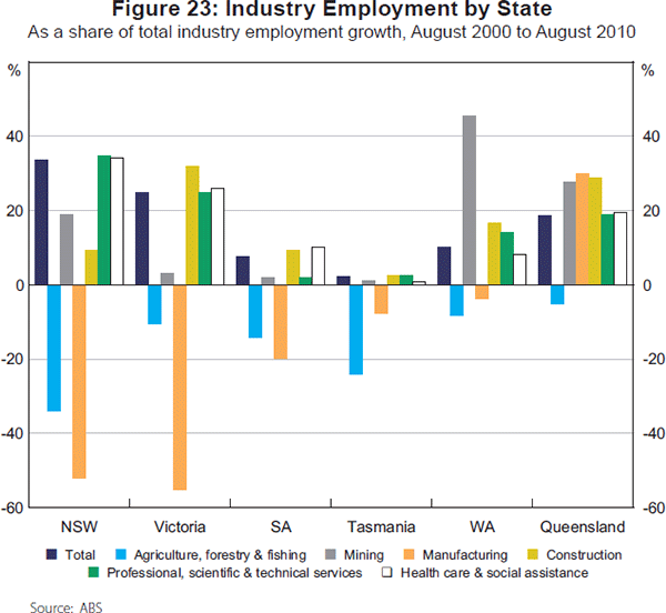
Figure 23 provides one way of seeing how the industrial composition of employment by state has mattered for employment outcomes in the 2000s. It graphs the share of the change in total employment in selected industries by state from 2000 to 2010. Growth in mining and construction employment can be seen to have been disproportionately concentrated in Western Australia and Queensland, while the decline in manufacturing has been disproportionately concentrated in Victoria and New South Wales. Growth in employment in the professional, scientific & technical services and health care & social assistance industries, by contrast, has been roughly proportionate to the share of total employment in each state.
To see how these changes have translated into changes in aggregate labour market outcomes, Table 9 shows changes in employment and labour force participation for the decade and sub-periods, distinguishing between non-mining and mining states.[5]
| 2000:Q3–2010:Q3 | 2000:Q3–2004:Q3 | 2004:Q3–2008:Q3 | 2008:Q3–2010:Q3 | |
|---|---|---|---|---|
| Average annual rate of growth – % | ||||
| Non-mining states | ||||
| Employment | 1.9 | 1.2 | 2.6 | 1.9 |
| Labour force participation | 1.8 | 1.1 | 2.3 | 2.2 |
| Population | 1.6 | 1.3 | 1.6 | 2.0 |
| Mining states | ||||
| Employment | 3.1 | 2.5 | 4.6 | 1.3 |
| Labour force participation | 2.9 | 2.1 | 4.1 | 2.2 |
| Population | 2.6 | 2.0 | 3.0 | 2.8 |
| Difference (mining – non-mining) – % pts | ||||
| Employment | +1.3 | +1.4 | +2.1 | −0.6 |
| Labour force participation | +1.2 | +1.0 | +1.8 | 0.0 |
| Population | +1.0 | +0.7 | +1.4 | +0.8 |
|
Source: ABS |
||||
Employment, labour force and population all grew more strongly in the mining states compared with the non-mining states during the 2000s, with the largest difference being evident in the period from 2004 to 2008. Nevertheless, applying a decomposition analysis (reported in Table 10) finds that the increase in the employment-to-population rate in Australia of 3 percentage points from 2004 to 2008 is explained to equal extents by increases in the employment-to-population rates in the non-mining and mining states. The larger size of the non-mining states means that they need a smaller increase in their employment-to-population rate than the mining states in order to make the same contribution to increasing the aggregate employment-to-population rate.
| 2004:Q3–2008:Q3 | 2008:Q3–2010:Q3 | |
|---|---|---|
| Change in employment-to-population rate | +3.0 | −0.7 |
| Change due to: | ||
| Change in non-mining employment-to-population rates | ||
| NSW | +0.6 | −0.1 |
| Victoria | +0.5 | 0.0 |
| SA | +0.2 | 0.0 |
| Tasmania | +0.1 | −0.1 |
| ACT | +0.1 | 0.0 |
| Change in mining employment-to-population rates | ||
| WA | +0.6 | −0.2 |
| Queensland | +0.8 | −0.4 |
| NT | +0.1 | 0.0 |
|
Source: ABS |
||
Employment growth in the non-mining states in the 2000s mainly derived from strong growth in service sectors – such as health care & social assistance – and may also reflect spillover effects from the mining states (for example, Garton (2008) shows that differences in growth in final demand between mining and non-mining states is larger than differences in growth in gross state product).
During the GFC, the mining states experienced larger slowdowns in employment growth than the non-mining states. The decomposition analysis shows that all of the decrease in the aggregate employment-to-population rate of 0.7 percentage points in the GFC was due to the declining employment-to-population rate in the mining states.
9.2 Did the mining boom cause a wage breakout?
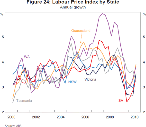
Have differences in employment growth between the mining and non-mining states in the 2000s translated into differences in wage growth? Figure 24 shows the annual rate of growth in the labour price index (LPI) by state during the 2000s. Rates of growth were broadly comparable across the states until late 2004, after which point, until the end of 2009, wage growth in WA and Queensland was considerably in excess of that in other states. For example, from November 2004 to 2009, the LPI in WA increased by 25.5 per cent, compared with 19.9 per cent in NSW.
Having established that the mining states have had higher rates of wage growth in the second half of the 1990s, it is also of interest to ask whether these wage increases are ‘excessive’, or a departure from what might have been predicted to occur in the non-mining states. As a rudimentary way to explore this question, Figure 25 graphs the annual rate of growth in total employment and in the average LPI for mining and non-mining states using quarterly data from 2000:Q3 to 2010:Q3.
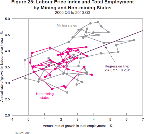
Mining states have obviously had higher rates of employment growth and increases in the LPI (see also Kennedy, Luu and Goldbloom (2008)). However, a regression line estimated on the full set of observations appears to have observations from both mining and non-mining states fairly evenly divided above and below the line. Slightly more formally, introducing an interaction term for mining states into the regression, it is not possible to reject that the relation between wage growth and employment growth is the same in mining and non-mining states.
While mining states have had higher rates of wage growth than non-mining states, it appears that wage growth has been in proportion to the higher rates of employment growth in those states. Interstate labour mobility and immigration targeted at regional and skill shortages are likely to have moderated wage pressure in the mining states. For example, Connolly et al (2011) show that in 2009/10457 visa holders accounted for 3 per cent of employment in the mining industry. What is also noteworthy about the pattern of wage changes is that the higher rates of wage increase in the mining states have not flowed on to the non-mining states.
10. What Happened in the Downturns?
10.1 The 2000s downturns – shorter and milder
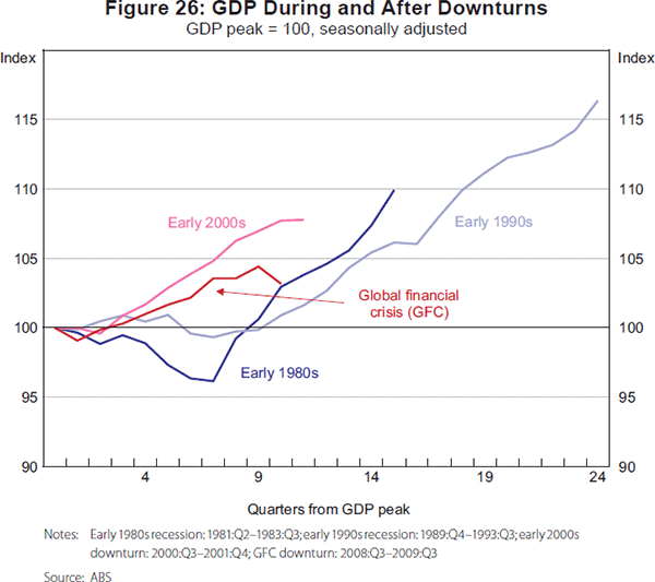
In the 2000s the Australian economy experienced two main downturns; in 2000–2001 and 2008–2009. Neither of these downturns was as severe – either in depth or duration – as the recessions of the early 1980s and 1990s. This is evident from Figure 26 which displays the evolution of GDP during these four episodes.
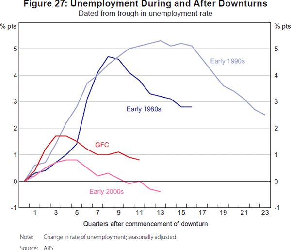
The shorter duration and smaller magnitude of downturns in the 2000s is reflected in what happened to the rate of unemployment (dated from the trough in the rate of unemployment). For the first four to five quarters during the downturns in the 2000s, it can be seen from Figure 27 that the rate of unemployment followed a quite similar pattern to the recessions of the 1980s and 1990s. But after that point, the rate of unemployment in the 2000s downturns began to decline, whereas it continued to increase in the earlier episodes.[6]
10.2 Did the labour market adjust differently in the 2000s?
One interesting aspect of downturns in the 2000s is the way that adjustment happened. During downturns there is a decrease in the total hours worked in the economy. This decrease in total hours worked can come from a decrease in persons employed or a decrease in hours worked per person. To examine this adjustment, Table 11 decomposes changes in total monthly hours worked between the effects of changes in persons employed and changes in average monthly hours worked. This is done for each of the downturn periods, and also for the first eight quarters of recovery.
| Change in total monthly hours worked | Change in persons employed | Change in average monthly hours worked | Share of change in total monthly hours worked due to change in average monthly hours worked | ||
|---|---|---|---|---|---|
| Downturn | |||||
| Early 1980s | −4.1 | −2.0 | −1.9 | 47.5 | |
| Early 1990s | −2.8 | −2.2 | −0.6 | 21.5 | |
| Early 2000s | −2.5 | +0.7 | −3.2 | 127.8 | |
| GFC | −2.5 | +0.1 | −2.6 | 104.8 | |
| Recovery (8 quarters) | |||||
| Early 1980s | +8.3 | +6.1 | +2.0 | 26.1 | |
| Early 1990s | +8.2 | +8.0 | +0.2 | 2.6 | |
| Early 2000s | +5.1 | +4.4 | +0.7 | 14.6 | |
| GFC(a) | +4.9 | +4.6 | +0.4 | 8.0 | |
|
Note: (a) 7 quarters Source: ABS |
|||||
In the recessions of the 1980s and 1990s, most of the decrease in total monthly hours worked came from a decrease in employment. By contrast, in the 2000s the reduction in total monthly hours worked is entirely accounted for by reduced average monthly hours (in fact, total persons employed increased slightly in both downturns). In the recovery phase following each downturn almost all the upward adjustment in total monthly hours worked comes from an increase in persons employed – and this is common to all episodes.
An implication of the way employment and hours adjusted in the 2000s is that we observe decreases in average hours worked during each downturn, and these decreases are not subsequently reversed during the recovery phases.[7]
The greater role of adjustment in average hours worked in the 2000s also had consequences for how the excess supply of labour during downturns was manifested – in unemployment versus underemployment. In the 1980s recession the rate of unemployment increased by 4.7 percentage points compared with a 1.3 percentage point increase in the rate of underemployment. But in the 2000s downturns, the increases in the rates of unemployment and underemployment were, respectively, 0.8 and 0.7 percentage points in 2000–2001, and 1.7 and 2 percentage points in 2008–2009. Hence, reflecting the larger share of adjustment accounted for by average hours worked in the 2000s, increases in the rate of underemployment account for a larger share of the rise in the rate of labour underutilisation.
10.3 Why might adjustment have been different?
A possible explanation for why employment did not adjust in the 2000s downturns was their short duration. In the initial phase of downturns employers may seek to retain workers with firm-specific human capital, and instead adjust to lower demand by decreasing their employees' hours of work. If it eventuates that the downturn is of longer duration, then employers are forced to also decrease employment.
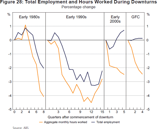
To address this explanation, Figure 28 graphs the percentage change in employment and total monthly hours worked by quarter during the four downturn episodes. In the early stages (first four to five quarters) of the 1980s and 1990s recessions, adjustment did happen to a greater degree via changes to hours worked than was the case later in those recessions. Hence it may be that some of the apparent change in how adjustment occurred during downturns in the 2000s was due to the short duration of those episodes.
At the same time, it does not seem that the 2000s downturns simply involved employers retaining the same group of workers and decreasing their hours of work. Wooden (2011), from analysis of HILDA data in the late 2000s, concludes that most of the decrease in hours worked in the GFC was due to the destruction of jobs with longer hours and creation of jobs with shorter hours, rather than employers adjusting the hours of continuing employees.
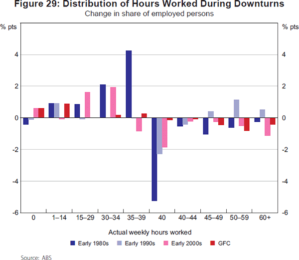
Figure 29 graphs the changes in the distribution of hours worked in each downturn. While not able to identify how changes to hours of work occurred, it does show that there were large-scale changes in the distribution of hours worked in downturns in the 2000s. In those downturns there were decreases in the proportions of workers in all categories of longer weekly work hours (40 hours and more), and increases in the proportions working shorter weekly hours (34 hours and less). This compares with the 1980s where the main change in the distribution of hours was more minimal – away from working 40 hours per week towards working 35 to 39 hours. In the 1990s there was a shift towards working longer hours, and away from working 40 hours.
Reforms to the industrial relations system, allowing employers greater flexibility in choosing their employees' work hours, have been suggested as a further explanation for changes to how adjustment occurred in the 2000s (see, for example, Sloan (2011)). In this regard it seems important to note that there were changes to how adjustment occurred in both downturns in the 2000s. If industrial relations reform is the explanation, it must have been the reforms of the 1990s that mattered most. A movement away from longer hours may also have reflected workers seeking to adjust – being consistent with stated preferences that indicate those working longer hours are more likely to want to work fewer hours (see Connolly et al (2011) for evidence from the HILDA survey on workers' preferences).
11. What do the Beveridge Curve and Phillips Curve Tell Us about the Labour Market in the 2000s?
How adjustment happens in the Australian labour market can also be examined using the Beveridge curve and the Phillips curve – the former providing a perspective on the efficiency of matching processes in the labour market, and the latter revealing the relation between labour demand and wage outcomes.
Questions which naturally arise about the 2000s are whether the mining boom and possible labour shortages might have caused a reduction in matching efficiency; and whether there is evidence of effects on wage-setting in Australia from reforms to macroeconomic policy and the industrial relations system, or increasing exposure to international trade.
11.1 Beveridge curve
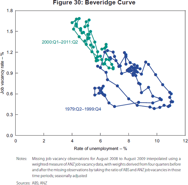
A Beveridge curve graphing the relation between the rate of unemployment and the job vacancy rate in Australia from 1979:Q2 to 2011:Q2 (using quarterly data) is shown in Figure 30. Observations for the 2000s are distinguished from earlier observations.
To investigate the Beveridge curve relation in more detail, I estimated the following models:
Where ut, vt, and ltuet are, respectively, the rate of unemployment, job vacancy rate and the long-term unemployed as a proportion of the labour force, and I(Post2001/1) is an indicator variable, equal to one for the period post-2001Q:1 and zero otherwise.
Equation (1a) is a form of Beveridge curve that is often estimated (see, for example, Kennedy et al (2008)). Equation (1b) is a quadratic specification estimated to allow extra flexibility in the Beveridge curve functional form. Allowing extra flexibility seems important for considering whether any shift in the curve has occurred – since identifying a shift essentially involves out-of-sample prediction from the pre-2000 observations.
Findings from estimation of the Beveridge curve models are reported in Table 12. Results for both models, including just the vacancy rate and proportion of long-term unemployed as explanatory variables, are reported in columns (1) and (4). The explanatory variables have the expected signs. For example, the positive sign on the long-term unemployment variable indicates that decreases in the proportion of long-term unemployed in the 2000s would have moved the Beveridge curve inwards over the decade.
| Model 1a | Model 1b | ||||||
|---|---|---|---|---|---|---|---|
| (1) | (2) | (3) | (4) | (5) | (6) | ||
| Constant | 1.49** (0.015) | 1.53** (0.02) | 1.50** (0.02) | 6.39** (0.30) | 6.13** (0.33) | 6.22** (0.32) | |
| ln(vt) | −0.22** (0.02) | −0.18** (0.02) | −0.21** (0.02) | ||||
| vt | −3.39** (0.58) | −2.77** (0.68) | −3.02** (0.67) | ||||
| vt2 | 0.88** (0.29) | 0.46 (0.38) | 0.64 (0.36) | ||||
| Ituet | 0.25** (0.01) | 0.23** (0.01) | 0.25** (0.01) | 1.82** (0.06) | 1.84** (0.06) | 1.84** (0.06) | |
| Dummy variable post-2004:Q3 | −0.07** (0.02) | 0.31 (0.18) | |||||
| Dummy variable post-2007:Q3 | −0.3 (0.02) | 0.25 (0.19) | |||||
| Dummy variable for inputed vacancy rate observations (2008:Q3 to 2009:Q3) | 0.04 (0.04) | 0.15 (0.25) | |||||
| Adjusted R-squared | 0.93 | 0.93 | 0.93 | 0.95 | 0.95 | 0.95 | |
| Observations | 129 | 129 | 129 | 129 | 129 | 129 | |
| Notes: Standard errors are shown in brackets; * and ** indicate significance at the 5 and 1 per cent level, respectively | |||||||
To examine whether the mining boom might have affected matching efficiency, a shift dummy variable for the post-2004:Q3 period was introduced. Findings are reported in columns (2) and (5) of Table 12. With the log specification, the shift variable suggests that the Beveridge curve moved inwards post-2004:Q3, whereas the quadratic specification suggests no change.
As it is difficult to be precise about when the mining boom might have begun to create significant extra demand in the labour market, I also experimented with shift variables for later periods. In these specifications the shift variable is almost always insignificant, and is always insignificant when a dummy variable for the quarters with imputed vacancy observations is included. For example, columns (3) and (6) report results from models including a shift variable for the post-2007:Q3 period.
Overall, my interpretation is that the Beveridge curve relation is likely to have shifted inwards due to decreases in long-term unemployment in the 2000s, but that there is little evidence of an outward shift coinciding with the mining boom. Hence, increases in the vacancy rate that occurred in the 2000s seem likely to mainly represent movements along the same Beveridge curve. The efficiency of job matching in the economy as a whole did not worsen appreciably in the 2000s, notwithstanding much discussion of skill shortages in this time (see Coelli and Wilkins (2008) for a summary of this discussion).
As a final exercise, I follow Kennedy et al (2008) in calculating a ‘natural rate’ of unemployment from the Beveridge curve (using the model in column (1) of Table 12 and assuming a vacancy rate of 1.2 per cent). I estimate that reducing the long-term rate of unemployment from about 1.5 to 1 per cent in the 2000s would have decreased the natural rate of unemployment by about 0.7 percentage point.
11.2 Phillips curve
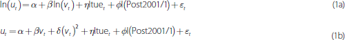
A Phillips curve graphing the relation between the annual rate of growth in the CPI and the rate of unemployment from 1978:Q1 to 2011:Q2 (using quarterly data) is shown in the top panel of Figure 31. There appear to be two parts to the graph – an inverse relation up until the latter part of the 1990s, and then a much flatter (or almost no) relation after that time.[8]
To verify the visual impression, I estimated the following simple regression:

Where ΔCPIt,t–4 represents year-ended CPI inflation, ut is the rate of unemployment and I(Post1997/1) is an indicator variable, equal to one for the period post-1997:Q1 and zero otherwise. The results from this model are reported in column (1) of Table 13. They confirm that there has been an inward shift and substantial flattening of the Phillips curve relation after the latter part of the 1990s.
| (1) | (2) | (3) | (4) | (5) | |
|---|---|---|---|---|---|
| Constant | 17.76** (1.72) | 15.89** (0.97) | 3.10** (0.80) | 3.83** (0.83) | 3.85** (0.75) |
| ut | −1.39** (0.14) | −0.38** (0.17) | −0.28** (0.08) | −0.16 (0.09) | −0.14** (0.05) |
| I(Post1997/1) | −11.63** (1.75) | −0.98 (0.50) | −1.86** (0.86) | −0.37 (1.00) | |
| I(Post1997/1) * ut | 0.81** (0.26) | −0.04 (0.23) | 0.14 (0.12) |
0.02 (0.09) |
|
| Lagged inflation (ΔCPIt−1,t−5) | 0.87** (0.04) | 0.80** (0.04) | 0.80** (0.04) | ||
| Rate of underemployment | −1.41** (0.17) | −0.30** (0.11) | −0.36** (0.08) | ||
| Dummy variable for 2006:Q1–2009:Q4 – I(2006/1–2009/4) | −0.27 (0.47) | ||||
| I(2006/1–2009/4) * ut | −0.03 (0.09) | ||||
| Adjusted R-squared | 0.63 | 0.75 | 0.93 | 0.93 | 0.93 |
| Observations | 133 | 133 | 133 | 133 | 133 |
| Notes: Standard errors are shown in brackets; * and ** indicate significance at the 5 and 1 per cent level, respectively | |||||
Kuttner and Robinson (2008) have previously explored this issue and also find evidence of a flattening of the Phillips curve for Australia. They suggest firmer anchoring of inflation expectations (via the introduction of inflation targeting) and increasing exposure to international trade as possible explanations. Reforms to the system of wage-setting in Australia in the 1990s might also have affected the Phillips curve. For example, the introduction of enterprise bargaining and reductions in the extent of flow-on between workers in their wage increases could have moderated the inflationary effects of changes to labour demand.
Another possible explanation for the flattening relates to the measurement of labour demand. The divergent trends in the rates of unemployment and underemployment since the 1990s raise the question of whether the rate of unemployment is an appropriate proxy for demand pressure. Therefore, it seems sensible to undertake analysis of the robustness to alternative measures of demand pressure.[9]
The bottom panel of Figure 31 shows an alternative graph of the Phillips curve relation, using the rate of labour underutilisation as the proxy for demand. It is obvious that observations are now more clustered, and there is less evidence of a bifurcation of the relation from the latter part of the 1990s. To re-examine the question of whether there has been some shift in the Phillips curve relation, the rate of underemployment is included as an extra explanatory variable in Equation (2). The results are reported in column (2) in Table 13. The rate of underemployment is found to have a significant negative effect on inflation, and its inclusion in the model causes the structural change variables to be no longer significant.
In other results reported in Table 13 (columns (3) and (4)), I also include a lagged inflation term, and find the same pattern of results. In addition, I experimented with alternative time periods for structural change in the Phillips curve (for the 2000s only, and for sub-periods in the 2000s – such as the Work Choices era in column (5)) – and in each case found the same pattern of results.
The analysis of the Phillips curve therefore casts doubt on the suitability of the rate of unemployment as a proxy for demand pressures in the labour market. The increasing importance of hours adjustment in downturns, and hence the greater share of the cyclical response in labour underutilisation accounted for by underemployment, indicates that a broader measure of labour underutilisation may be appropriate.
Using a broader measure of labour underutilisation suggests that the impression of a weakening relation between inflation and labour market demand using the rate of unemployment is in part due to mismeasurement of labour demand. In interpreting my estimates of the Phillips curve, however, it is also necessary to be aware that the rate of labour underutilisation will overcorrect for the effect of underemployment. This is because an unemployed person will have a large number of underutilised hours of labour, whereas an underemployed person will have much fewer under-utilised hours. But the rate of labour underutilisation weights each person equally.[10]
Hence, while mismeasurement of labour demand may explain some part of the movement in the Phillips curve since the late 1990s, it also seems likely that a weakening of the relation between inflation and labour demand pressure occurred during this time. Distinguishing more precisely the shift in the Phillips curve from the effect of mismeasurement, and exploring the reasons for the shift, seem important topics for giving a better understanding of the determinants of inflation in Australia.
12. Summary and Conclusion
The 2000s saw relatively strong growth in employment and labour force participation – at least by comparison with the 1990s. Rates of growth in employment and participation were highest in the period from 2004 to 2008, with downturns in 2000–2001, 2003–2004 and 2008–2009 (the latter associated with the GFC).
The rate of growth in aggregate employment was of course strongly related to patterns of growth in GDP. It also seems that the decline in real unit labour costs in the 2000s may explain the strong employment outcome.
Increases in labour force participation in the 2000s occurred due to increasing rates of participation for females aged 25 to 54 years, and males and females aged 55 years and above. Participation rates increased for both the Australian-born and immigrant populations (thereby reversing the pattern of decreasing participation rates for immigrants in the past 20 years).
Increased participation for females aged 25 to 54 years is likely to have largely been due to the flowthrough effects of increasing participation by cohort, but may also have been caused by household financial considerations. For the older population there is a large set of possible explanations and further work would be needed to address their relative importance. However, the fact that the rise in participation has been a common phenomenon among industrial economies indicates that the main explanations are likely to also be common across countries – such as the greater proportion of the workforce in less physically demanding jobs, or improved health. The rise in participation rates of immigrants is likely to have been due to an increase in the relative importance of skilled migration and using migration to deal with areas of labour shortage.
Significant changes in the composition of employment took place in the 2000s. First, there was a continuing trend towards female and part-time employment. Second, the shares of employment in mining and construction, professional, scientific & technical services, and health care & social assistance increased, while manufacturing and agriculture declined. Third (and somewhat related), the occupational composition of employment shifted towards jobs at the top and (to some degree) the bottom of the earnings distribution – management and professional jobs and carer jobs – and away from jobs in the middle of the earnings distribution such as numerical clerks and secretaries. Changes in the industrial and occupational composition of employment seem to reflect changes in the composition of GDP, and are also consistent with increasing use of IT-related capital substituting for workers doing ‘routine’ jobs.
Over the decade of the 2000s the rate of unemployment declined by 1 percentage point. For most of the decade the unemployment rate was falling, but increased in 2000–2001 and during the GFC of 2008–2009. Consistent with the downturns in GDP growth in the 2000s having been milder than in the 1980s or 1990s, the rate of unemployment increased by much less during these episodes. Increases in the rate of unemployment during the downturns in the 2000s were mainly associated with a decline in the full-time employment-to-population rate, whereas the part-time employment-to-population rate increased considerably throughout the decade.
The rate of long-term unemployment declined over the 2000s. In particular, the mildness of the downturns in the 2000s meant that long-term unemployment did not increase to account for the same proportion of unemployment or the labour force as was the case in the recessions of the 1980s and 1990s. This is likely to have implications for the capacity to reduce the rate of unemployment further in the coming decade.
There were also interesting developments to working hours during the 2000s. First, average hours of work declined by about 1.7 hours, after having been stable for the previous two decades. This was mainly caused by a decrease in the proportion of males working longer hours, and occurred within all one-digit industry and occupation groups. Second, much of the decrease in average hours worked was concentrated in the downturns during the 2000s. That adjustment in the downturn phases occurred via changes to average hours worked rather than the number of persons employed, which was a major departure from the experience of the recessions of the 1980s and 1990s.
The apparent role of changes to average hours worked in adjustment to downturns in the 2000s might be explained by the short duration of those episodes, with employers seeking to hoard labour to retain firm-specific human capital. A comparison with the longer recessions of the 1980s and 1990s provides some support for this view. Another possibility is that industrial relations reforms of the 1990s have allowed employers greater flexibility in how they adjust the total hours of their workforce.
The aspect of adjustment in the Australian labour market that attracted most attention in the 2000s was how the mining boom played out. The shares of the mining and construction industries in total employment increased, and growth in these sectors in 2004–2008 was important for explaining why aggregate employment growth occurred disproportionately in this phase of the 2000s. While the mining states increased their share of employment, growth in all states in service-related industries meant that non-mining states still accounted for about 50 per cent of total employment growth.
The mining boom was associated with high rates of growth in wages for mining workers and in the mining states in the latter part of the 2000s. But the increases that occurred were in proportion to rates of increase in labour demand and there was no general breakout in wage inflation. As well, there is little evidence at the national level of labour shortages causing a decline in the efficiency of matching in the 2000s. Hence the institutional framework in the Australian labour market, and the use of immigration policy to address labour shortages, appear to have allowed the mining boom to be accommodated without causing major disruption.
From one perspective this might not be surprising. The mining sector is a small share of total employment, and so it could be argued that adjustment in the sector should happen without substantial effects on the overall Australian labour market. An alternative perspective, however, sees this outcome as a significant achievement. Previous episodes, such as the mining boom of the early 1980s, were associated with major periods of wage inflation. Not having this happen in the 2000s can therefore be considered a demonstration of how adjustment occurs differently in the Australian labour market today compared with 30 years ago.
The Phillips curve provides a more general way to study wage inflation. A first look at this relation gives an impression of a shift in the nature of wage-setting from the late 1990s onwards, with the Phillips curve moving inward and showing a decreased responsiveness of inflation to demand pressure. This impression turns out to partly reflect the measure of labour demand used. Including a broader measure of labour demand, that incorporates the increasing importance of underemployment as a component of labour underutilisation, shows less evidence of a shift. Nevertheless, it seems reasonable to conclude that some shift in the Phillips curve has occurred. This shift may reflect changes to macroeconomic policy, to the industrial relations system, or possibly increasing exposure of the Australian economy to international trade. A weakened relation between inflation and labour demand from the late 1990s onwards is consistent with the mining boom having had a minimal effect on wage inflation in Australia.
Consideration of the Beveridge curve and Phillips curve indicates that the natural rate of unemployment is likely to have decreased during the 2000s. Using the Beveridge curve model I estimate a decrease in the natural rate of 0.7 percentage points over the decade due to a decline in the proportion of long-term unemployed. An inward shift of the Phillips curve since the late 1990s, associated, for example, with changes to Australia's wage-setting system, is also consistent with a decrease in the natural rate having occurred. Hence, at the end of the 2000s, it appears that policy-makers in Australia can be aiming for a lower rate of unemployment than at the start of the decade.
Appendix A
| 1980 | 1990 | 2000 | 2010 | |
|---|---|---|---|---|
| (1) Aggregate employment-to-population rate(a) | 61.0 | 62.5 | 63.9 | |
| (2) LFPR(a) | 56.6 | 57.2 | 60.6 | |
| (3) Share of FT employment | 83.6 | 78.7 | 73.1 | 70.1 |
| hours worked | 93.2 | 90.9 | 88.1 | 85.1 |
| (4) Share of male employment | 63.4 | 58.4 | 55.7 | 54.7 |
| hours worked | 70.4 | 66.0 | 63.6 | 61.7 |
| (5) Lego labour market – coefficient of compositional change (CCC)(b) | 0.063 | 0.056 | 0.030 | |
| (6) Manufacturing share of employment | 15.8(c) | 14.4 | 12.1 | 8.9 |
| (7) Mining and construction share of employment | 8.7(c) | 8.7 | 8.7 | 10.7 |
| (8) Industry employment – CCC(b) | 0.041(d) | 0.072 | 0.073 | |
| (9) Share of ‘mining state’ employment – WA, Qld and NT | 24.7 | 27.2 | 29.8 | 32.4 |
| (10) State labour markets – CCC(b) | 0.029 | 0.027 | 0.027 | |
| (11) Share of employment of workers aged 25–54 years | 64.1 | 69.6 | 71.6 | 67.0 |
| (12) Employment by age – CCC(b) | 0.066 | 0.068 | 0.061 | |
| (13) Employment-to-population rate of: | ||||
| Australian-born | 57.6 | 60.8 | 62.8 | 64.9 |
| Immigrants | 59.8 | 57.0 | 54.0 | 57.1 |
| Immigrant share of aggregate employment | 26.1 | 25.7 | 24.4 | 26.8 |
| (14) LFPR of: Australian-born | 61.2 | 65.2 | 67.0 | 68.1 |
| Immigrants | 63.8 | 61.8 | 57.8 | 60.3 |
| Immigrant share of aggregate labour force | 26.2 | 25.9 | 24.5 | 26.9 |
| (15) Share of population with a bachelor degree or above | 5.8(e) (15+ years) |
8.4 (15–69 years) |
15.7 (15–64 years) |
23.0 (15–64 years) |
| (16) Rate of unemployment(a) | 7.4 | 8.5 | 5.1 | |
| (17) Per cent of long-term unemployed | 19.9 | 20.6 | 26.0 | 18.1 |
| (18) Share of families with children under 15 with no parent employed | 8.0 | 12.9 | 16.4 | 9.8(f) |
| (19) Rate of labour underutilisation(a) | 11.0 | 15.1 | 11.9(f) | |
| (20) Rate of underemployment(a) | 3.6 | 6.6 | 6.8 | |
| (21) Annual average rate of growth in AWOTE – Full-time | ||||
| Real | 0.20(g) | 1.45 | 1.85 | |
| Nominal | 8.10(g) | 3.85 | 4.70 | |
| (22) Annual average rate of growth in LPI | ||||
| Real | 0.90 | |||
| Nominal | 3.75 | |||
| (23) Annual average rate of growth in real GDP per hour worked | 1.30 | 2.15 | 1.40 | |
| market sector | 1.75 | |||
| (24) Weekly earnings full-time employees in main job – 80/20 percentile ratio | ||||
| Males – ratio | 1.94 | 1.93 | 2.12 | 2.26 |
| Females – ratio | 1.87 | 1.86 | 1.89 | 1.96 |
| (25) Female-to-male ratio of: | ||||
| Average weekly earnings for full-time employees in main job | 77.8 | 79.2 | 79.6 | 79.6 |
| Average adult ordinary time hourly earnings for non-managerial employees | 87.9 | 90.5 | 91.8 | 90.0 |
| (26) Share of employees having pay set by: | ||||
| Awards only | 23.2 | 15.8 | ||
| Registered collective agreements | 36.8 | 45.3 | ||
| Unregistered individual agreements | 40.0 | 38.9 | ||
| (27) Average weekly hours of work | 35.8(c) | 35.9 | 35.7 | 34.0 |
| (28) Per cent of males working 50+ hours | 21.5(c) | 25.5 | 29.8 | 24.7 |
| (29) Share of current job with duration less than 1 year | 22.3 | 26.5 | 23.6 | 18.0 |
| (30) Share of current job with duration more than 10 years | 20.7 | 21.8 | 24.4 | 24.5 |
| (31) Trade union density | 49.0(e) | 41.0 | 24.7 | 18.3 |
|
Notes: (a) Average in previous decade Sources: ABS; RBA |
||||
| 2000:Q3 | 2010:Q3 | 2010:Q3 | |
|---|---|---|---|
| Share of employment taking account only of change in industry composition of employment |
|||
| Occupation | |||
| Manager | 11.6 | 13.2 | 10.7 |
| Professional | 19.1 | 21.8 | 20.7 |
| Technician and trade worker | 15.3 | 14.9 | 15.2 |
| Community and personal service | 8.0 | 9.5 | 8.6 |
| Clerical and administrative | 16.8 | 14.5 | 17.2 |
| Sales | 10.2 | 9.9 | 9.9 |
| Machinery operator and driver | 6.9 | 6.4 | 6.7 |
| Labourer | 12.1 | 9.8 | 11.0 |
| Hours of work | |||
| 0 | 4.5 | 5.5 | 4.6 |
| 1–14 | 12.2 | 11.9 | 12.4 |
| 15–29 | 12.7 | 14.4 | 13.0 |
| 30–34 | 6.8 | 8.5 | 7.0 |
| 35–39 | 15.0 | 16.1 | 15.0 |
| 40 | 15.1 | 14.4 | 15.1 |
| 41–44 | 4.8 | 4.2 | 4.8 |
| 45–49 | 8.3 | 7.7 | 8.4 |
| 50–59 | 10.3 | 9.9 | 10.2 |
| 60+ | 10.3 | 7.4 | 9.5 |
|
Source: ABS |
|||
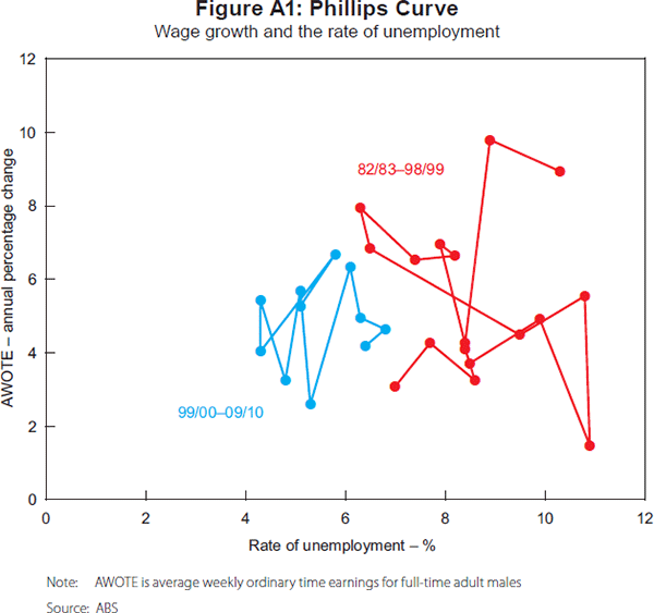
Footnotes
Department of Economics, University of Melbourne. I am grateful for helpful discussions with Mick Coelli, Ian McDonald and Lawrence Uren, for comments from participants in the Brown bag seminar at the University of Melbourne, and from Michael Plumb, Jonathan Kearns and other participants at a seminar at the Reserve Bank, as well as to Mark Wooden, Roger Wilkins and Guyonne Kalb for assistance with the policy discussion. I have made several revisions and extensions to the version of the paper that was presented at the RBA Conference – I thank the participants, and in particular David Gruen and Judy Sloan, for their comments at the Conference. Email: jib@unimelb.edu.au. [*]
For an overview, see FaHCSIA (2010). [1]
See Cai and Kalb (2007) on the importance of health status as a determinant of labour force participation in the older population in Australia. [2]
For reviews of productivity in Australia in the 2000s, see Productivity Commission (2010) and Eslake (this volume). [3]
Wilkins (2006) examines the main correlates of underemployment. [4]
Western Australia, Queensland and the Northern Territory are defined as ‘mining’ states. This is a useful simplification for trying to summarise state-level outcomes; Hughes (2008), however, does make the important point that the experience of the mining states has been far from identical. [5]
Plumb, Baker and Spence (2010) note that when the evolution of the rate of unemployment is examined using the peak in GDP to date the beginning of downturns, the rate of unemployment was much slower to adjust to the downturn in GDP in the GFC than in previous episodes, which they argue is due to labour market tightness. [6]
Evidence on the size of adjustment in aggregate monthly hours is different if different start and end dates for the downturn are chosen. But the qualitative findings on differences in adjustment between the 2000s and earlier time periods remain – see ABS (2011a). [7]
A similar pattern exists using the rate of change in average weekly earnings as the measure of inflation – see Figure A1. [8]
For a similar analysis for an earlier period, see Dawkins and Wooden (1985) and Gregory (1986); and for a review of Phillips curve analysis in Australia, see McDonald (2002). [9]
The solution would be to use a volume-weighted measure of labour underutilisation. Unfortunately this is only available from the ABS for the 2000s. [10]
References
ABS (Australian Bureau of Statistics) (2011a), ‘Labour Force Characteristics During Recent Economic Downturns’, ‘Australian Labour Market Statistics’, ABS Cat No 6105.0, January, pp 20–29.
ABS (2011b), ‘Labour Underutilisation – More than Unemployment’, ‘Australian Labour Market Statistics’, ABS Cat No 6105.0, January, pp 12–16.
Acemoglu D and D Autor (2010), ‘Skills, Tasks and Technologies: Implications for Employment and Earnings’, NBER Working Paper No 16082.
Autor D and D Dorn (2009), ‘The Growth of Low Skill Service Jobs and the Polarization of the U.S. Labor Market’, NBER Working Paper No 15150.
Belkar R, L Cockerell and R Edwards (2007), ‘Labour Force Participation and Household Debts’, RBA Research Discussion Paper No 2007-05.
Borland J (2003), ‘Labour Markets and Industrial Relations’, in I McAllister, S Dowrick and R Hassan (eds), Cambridge Handbook of the Social Sciences in Australia, Cambridge University Press, Cambridge, pp 94–117.
Breunig R, A Weiss, C Yamauchi, X Gong and J Mercante (2011), ‘Child Care Availability, Quality and Affordability: Are Local Problems Related to Labour Supply?’, Economic Record, 87(276), pp 109–124.
Cai L and G Kalb (2007), ‘Health Status and Labour Force Status of Older Working-Age Australian Men’, Australian Journal of Labour Economics, 10(4), pp 227–252.
Chapman B (1990), ‘The Labour Market’, in S Grenville (ed), The Australian Macro-Economy in the 1980s, Proceedings of a Conference, Reserve Bank of Australia, Sydney, pp 7–65.
Coelli M and R Wilkins (2008), ‘Are Skills Shortages a Constraint on Increasing Employment in Australia?’, The Australian Economic Review, 41(3), pp 310–322.
Connolly E, K Davis and G Spence (2011), ‘Trends in Labour Supply’, RBA Bulletin, June, pp 1–8.
Cully M (2011), ‘How Much do Migrants Account for the Unexpected Rise in the Labour Force Participation Rate in Australia over the Past Decade?’, Paper presented at the 40th Australian Conference of Economists, Canberra, 11–14 July.
Dawkins P (2000), ‘The Australian Labour Market in the 1990s’, in D Gruen and S Shrestha (eds), The Australian Economy in the 1990s, Proceedings of a Conference, Reserve Bank of Australia, Sydney, pp 316–352.
Dawkins P and M Wooden (1985), ‘Labour Utilization and Wage Inflation in Australia: An Empirical Examination’, Economic Record, 61(2), pp 516–521.
Debelle G and J Borland (eds) (1998), Unemployment and the Australian Labour Market, Proceedings of a Conference, Reserve Bank of Australia, Sydney.
FaHCSIA (Department of Families, Housing, Community Services and Indigenous Affairs) (2010), Income Support Customers: A Statistical Overview 2010, Statistical Paper No 9, Department of Families, Housing, Community Services and Indigenous Affairs, Canberra. Available at <http://www.fahcsia.gov.au/about/publicationsarticles/research/statistical/Pages/stp_9.aspx>.
Fair Work Australia (2011), ‘Statistical Report – 2010–11 Annual Wage Review’.
Garton P (2008), ‘The Resources Boom and the Two-Speed Economy’, Economic Roundup, 3, pp 17–29.
Goos M, A Manning and A Salomons (2009), ‘Job Polarization in Europe’, The American Economic Review, 99(2), pp 58–63.
Gregory RG (1986), ‘Wages Policy and Unemployment in Australia’, Economica, 53(210), pp S53–S74.
Gregory RG and RC Duncan (1979), ‘The Labour Market’, WE Norton (ed), Conference in Applied Economic Research, Reserve Bank of Australia, Sydney, pp 256–319.
Hsieh W and M Kohler (2007), ‘Immigration and Labour Supply’, RBA Bulletin, September, pp 8–13.
Hughes B (2000), ‘Discussion’, in D Gruen and S Shrestha (eds), The Australian Economy in the 1990s, Proceedings of a Conference, Reserve Bank of Australia, Sydney, pp 353–359.
Hughes B (2008), ‘What do State Occupational Data Say about Macro Wage Equations?’, The Australian Economic Review, 41(3), pp 298–309.
Hunter B (2010), ‘Revisiting the Relationship Between the Macroeconomy and Indigenous Labour Force Status’, Economic Papers: A Journal of Applied Economics and Policy, 29(3), pp 320–332.
Industry Commission (1997), Changing Labour Markets: Prospects for Productivity Growth, Workshop Proceedings, Industry Commission, Melbourne.
Kennedy S and A Da Costa (2006), ‘Older Men Bounce Back: The Re-emergence of Older Male Workers’, Economic Roundup, Spring, pp 31–43.
Kennedy S, N Luu and A Goldbloom (2008), ‘Examining Full Employment in Australia Using the Phillips and Beveridge Curves’, The Australian Economic Review, 41(3), pp 286–297.
Kennedy S, N Stoney and L Vance (2009), ‘Labour Force Participation and the Influence of Education Attainment’, Economic Roundup, 3, pp 19–36.
Kuttner K and T Robinson (2008), ‘Understanding the Flattening Phillips Curve’, RBA Research Discussion Paper No 2008-05.
McDonald IM (2002), ‘Equilibrium Unemployment: Theory and Measurement in Australia Using the Phillips Curve’, Economic Record, 78(243), pp 451–470.
Norris K and M Wooden (eds) (1996), The Changing Australian Labour Market, Economic Planning Advisory Commission Commission Paper No 11, Australian Government Publishing Service, Canberra.
Plumb M, M Baker and G Spence (2010), ‘The Labour Market During the 2008–2009 Downturn’, RBA Bulletin, March, pp 1–6.
Productivity Commission (2010), ‘Recent Developments in Australia's Productivity’, Annual Report 2009-10, Annual Report Series, Productivity Commission, Canberra, pp 55–74.
Reference Group on Welfare Reform (2000), Participation Support for a More Equitable Society: Final Report of the Reference Group on Welfare Reform, Department of Family and Community Services, Canberra.
Sloan J (2011), ‘The Economics of the Fair Work Act’, Presentation at the 40th Australian Conference of Economists, Canberra, 11–14 July.
Stewart A (2006), ‘Work Choices in Overview: Big Bang or Slow Burn?’, Economics and Labour Relations Review, 16(2), pp 25–60.
Sutherland C and J Riley (2010), ‘Industrial Legislation in 2009’, Journal of Industrial Relations, 52(3), pp 275–287.
Taskforce on Strengthening Government Service Delivery for Job Seekers (2011), ‘Report to the Secretary of the Department of Education, Employment and Workplace Relations and the Secretary of the Department of Human Services’, Department of Education, Employment and Workplace Relations, Canberra. Available at <http://www.deewr.gov.au/Employment/Documents/TaskforceReport.pdf>.
Warren D (2011), ‘The Retirement Decisions of Mature Age Australians’, PhD dissertation, Melbourne Institute of Applied Economic and Social Research, University of Melbourne.
Wilkins R (2006), ‘Personal and Job Characteristics Associated with Underemployment’, Australian Journal of Labour Economics, 9(4), pp 371–393.
Wooden M (2001), ‘Industrial Relations Reform in Australia: Causes, Consequences and Prospects’, The Australian Economic Review, 34(3), pp 243–262.
Wooden M (2011), ‘Hours of Work and Job Mobility’, mimeo, Melbourne Institute of Applied Economic and Social Research, University of Melbourne.
World Bank (2011), ‘World Development Indicators & Global Development Finance’ database, accessed 6 July 2011. Available at <http://databank.worldbank.org/ddp/home.do>.