RDP 8303: The 1930's and the 1980's: Some Facts 4. Balance of Payments
September 1983
- Download the Paper 1.57MB
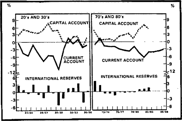
The solid lines on graph 12 show current account deficits (occasionally surpluses) in relation to GDP. The dashed lines show net capital inflows and the bars changes in international reserves, also in relation to GDP.
BALANCE OF PAYMENTS

During the periods of relatively strong growth in the early 1920's the current account deficit fluctuated between 0 and 6 per cent of GDP. Current account deficits were financed by large overseas borrowings, mainly by State governments and government authorities. Most of this borrowing was in London, in some cases in the form of overdrafts.[9]
With the decline in world trade and the fall in commodity prices, the current account deficit increased substantially in the second half of the 1920's. It peaked at over 10 per cent of GDP in 1929/30 (with real GDP growing by only 2 per cent). with a virtual drying up of capital inflow, there was a large drop of reserves in the same year. In the next two years, the rapid weakening of activity in Australia, large increases in protection and devaluation of the exchange rate produced a sharp move to surplus in the current account. Schedvin (1970, P.9), notes that this combination of factors “successfully restored payments balance around mid-1931, although this was achieved without the exhaustion of international reserves by the barest margin”.
The 1970's opened with a strong current account. From 1973/74 on, the rest of the 1970's saw current account deficits of between 2 and 4 per cent of GDP. The deficit widened substantially in 1980/81 and 1981/82. There has been some cut-back during 1982/83 and this trend is projected in Scenario A to continue for the next three years.
Capital inflows were very strong in the early 1970's and then weakened considerably for the rest of the decade. In the early 1980's net capital inflows increased even more in relation to GDP than did the current account deficit. The overall balance of payments has shown sizeable surpluses for the last three years.
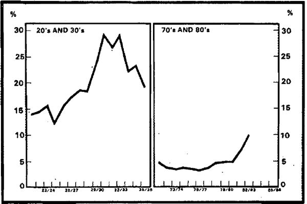
Graph 13 shows interest payments on overseas borrowings as a ratio to export receipts. Table 3 gives some figures.
DEBT SERVICING BURDEN

| interest on overseas debt* |
export receipts# (current prices) |
ratio (%) |
|
|---|---|---|---|
| 1921/22 – 24/25 | 40 | 284 | 14.1 |
| 1925/26 – 28/29 | 52 | 297 | 17.5 |
| 1929/30 | 53 | 216 | 24.5 |
| 1930/31 | 59 | 201 | 29.4 |
| 1931/32 – 34/35 | 60 | 237 | 25.3 |
| 1971/72 – 75/76 | 323 | 8,257 | 3.9 |
| 1976/77 – 80/81 | 769 | 17,455 | 4.4 |
| 1981/82 | 1,669 | 22,663 | 7.4 |
| 1982/83 | 2,300(e) | 24,559 | 9.4(e) |
|
* For 1920's and 1930's, interest on government debt domiciled overseas. For 1970's and 1980's, includes interest payable on private overseas borrowing. # National Accounts basis. |
|||
The large overseas borrowings (as noted above, predominantly by governments) in the late 1920's meant that interest payments increased substantially in the face of generally falling export prices. Export earnings collapsed in 1929/30. As a ratio to exports, interest payments jumped from 14 per cent in the early 1920's to almost 30 per cent in 1930/31. There was subsequently a modest reduction.
In the 1970's the corresponding ratio has been much smaller, generally between 3 and 5 per cent, although the outcome for 1982/83 may be nearer 10 per cent. The sizeable increase in the last two years mainly reflects the increased use of offshore borrowing at high interest rates. In contrast to earlier experience, overseas borrowing in the 1970's and 1980's has been mostly on private account.
EXCHANGE RATES

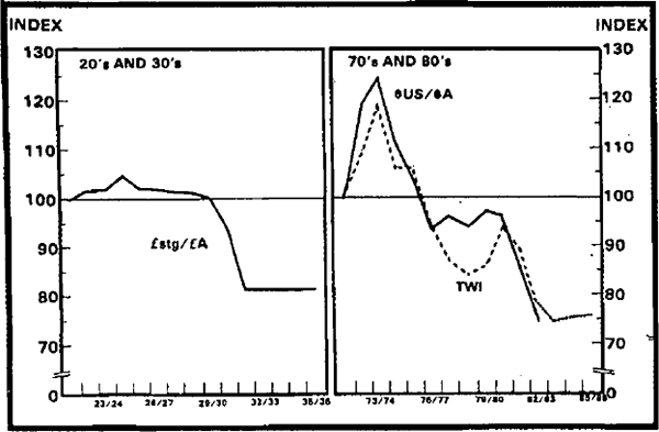
In graph 14, the exchange rate against Sterling is shown to have been fairly stable until the large devaluation in 1931, after which it again held constant. In the 1970's, exchange rates were much more volatile after the break-down of the system of fixed exchange rates which had operated since shortly after World War II. The Australian dollar appreciated against other currencies early in the decade. The effects of the subsequent devaluations are clearly seen. After the November 1976 devaluation, the trade weighted index tended to appreciate for several years. In the past two years, however, the value of the Australian dollar has fallen by around 17 per cent.
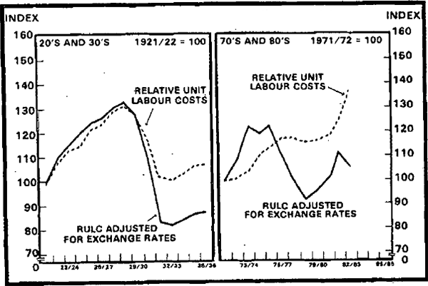
Competitiveness is shown in graph 15. Many measures of competitiveness can be constructed: those shown by the dotted lines are the ratio of unit labour costs in Australia to those in the United Kingdom (in the 1920's and the 1930's) and major OECD countries (in the 1970's and the 1980's). The solid lines adjust the ratios of unit labour costs for movements in the exchange rate (against Sterling in the early episode and the other relevant currencies for the recent experience). In this graph a movement down indicates an increase in competitiveness (and vice versa).
INDICES OF COMPETITIVENESS

For much of the 1920's the competitiveness of Australian industry declined relative to that of the United Kingdom. However, the large cut in real unit labour costs from 1931/32 onwards produced a substantial improvement in competitiveness. When the effects of devaluation were added, there was a very large increase in competitiveness in the early 1930's.[10] Giblin (1936) provides a nice summary of the situation:
“With the depression came a gradual but strong improvement of competitive power by Australian factories, so that even when duties remained unchanged, less protection was used. This came about partly as a result of greater economy and efficiency induced by the depression and the keen competition of Australian factories for the reduced market.
A still more powerful factor was the fall in wages relative to wages abroad. This came about primarily through our peculiar method of adjusting wages to prices. The 10 per cent additional cut imposed by the Federal Court affected perhaps half the field of wages, but was offset by the slowness of some of the States, particularly New South Wales, to allow wages to be adjusted to lower prices. The net effect over all Australian wages has been a reduction almost exactly equal to the fall in prices. Wages in the three years 1930 to 1932 fell 21 per cent, and retail prices 22 per cent. In England, in the same time, the cost of living fell 15 per cent, and wages only 5 per cent. Wages now in Australia are 18 per cent lower than in 1930, but in England only 2 per cent lower. This fall in wages relative to the movement in England took place in the face of a depreciation of the currency in relation to sterling; it may be said at the present time that sterling wages have fallen 34 per cent in Australia since 1930, and practically not at all in England.” (p.17).
Australian unit labour costs rose by considerably more than those in OECD countries during the 1970's and 1980's. However, the substantial net devaluation of the exchange rate over this period has largely offset the effects of larger increases in unit labour costs. It should also be noted that other measures – e.g. those based on relative prices of commodities – show a less unfavourable picture for competitiveness in recent years.
Footnotes
Schedvin (1970, P5) gives a succinct account of sources of instabilities to the market for overseas loan funds in the 1920's. [9]
It would be possible to adjust the measures of competitiveness shown here to allow for the additional effects of the changes in tariffs on the competitiveness of manufacturing industry, as done for the 1973 changes by Gregory and Martin (1976). Such a procedure would suggest an even bigger improvement in competitiveness (for manufacturing) than that shown for the early 1930's in graph 15. [10]