RDP 8303: The 1930's and the 1980's: Some Facts 5. Indicators of Government Policy
September 1983
- Download the Paper 1.57MB
A considerable debate occurred in the 1920's over protection of Australian industry. Graph 16 shows indices of rates of protection.[11]
INDICES OF TARIFF RATES
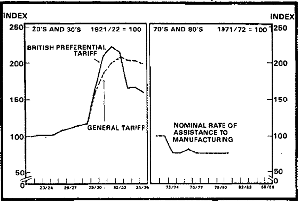
A gradual upward trend through the early and mid-1920's was followed by sharp increases when the foreign exchange crisis of 1929–31 forced policy-makers to act to reduce imports sharply. In the 1970's and 1980's overall rates of protection have been much more stable.
PUBLIC SECTOR OUTLAYS
BUDGET DEFICIT
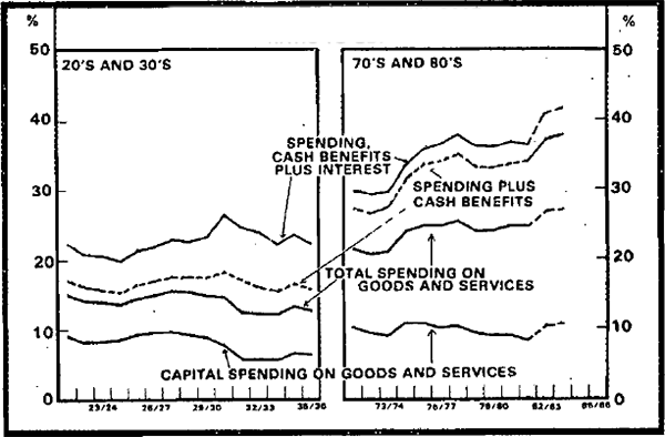
The size of government budgets was another big issue in the 1930's. Graph 17 shows public sector outlays by type and relative to GDP in the 1920's and 1930's and in the 1970's and 1980's. While capital spending on goods and services was roughly the same proportion of GDP in both periods, current spending in the 1920's and 1930's was about half that in the 1970's and 1980's. Cash benefits accounted for a much smaller share of total government outlays in the 1920's and 1930's than in the 1970's and 1980's but interest payments were relatively larger in the former period.
Relative to GDP, there was a steady upward trend in public sector outlays from the mid 1920's until 1930/31, with a sharp acceleration in the latter year. Early on this mainly reflected rising expenditure on capital goods and rising interest payments but later a sharp increase in interest payments and cash benefits combined with falls in GDP were the main influences. The rise in total outlays was, however, moderated by a rapid fall in capital spending after 1928/29. This reflected severely restricted opportunities for overseas borrowing.
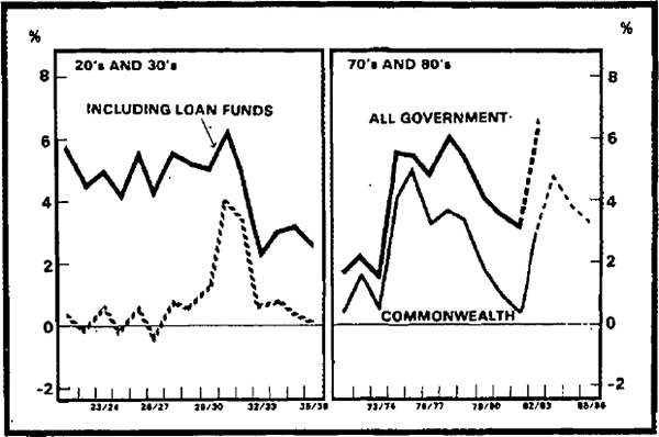
The left-hand panel of graph 18 shows measures of public sector deficits (relative to GDP) during the 1920's and 1930's. There was a gradual rise in public sector revenues relative to GDP over this period, due mainly to growth in indirect taxation revenues (relative to GDP). Consequently, the rise in the deficit at the onset of the depression is much less pronounced than that in outlays. The fall in capital spending in the late 1920's also moderated the increase in the deficit. This is shown in graph 18 by the fact that the deficit including loan funds (shown by the black line) increased by much less than the consolidated revenue deficit (represented by the striped line).
The policy, adopted in the Premiers' Plan, of balancing, or at least trying to balance, budgets is clearly reflected in the sharp fall in the size of both measures of budget deficits by 1932/33.
The right-hand panel of graph 17 shows public sector outlays by type (again relative to GDP). In the early 1970's total government outlays were about 32 per cent of GDP. There was a sharp increase in government outlays beginning in 1974/75 and due mainly to increased current spending on goods and services and increased cash benefits. Total outlays continued to increase relative to GDP until 1977/78 before falling slightly and then levelling out.
The combination of weakening economic activity and expansionary policies (both of the Commonwealth and the non-Commonwealth authorities) contributed to a marked increase in public sector outlays in 1982/83. As shown in graph 17 this increase is reflected in all the categories of outlays.
Public sector deficits in the 1970's and 1980's are shown in the right-hand panel of graph 18. The thick line in this panel shows the consolidated deficit of all public authorities. In the early 1970's this deficit amounted to about 2 per cent of GDP. It subsequently increased sharply with the expansion of Commonwealth outlays in the middle of the decade. The relative size of deficits was gradually pegged back in the late 1970's, but the increase in spending by non-Commonwealth authorities, financed mainly by borrowing, prevented the consolidated deficit from falling to the same extent as the Commonwealth deficit.
Both deficit measures increased sharply in 1982/83 and this trend has been projected to continue in 1983/84. Scenario A projects further large Commonwealth deficits in the following two years, but with some declines (especially relative to GDP).
INTEREST RATES
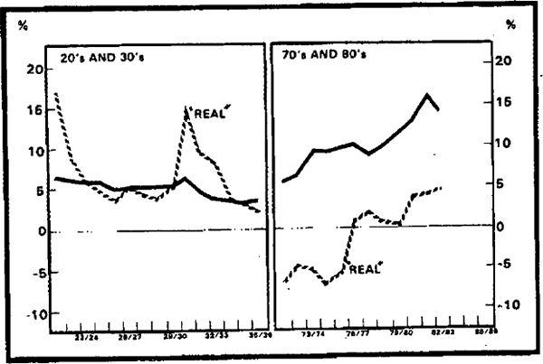
Graph 19 shows nominal and “real” interest rates.[12] Nominal rates were fairly stable in the earlier period, with the volatility in real rates caused mainly by fluctuations in inflation. With prices falling, real rates of interest reached over 15 per cent in 1930/31. The Premiers' Plan included a cut in interest rates; the effects of this cut are seen in the latter part of the early period.
In the early seventies, high and persistent rates of inflation exceeded nominal rates of interest, implying negative real interest rates (as measured) for some years. In the last few years, nominal rates have exceeded inflation, implying positive real rates which approached 5 per cent in 1981/82 and 1982/83. For the 1970's and 1980's, however, real rates of interest have, on average, been much lower than in the 1920's and 1930's.
GROWTH IN M3
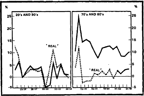
Graph 20 shows the rate of growth in the supply of money, in nominal and real terms. Both measures of money fell substantially in 1929/30. In the following year, money again declined but by less than the general level of prices. This implied growth in real terms, which continued in the next two years. Towards the middle of the thirties, growth rates (on both real and nominal measures) again declined.
In the early seventies, there was a sharp acceleration of monetary growth, associated with large foreign exchange surpluses. This was followed by almost as sharp a deceleration in 1973/74, and a further reduction in 1977/78. In subsequent years at the end of the 1970's and early 1980's, monetary growth was generally between 10 and 13 per cent. After adjustment for inflation, monetary growth in real terms has (since 1972/73) been a good deal more stable than in the 1920's and 1930's.
Footnotes
The average level of protection in the 1970's was around 17 per cent for manufacturing, compared with average tariff rates of up to 50 per cent in the 1920's for non-U.K. goods. The figures for the 1970's and 1980's include IAC estimates of protection through quotas and other restrictions as well as tariffs, while the early figures do not allow for non-tariff barriers to trade. For some discussion of the latter see Schedvin (1970), Chapter 8.
A feature of recent changes to protection policy has been the increase in the dispersion of levels of protection. This increase means that the stability shown in the right-hand panel of graph 16 is more apparent than real.
[11]The “real” rate of interest is defined for this graph as the yield on government bonds adjusted for movements in the linked c-series for the 1920's and 1930's and the GDP deflator for the 1970's and 1980's. [12]